
Color plays a powerful role in how people experience their homes. Beyond aesthetics, color influences emotions, energy levels, and even behavior. In interior design, understanding color psychology helps homeowners create spaces that feel balanced, comfortable, and emotionally supportive.
For homeowners where homes serve as places to work, rest, and connect, thoughtful color choices can significantly improve daily wellbeing. Interior color psychology bridges design and human perception, guiding decisions that shape how a space feels rather than simply how it looks.
Introduction to Color Psychology in Interior Design
Color psychology explores how different hues affect emotions and mental states. In interior design, this knowledge is applied to create environments that align with the intended function of a space.
Designers consider how colors interact with light, materials, and spatial layout. A calming bedroom, an energizing kitchen, or a focused home office all benefit from specific color strategies. For homeowners, understanding these principles allows more confident and intentional design decisions.
Color psychology doesn’t rely on rigid rules. Cultural context, personal experience, and lifestyle all influence how colors are perceived. In many American homes, flexibility and personalization are key to effective application.
The Science Behind Color Perception
Color perception begins with light interacting with the eye and brain. When light reflects off surfaces, different wavelengths are processed by the visual system and interpreted as color. These signals then interact with memory, emotion, and cognition.
Research in environmental psychology shows that color can influence heart rate, stress levels, and attention. Warm colors often stimulate energy and engagement, while cooler tones tend to promote calm and focus. Neutral colors provide balance and visual rest.
Lighting conditions also affect perception. Natural daylight, artificial lighting, and shadow can change how a color appears throughout the day. This is especially relevant in American homes with varied room orientations and open layouts.
Key Concepts of Color Psychology
Several core concepts guide how color psychology is applied in interior design. Hue refers to the color itself, while saturation describes intensity and brightness. Value indicates how light or dark a color appears.
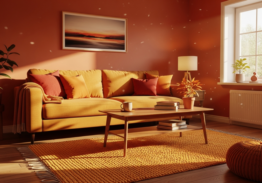
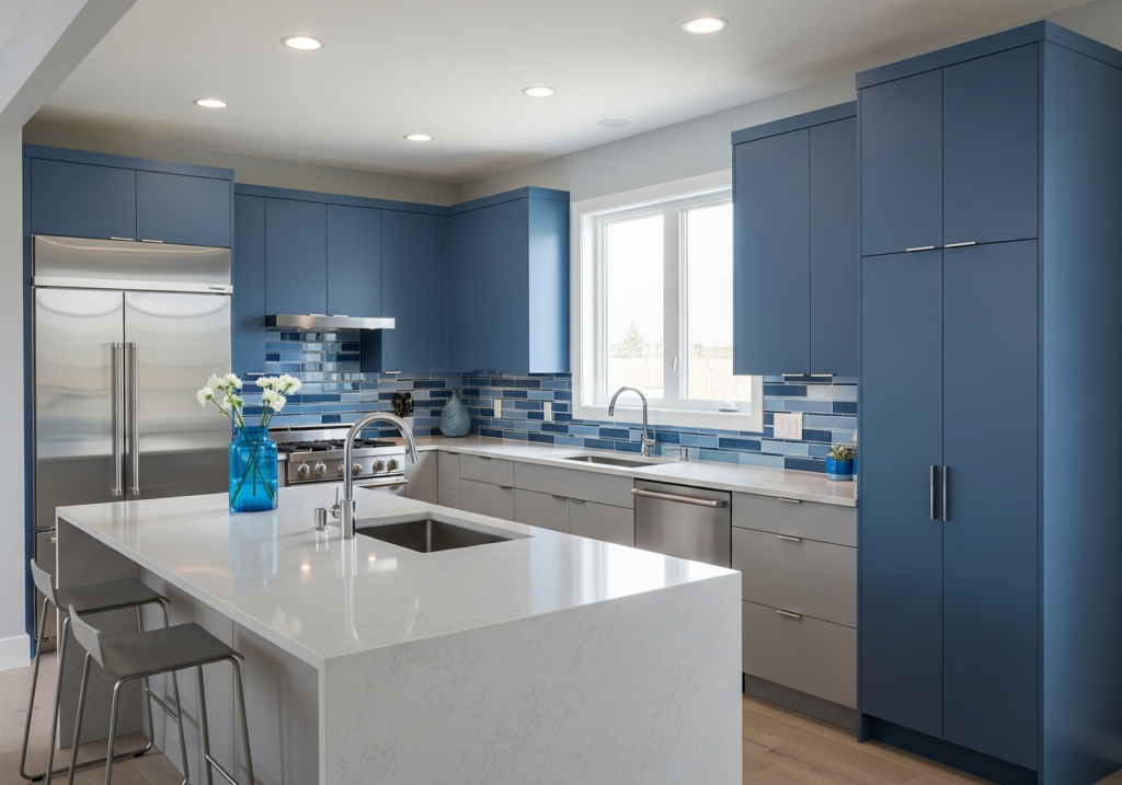
Warm colors such as reds, oranges, and yellows are associated with warmth, activity, and social interaction. Cool colors like blues and greens often evoke calmness, clarity, and relaxation. Neutral tones create stability and allow other design elements to stand out.
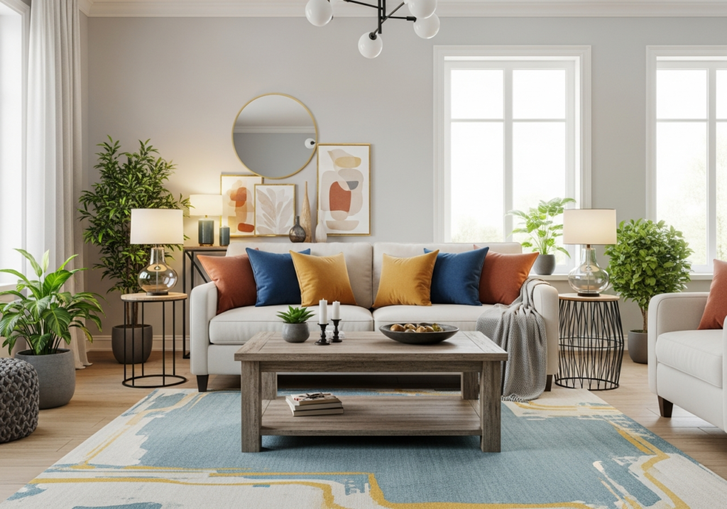
Balance is essential when working with color in interior design because it shapes how a space feels both emotionally and visually. Overuse of intense or highly saturated colors can easily overwhelm a room, creating visual tension and making the environment feel chaotic or exhausting over time.
On the other hand, relying too heavily on muted or neutral tones may cause a space to feel flat, lifeless, or lacking in personality. Successful interiors strike a thoughtful balance by combining bold and subtle hues in a way that feels intentional and cohesive. These well considered color combinations help support emotional comfort, allowing occupants to relax and feel at ease, while also maintaining visual harmony that keeps the space engaging, refined, and aesthetically pleasing.
Practical Application: Choosing Colors for Your Home
Applying color psychology effectively requires understanding how spaces are used and how occupants respond emotionally. In homes, rooms often serve multiple purposes, making thoughtful color selection even more important.
Homeowners benefit from considering natural light exposure, room size, and existing furnishings. Lighter colors can make small rooms feel more open, while deeper tones add intimacy to larger spaces.
Personal preference matters. While psychological principles offer guidance, individual comfort should always take priority. Colors that feel welcoming and familiar often create the strongest emotional connection.
Example Scenarios: How Colors Affect Mood in Different Rooms
In living rooms, warm neutrals and soft earth tones promote comfort and conversation. These colors support social interaction without overstimulation. Accent colors can add personality while maintaining balance.
Bedrooms benefit from cooler, muted hues such as soft blues, greens, or warm grays. These colors encourage relaxation and support healthy sleep patterns. Overly bright or high contrast colors may disrupt rest.
Kitchens and dining areas often incorporate warm tones to stimulate appetite and energy. Subtle yellows, warm whites, or natural wood finishes create inviting spaces for gathering.
Home offices require colors that support focus and mental clarity. Cool neutrals, gentle greens, or muted blues reduce visual fatigue and help maintain concentration during extended work periods.
Bathrooms frequently use light, clean colors to convey freshness and calm. Soft whites, pale blues, and natural stone tones enhance the feeling of cleanliness and relaxation.
Avoiding Common Color Psychology Mistakes
One common mistake is choosing colors solely based on trends without considering long term comfort. Trend driven colors may feel exciting initially but lose appeal over time.
Another issue is ignoring lighting conditions. A color that looks appealing in a showroom may appear different in a home environment. Testing samples under various lighting conditions helps avoid disappointment. Overusing bold colors can also disrupt balance. Strategic placement through accent walls, textiles, or decor often achieves better results than full room saturation.
Conclusion
Color psychology is a powerful tool in interior design that shapes how spaces feel and function. By understanding how color affects mood and perception, homeowners can create environments that support comfort, productivity, and emotional wellbeing.
For American households, successful application lies in balance, personalization, and awareness of daily living patterns. When colors are chosen thoughtfully, interiors become more than visually appealing. They become spaces that genuinely enhance quality of life.