

Designing a bedroom can feel more stressful than it should. You want the space to feel restful, stylish, and pulled together, but one wrong color choice can make the room feel busy instead of calm. That is why an analogous color scheme works so well. It is a low effort, high impact way to create a bedroom that feels cohesive without looking flat. By using analogous colors that naturally belong together, you can shape a room that feels polished, intentional, and easy to relax in at the end of the day.
What Are Analogous Colors? The Secret to a Restful Bedroom
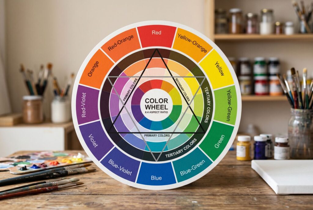
If you have ever asked what analogous colors are, the answer is simpler than it sounds. Analogous colors are three neighboring hues on the color wheel. A classic example would be green, blue green, and blue. Another would be red orange, orange, and yellow orange. Because these colors sit side by side instead of competing from opposite ends of the wheel, they naturally create harmony. That is the core analogous definition: a color family built from close neighbors that blend smoothly and make a room feel visually connected.
This matters even more in a bedroom than in other spaces. Bedrooms should feel easy on the eye. High contrast can be dramatic, but it doesn’t always create the quiet mood people want where they sleep. An analogous color scheme softens the visual experience because the colors don’t fight for attention. Instead, they flow into one another. That gentle transition helps the room feel calmer, which is exactly what most people want from a bedroom.
Analogous colors also make decorating easier. Once you choose one base shade you love, the next steps become more intuitive. You are not starting with a blank canvas anymore. You are simply building outward from a color that already works.
3 Pro Level Analogous Colors Examples for the Bedroom
The best way to understand color harmony is to see it applied with purpose. These analogous colors examples are practical, stylish, and easy to adapt for a modern bedroom.
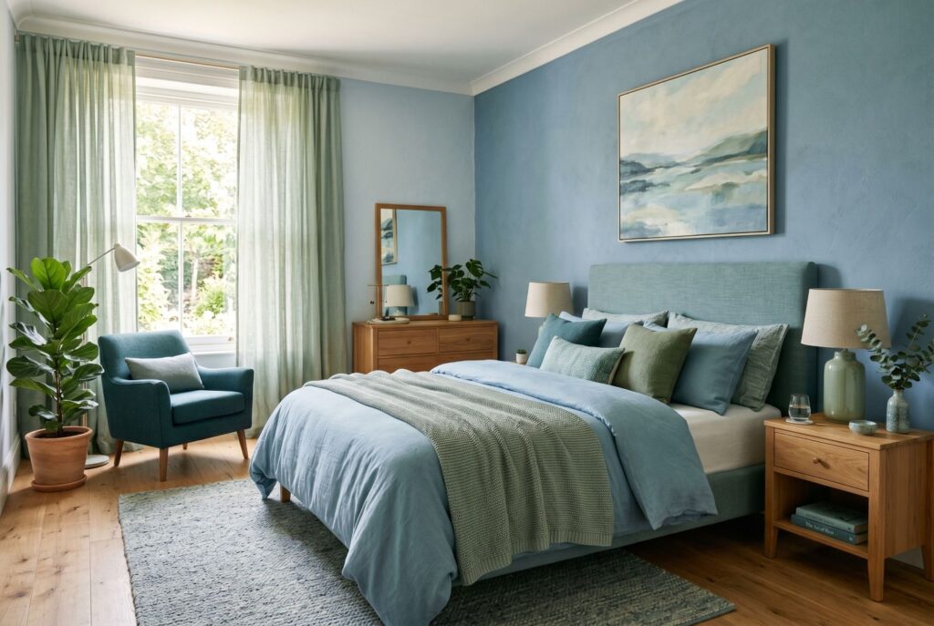
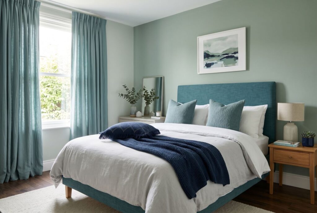
1. The Organic Modern Sanctuary: Green, Blue Green, and Blue
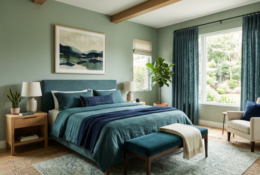
This is one of the most soothing analogous colors examples for a bedroom. Start with soft sage green on the walls to create a grounded base. Then bring in a deeper blue green through an upholstered headboard, bench, or curtains. Finish with navy blue in a throw blanket, lumbar pillow, or framed artwork.
This palette feels restorative and clean without becoming cold. It works especially well with white bedding, light oak furniture, woven textures, and brushed metal details. If you want a bedroom that feels connected to nature but still refined, this direction is hard to beat. It also suits rooms with moderate to strong daylight because the cooler tones stay fresh instead of heavy.
2. The Warm Japandi Retreat: Red Orange, Orange, Yellow Orange
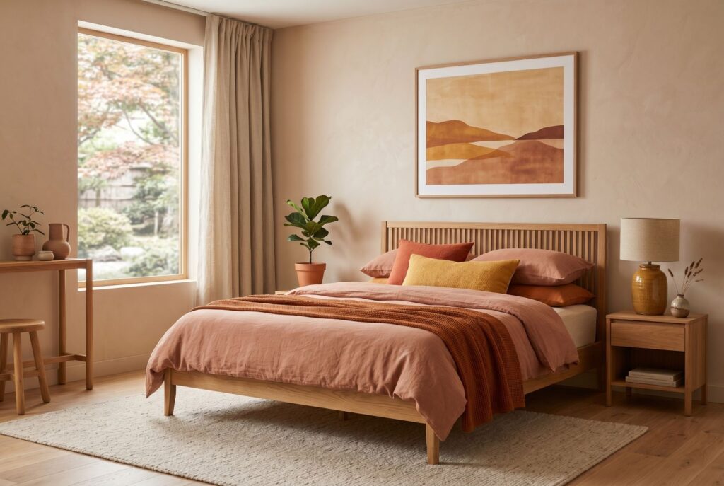
Warm analogous palettes can be just as restful when the tones are softened. Think muted terracotta, rust, clay, and warm ochre instead of bright citrus shades. On the walls, a pale clay tone can create warmth without overwhelming the room. Your bedding can bring in richer rust and orange notes, while a small accent piece such as a pillow, ceramic lamp, or art print can carry the warm ochre accent.
This palette works beautifully in bedrooms that need a little visual warmth. It feels grounded, tactile, and welcoming. Paired with cream bedding, natural linen, and warm wood, it creates a bedroom that feels cozy without looking cluttered. It is especially good for people who want warmth but don’t want their room to feel loud.
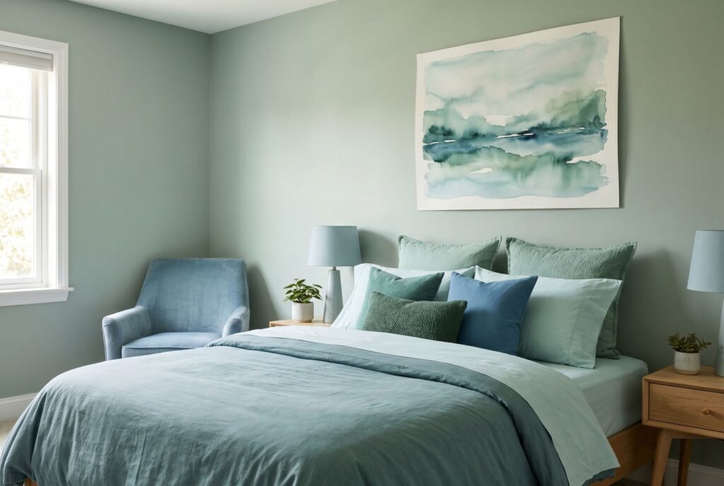
3. The Moody and Tidy Escape: Blue, Blue Violet, and Violet
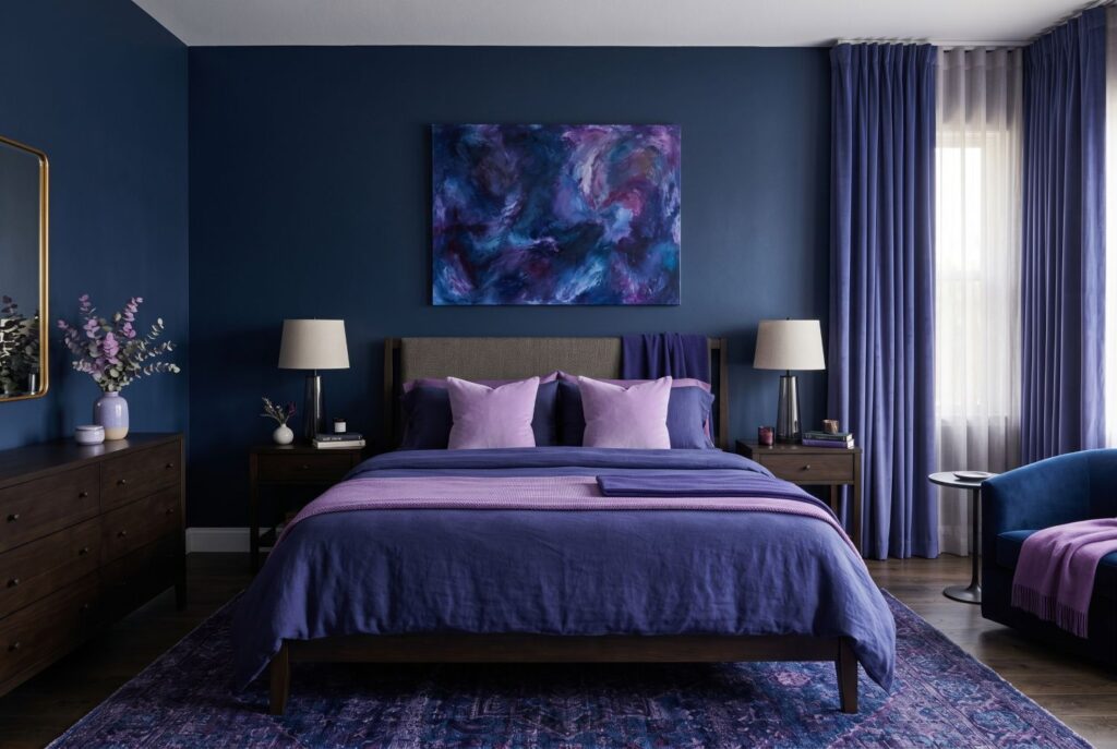
If you want the bedroom to feel elegant and a little more cocooning, this palette offers a richer take on analogous colors. Use a deep blue as the main shade, bring in blue violet through textiles like bedding or curtains, and add touches of soft violet for depth.
This is one of the most dramatic analogous colors examples, but it still feels controlled because the hues are related. The room can feel focused and restful at the same time. It pairs well with charcoal, matte black, smoked glass, and crisp white accents. For anyone who loves a darker bedroom, this approach helps the room stay layered rather than flat.
Execution: Applying the 60 30 10 Rule
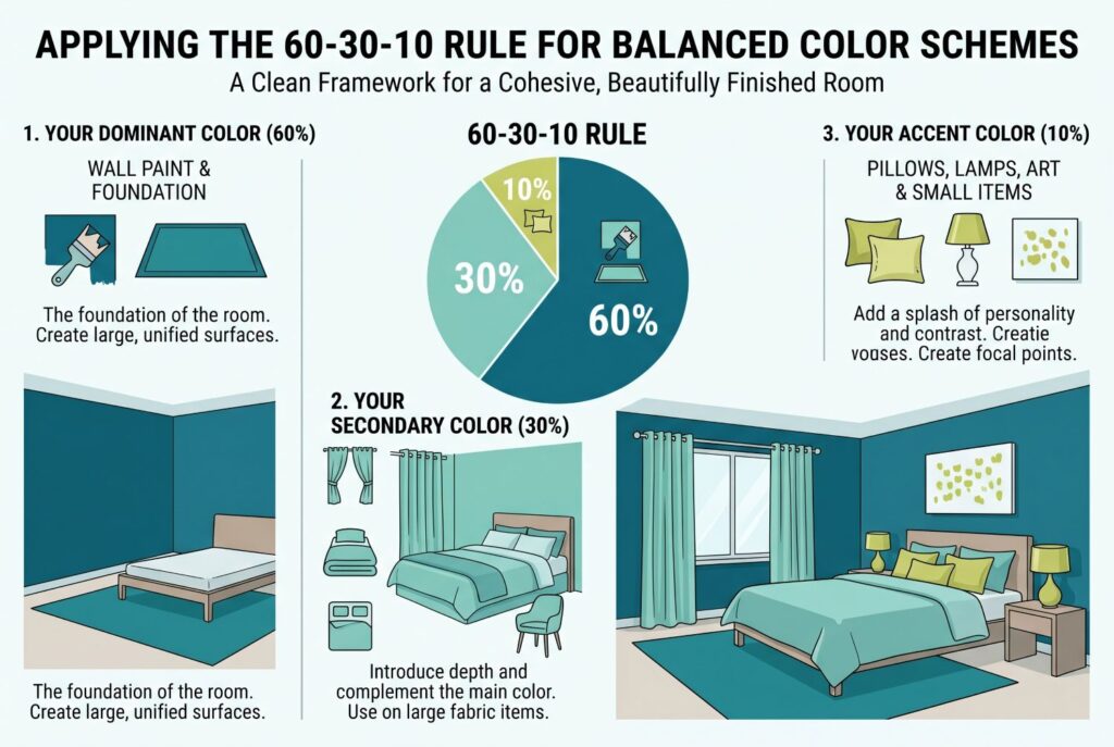
A strong palette still needs structure. Otherwise, even good colors can feel scattered. That is where the 60 30 10 rule comes in. It gives your analogous color scheme a clean framework so the room feels balanced and beautifully finished.
Use your dominant color for about 60% of the room. In a bedroom, that often means wall paint, a large rug, or the overall visual foundation. Your secondary color should cover around 30%, usually in bedding, curtains, or an upholstered piece. The final 10% belongs to your accent color, which can appear in throw pillows, lampshades, a small bench, or a single piece of art.
For example, in a green, blue green, and blue palette, sage might take the lead on the walls, blue green might show up in curtains and the headboard, and navy might appear in a throw or accent cushion. This keeps the room from feeling random. It also helps a tidy bedroom look even more intentional because every color has a clear role.
Avoiding the Matchy Matchy Trap: The Importance of Neutrals
One mistake people make with an analogous color scheme is using too much of every related shade with no visual break. That is when the room starts to feel overdone. So what is a color scheme in a practical bedroom sense? It isn’t only the colored pieces. It’s the full balance of color, neutral space, texture, and contrast working together.
Neutrals are what keep analogous colors from becoming too blended. Crisp white bedsheets, a cream textured rug, a light beige bench, or natural oak nightstands can all give the eye a place to rest. These quieter elements make the core palette feel stronger, not weaker.
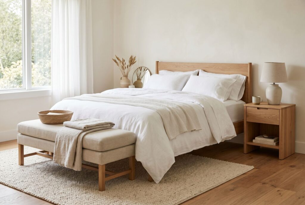
Texture also matters here. If your room uses several similar hues, vary the surfaces. A matte wall, soft linen duvet, knit throw, boucle bench, and wood nightstand all help create depth. That way the palette feels layered instead of flat.
Conclusion
Mastering the color wheel doesn’t have to feel technical. In a bedroom, it can be as simple as choosing one color you already love and then building around its neighbors. That is what makes an analogous color scheme so effective. It creates a room that feels unified, restful, and thoughtfully styled without asking you to memorize complicated design rules.
A good place to begin is with one piece you already own and love. Maybe it is your upholstered headboard, a favorite quilt, or a rug you want to keep. Let that piece become your base color. From there, choose neighboring shades on the color wheel and layer them with restraint. When you do that, your bedroom doesn’t just look better. It feels easier to live in every day.

