

Color theory sounds simple until you actually try to use it in a real room. Suddenly, terms like analogous colors, tertiary color, and color wheel harmony stop feeling academic and start affecting your walls, furniture, rugs, and lighting. If you’ve ever wondered why one room feels effortless while another feels slightly off, the answer often comes down to palette structure. This guide breaks down the difference between analogous colors and tertiary hues in plain English, so you can decide which direction fits your home, your lighting, and your everyday style best.
Decoding the Color Wheel: Analogous vs. Tertiary
Before choosing a room palette, it helps to understand what these terms actually mean. Both ideas come from the color wheel, but they serve different roles in home design.
What Are Analogous Colors?
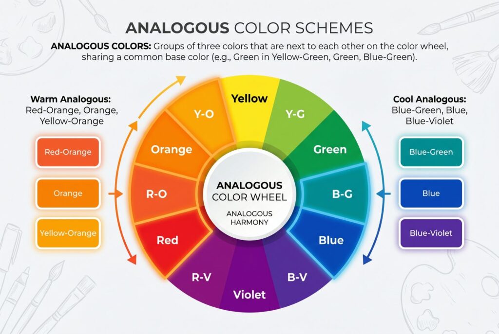
If you’ve been asking what analogous colors are, the simplest answer is this: they’re colors that sit next to each other on the color wheel. A classic example would be blue, blue-green, and green. Because these shades share a visual relationship, they naturally feel harmonious and easy on the eye. That’s why the analogous definition is usually tied to smooth transitions and low-contrast color flow.
In home design, analogous colors often create a calm, connected atmosphere. They don’t fight each other for attention. Instead, they layer softly and allow texture, materials, and light to do more of the talking. If your goal is a room that feels restful and visually steady, analogous colors are often the easiest entry point into color theory.
What Are Tertiary Colors?
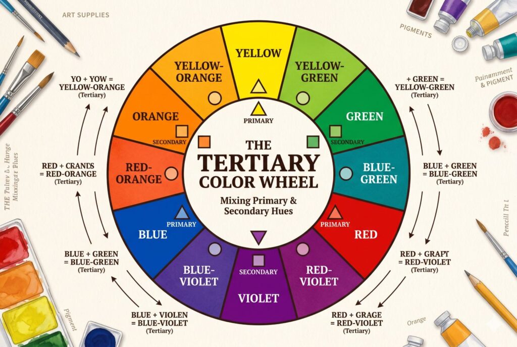
So, what are tertiary colors? A tertiary color is created by mixing a primary color with a neighboring secondary color. That means colors like blue-green, red-orange, or yellow-green belong in this category. If you’ve ever seen deep teal, terracotta, indigo, mossy olive, or muted plum and thought they felt richer than a basic primary or secondary hue, you were likely reacting to tertiary color complexity.
A clear tertiary colors definition should emphasize that these shades usually feel more nuanced than straightforward red, blue, or green. They often carry a moodier, more layered quality, which is why they show up so often in sophisticated interiors. Tertiary colors can feel grounded, dramatic, earthy, or jewel-like depending on their undertone and saturation.
The Analogous Color Scheme: Creating a Relaxing Home
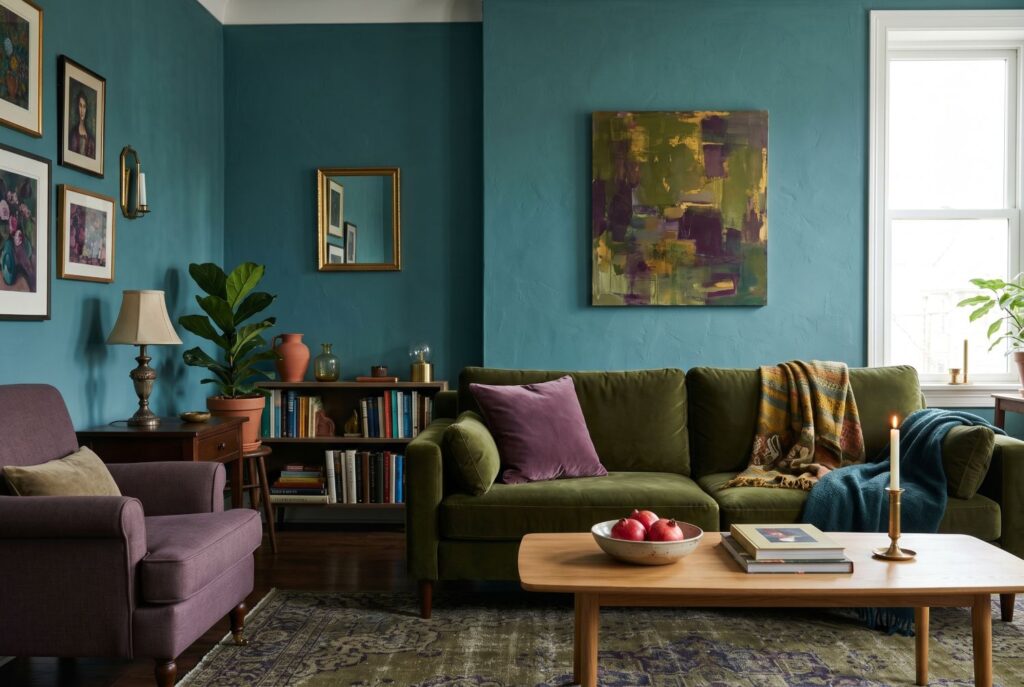
An analogous color scheme is one of the most forgiving ways to decorate. Because the colors are already related on the wheel, the room tends to feel unified even when you bring in different materials, patterns, or finishes. That makes this scheme especially appealing for people who want a designer look without constant second-guessing.
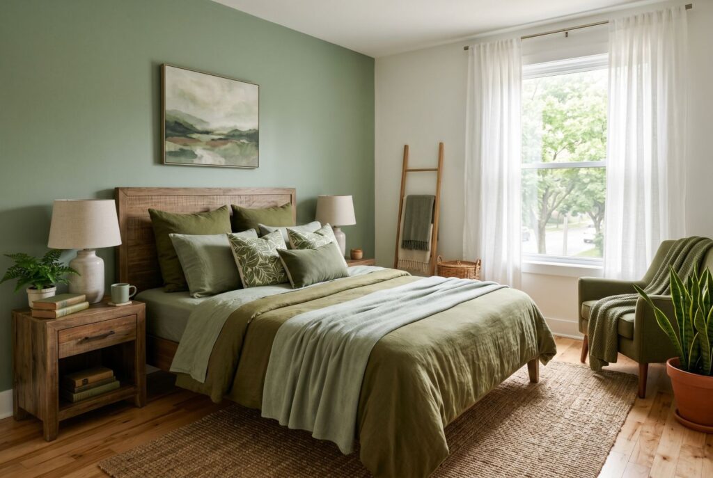
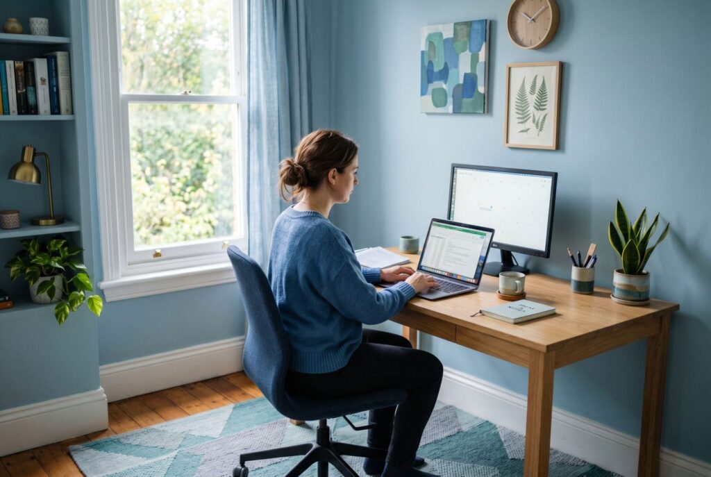
The best spaces for an analogous color scheme are usually rooms where calm matters most. Bedrooms are an obvious example. A palette built around sage, olive, and moss can feel soft and restorative without becoming bland. The same goes for a living room built around dusty blue, blue-gray, and slate. These combinations don’t feel loud, but they still offer enough variety to keep the room from feeling flat.
Home offices also benefit from analogous palettes. When you’re spending long hours in one space, high-contrast color combinations can sometimes feel too stimulating. An analogous approach keeps the visual rhythm smoother, which can make the room feel more settled and easier to focus in.
The trick to making analogous colors work well is variation. If you use three neighboring hues at exactly the same intensity, the room may start to feel one-note. Instead, bring in tints and shades. Use the lightest version on the wall, a medium tone in upholstery or curtains, and a deeper variation in accents or artwork. That’s what gives the room dimension without sacrificing the coherence that makes an analogous color scheme so appealing.
The Tertiary Color Palette: Adding Depth and Sophistication
If analogous colors are about ease and calm, tertiary colors are about richness and character. This is where interiors start to feel more layered, more personal, and sometimes a little more daring.
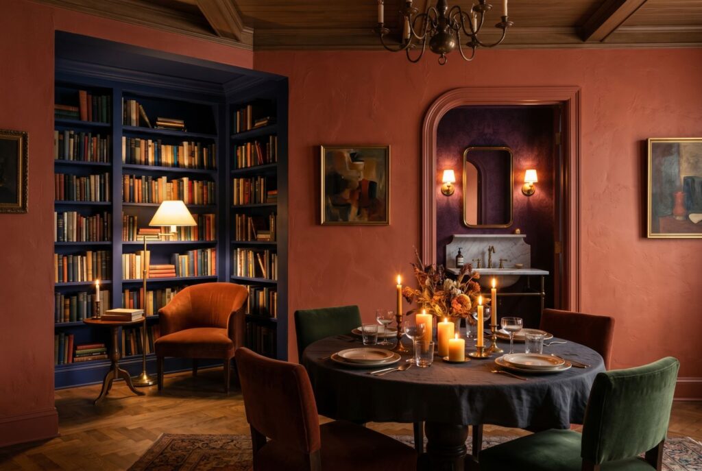
A tertiary color palette works especially well in rooms that benefit from mood. Dining rooms are a perfect example. A terracotta wall can make candlelight feel warmer. A deep indigo library nook can feel intimate and dramatic. A powder room wrapped in plum or blue-green can create that memorable “jewel box” effect designers often aim for in smaller spaces.
What makes tertiary colors so powerful is their subtle complexity. They don’t read as flat or obvious. A room painted in teal, olive, or aubergine usually feels more elevated than a room built around a plain primary hue. That’s one reason tertiary colors are often used when homeowners want a space to feel thoughtful rather than generic.
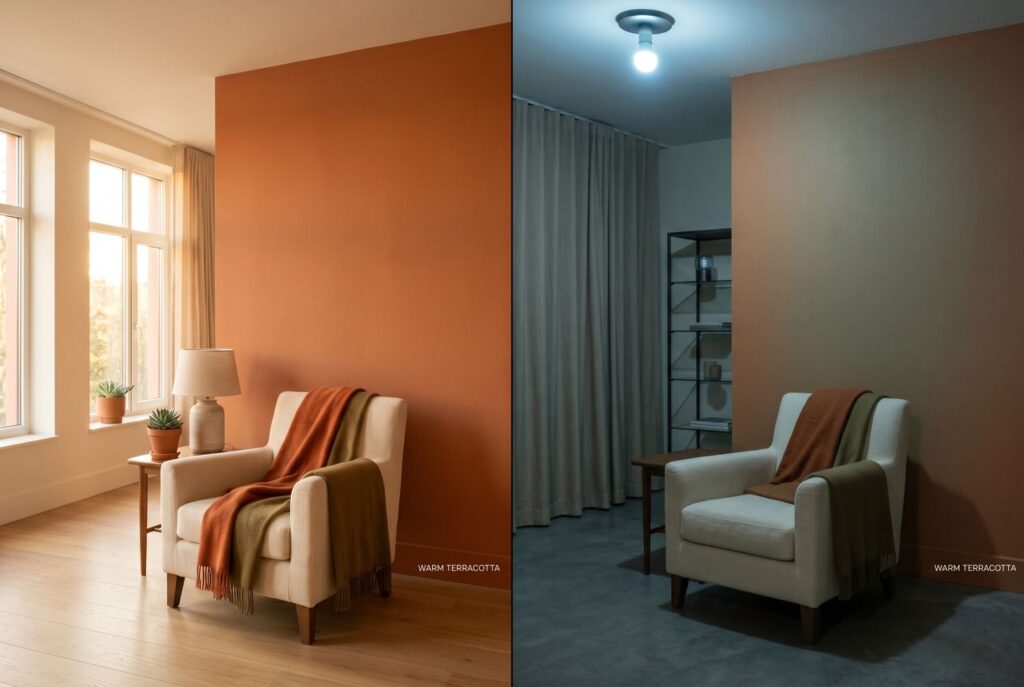
But this palette type also asks for more care. Tertiary colors can shift noticeably depending on natural light, bulb warmth, and surrounding finishes. A shade that looks rich in afternoon sun can feel muddy in a dim room with cool lighting. That doesn’t mean tertiary hues are difficult. It just means they need testing. Paint swatches matter more here because undertones can become stronger once the color covers a full wall.
Analogous vs. Tertiary: How to Choose for Your Space
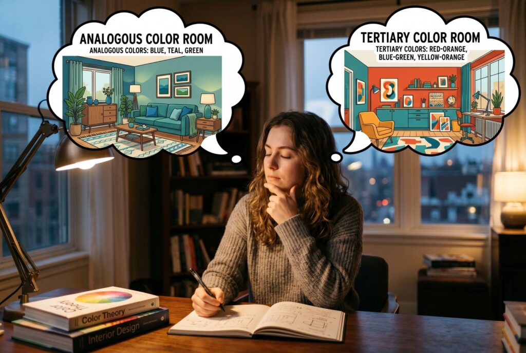
The real question isn’t which approach is more correct. It’s which one fits your room and the life you want it to support.
Start with mood. Do you want the room to feel serene, quiet, and cohesive? If so, analogous colors are usually the stronger choice. They’re easier to live with and less visually demanding. If you want the room to feel rich, dramatic, or layered, tertiary colors may be the better route.
Next, look at lighting. Natural light changes everything. Analogous schemes tend to stay stable because neighboring colors already harmonize. Tertiary colors are more sensitive. In a bright room, they can look luxurious and dimensional. In a dark room, they can feel heavier or duller unless you balance them with the right finishes and accent tones.
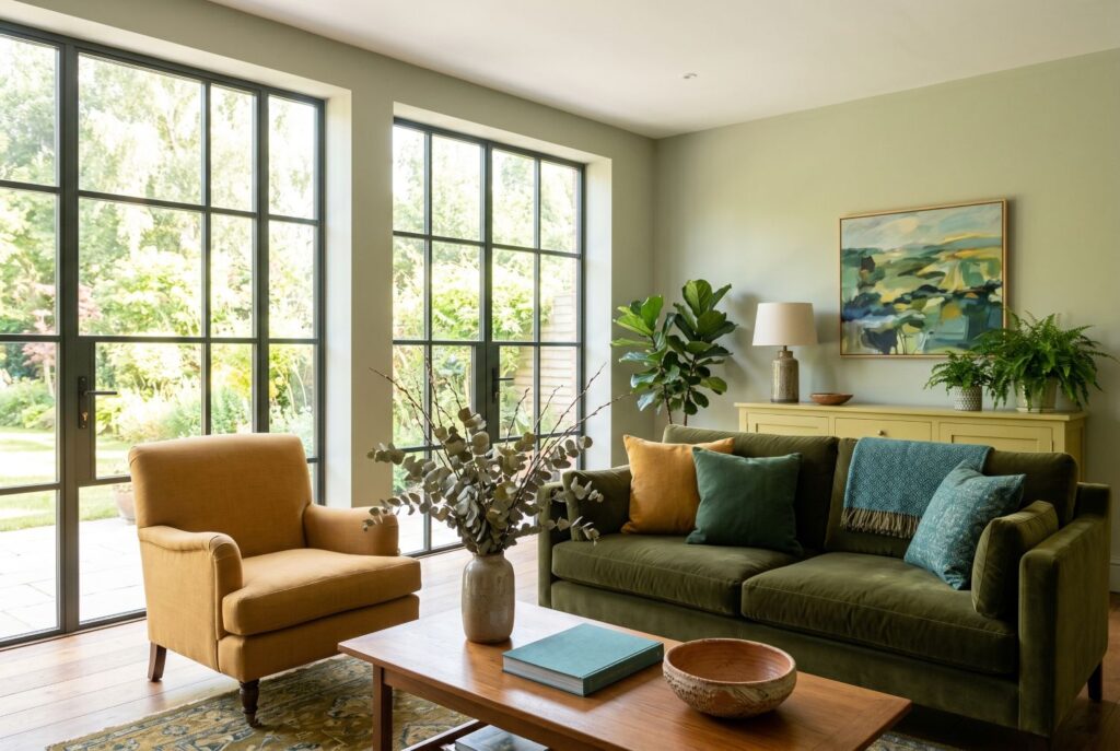
Then consider your existing furniture. Your largest pieces already influence the palette whether you notice it or not. A beige linen sofa, walnut table, and warm oak flooring may work beautifully with terracotta, olive, or ochre-toned tertiary hues. A charcoal sectional and cooler grays may support a blue-based analogous palette more naturally. The smartest color choices usually don’t start with a paint chip alone. They start with what’s already staying in the room.
Implementation: The 60-30-10 Rule for Any Palette

Once you’ve chosen a direction, the 60-30-10 rule helps turn color theory into an actual room plan. The idea is simple. About 60% of the room should be your dominant color. This is usually the wall color, the biggest rug, or the overall backdrop. Around 30% should be a secondary color, often carried through sofas, drapery, bedding, or larger furniture pieces. The final 10% belongs to accents like pillows, art, lamps, or decorative objects.
With an analogous color scheme, that might mean soft green walls, a deeper olive sofa, and blue-green accents. With tertiary colors, it could mean muted terracotta walls, camel upholstery, and deep plum or brass accents. The formula stays the same even though the emotional result changes.
This is what makes the 60-30-10 rule so useful. It removes guesswork. Instead of asking whether your room needs “more color,” you can ask where your major color zones are distributed and whether they feel balanced.
Conclusion

Understanding analogous colors and tertiary colors isn’t about memorizing art-school vocabulary. It’s about learning how color relationships shape the emotional feel of a room. Analogous colors are usually the easier path to a calm, cohesive home. Tertiary colors bring more depth, drama, and sophistication when you want a space to feel distinctive and expressive.
Neither approach is automatically better. The best one depends on your light, your furniture, and the mood you want every time you walk into the room. Grab a few paint swatches, test them on different walls, and look at them morning, afternoon, and evening. That’s when color theory stops being abstract and starts helping you create a home that feels exactly right.

