

Small kitchens can feel tight, crowded, and visually heavy, but you don’t always need a full renovation to change that. Sometimes, the smartest solution is color placement. Two tone kitchen cabinets can manipulate light, shadow, and visual weight so a compact kitchen feels taller, brighter, and more open.
The trick is not simply choosing two pretty colors. It is knowing where each color belongs. In small kitchens, dark shades should usually stay low, light shades should stay high, and every color transition should feel calm rather than busy.
To make a small kitchen look bigger with two tone kitchen cabinets, use darker lower cabinets to ground the room and lighter upper cabinets to reflect light upward. Choose low contrast neutrals, slim hardware, satin or semi gloss finishes, and controlled accents so your two tone cabinets feel airy instead of cluttered.
9 Design Rules for Small Space Two Tone Cabinetry
1. Ground the Room With Darker Lower Cabinets
The safest rule for two tone kitchen cabinets is simple: put visual weight at the bottom. Dark lower cabinets make the kitchen feel anchored, while light upper cabinets keep the eye level open.
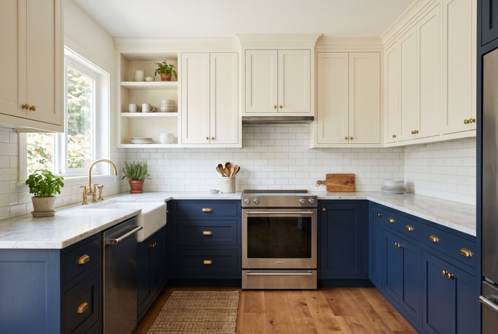
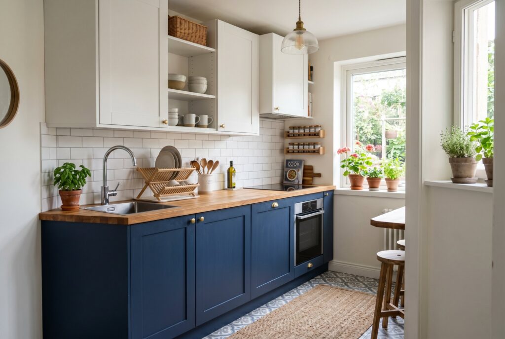
This works because dark colors naturally feel heavier. When they sit below the counter, they create stability. When they sit above your head in a tiny kitchen, they can make the ceiling feel lower and the walls feel closer. For small spaces, try navy lowers with warm white uppers, charcoal lowers with pale gray uppers, or muted green lowers with cream uppers. The result gives depth without making the kitchen feel boxed in.
2. Utilize Reflective Finishes to Bounce Natural Light
Finish matters just as much as color in 2 tone kitchen cabinets. A flat matte finish can look beautiful in a large kitchen, but in a small or windowless kitchen, it may absorb too much light.
Satin and semi gloss finishes are often better for compact spaces because they reflect light softly. They also tend to be more practical for kitchen cabinets because doors and drawers are touched every day. If your kitchen has only one small window, use a slightly reflective finish on the upper cabinets first. That upper shine helps bounce daylight and artificial light around the room, making the space feel more alive.
3. Create Seamless Transitions With Low Contrast Neutrals
High contrast two tone cabinets can look dramatic, but very sharp contrast may chop up a small kitchen visually. Black and pure white can work in modern spaces, but in a narrow kitchen, the break between colors can feel abrupt.
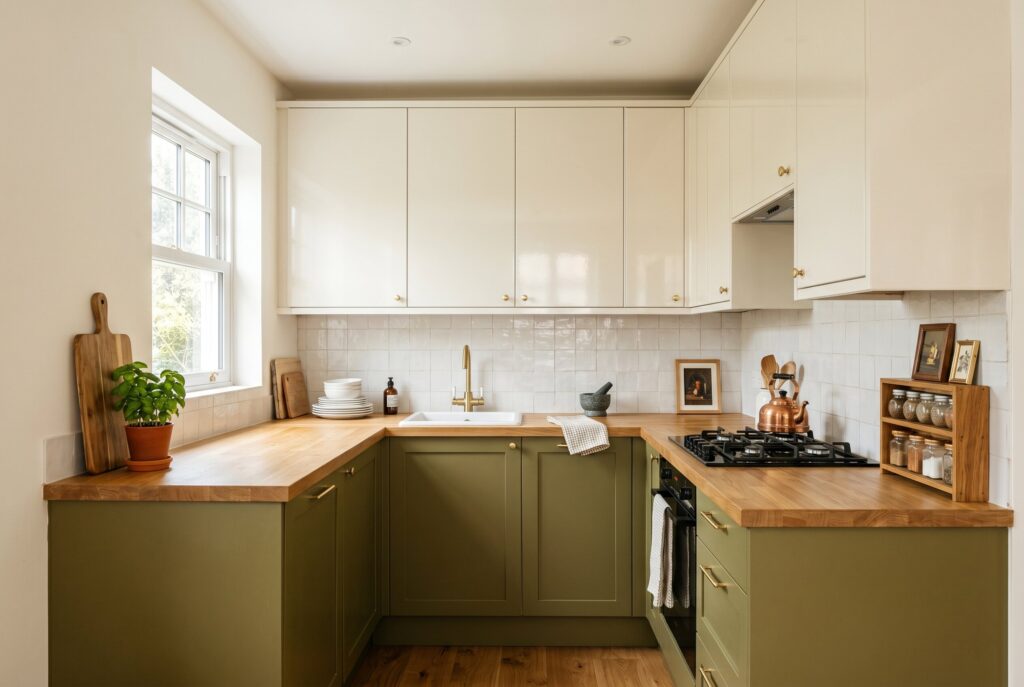
Low contrast “sister tones” are usually easier to live with. Try cream with mushroom, light gray with charcoal, warm white with taupe, or pale beige with muted olive. These combinations still create dimension, but they don’t interrupt the eye as aggressively. The kitchen feels layered rather than divided, which is exactly what a compact room needs.
4. Minimize Visual Clutter With Integrated Hardware

Bulky hardware can make small cabinet fronts feel even smaller. Large pulls, ornate knobs, and mixed metal finishes create tiny visual interruptions across the room.
For small kitchens, choose slim handles, edge pulls, hidden pulls, or hardware that matches the cabinet color closely. This keeps the cabinet doors looking cleaner and longer. If you are exploring painted kitchen cabinet ideas, remember that hardware should support the color plan instead of competing with it. Brass can warm green or navy cabinets, black can sharpen wood tones, and brushed nickel can keep pale cabinets feeling fresh.
5. Replace Heavy Uppers With Airy Open Shelving
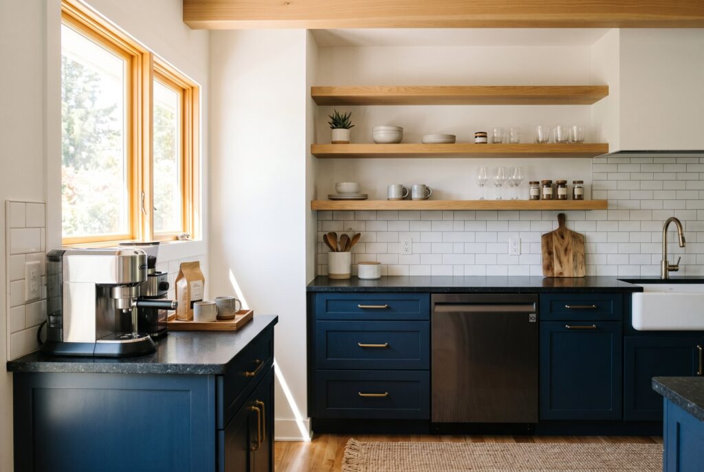
Sometimes the best second tone isn’t another cabinet color. In a very small kitchen, replacing some upper cabinets with light wood open shelves can make the wall feel wider and less crowded.
Use darker lower cabinets for storage and grounding, then place pale oak, white oak, or warm wood floating shelves above. This approach gives you the effect of two tone kitchen cabinets while removing visual bulk at eye level. It works especially well near a window, above a coffee station, or around a short wall where full upper cabinets would feel too heavy. Keep shelf styling simple so the openness doesn’t become clutter.
6. Extend the Upper Color to the Ceiling

One of the best tricks for a small kitchen is painting the wall above the upper cabinets the same color as the uppers. This creates an “infinite wall” effect, where the cabinets and wall visually blend together.
For example, if your upper cabinets are warm white, use the same warm white on the wall above them. If your uppers are pale greige, repeat that shade above. This reduces the stop and start feeling that can make a kitchen look shorter. It is especially helpful in kitchens with soffits, low ceilings, or awkward gaps above cabinetry.
7. Coordinate Cabinet Colors With Your Flooring

Small kitchens feel bigger when the lower cabinet color connects naturally with the floor. If the undertones clash, the room feels visually broken.
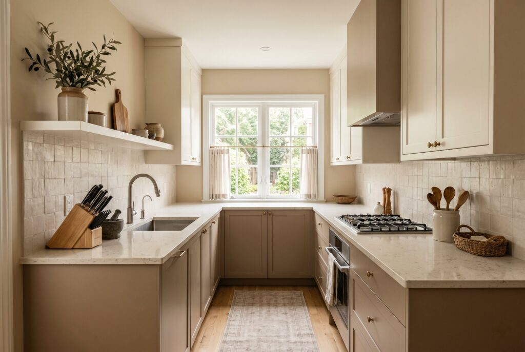
Look at your flooring before choosing cabinet paint. Light oak floors usually pair well with warm taupe, cream, muted green, or mushroom lowers. Cool gray tile works better with charcoal, blue gray, or soft white. Dark wood floors often need lighter lower cabinets so the kitchen doesn’t feel bottom heavy. When the floor and lower cabinets share a similar undertone, the room feels smoother and more expansive.
8. Focus Bold Accents Only on the Kitchen Island
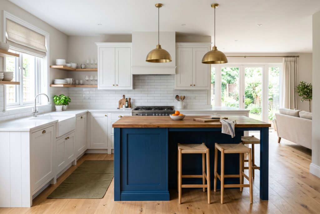
If your small kitchen has an island, use it strategically. Instead of splitting all upper and lower cabinets into different colors, keep the perimeter cabinets light and use the island as the second tone.
This creates a clear focal point without making the walls feel busy. A navy island, charcoal island, walnut island, or muted green island can add personality while the surrounding cabinets stay bright. This is one of the easiest ways to use 2 tone kitchen cabinets in an open plan home because the island reads almost like furniture, not just cabinetry.
9. Use Strategic Pops of Muted Red Kitchen Cabinets
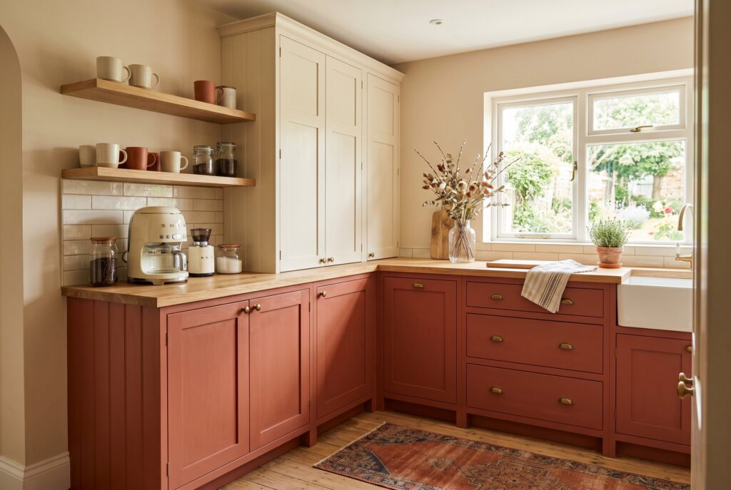
Red kitchen cabinets can be powerful, but in small spaces, too much red can feel overwhelming. The smarter move is using red as a controlled accent. Choose earthy red tones like terracotta, clay, oxblood, or muted brick instead of bright primary red. Apply the color to a coffee bar, under island cabinets, a pantry section, or one short run of lower cabinets. Pair it with cream uppers, light wood shelves, or soft beige walls. Used carefully, red adds warmth and personality without shrinking the room.
Execution: How to Choose the Perfect Painted Kitchen Cabinet Ideas
Before committing to any painted kitchen cabinet ideas, test large swatches in real light. Look at them at 8 AM, 2 PM, and 8 PM because small kitchens change dramatically throughout the day.
Morning light may make a color feel cool. Afternoon light may reveal hidden yellow, green, or gray undertones. Evening bulbs may make dark colors feel heavier. Tape samples where the upper and lower cabinets will actually be, not just on one wall. The best two tone kitchen cabinets should look balanced in every lighting condition.
Conclusion
Two tone kitchen cabinets are more than a color trend. In a small kitchen, they are a design tool. Used well, they can lift the ceiling, ground the room, reduce clutter, reflect light, and create the illusion of more space. The key is control. Keep the upper visual field light, place darker tones lower, avoid harsh contrast when the room is very tight, and use bold accents only where they add focus. With the right finish, hardware, flooring coordination, and lighting test, even the smallest kitchen can feel brighter, calmer, and far more intentional.

