

If you’re preparing a major remodeling budget this year, here’s something worth knowing: all-white kitchens aren’t the safest choice anymore. The strongest 2026 kitchen cabinet colors are moving toward warmth, depth, and personal expression, from moody blues and earthy greens to rich wood tones and soft, creamy neutrals.
The goal isn’t simply to follow a trend. It’s to create a kitchen that feels expensive, welcoming, and timeless. Below are 15 cabinet colors that look high-end and age well, each with real paint colors to try and a ready-made palette for countertops, hardware, walls, and floors.
Quick Picks: 15 Expensive-Looking Kitchen Cabinet Colors at a Glance
| Color | Undertone | Best For | Paint to Try |
|---|---|---|---|
| Navy Blue | Cool blue | Timeless, transitional kitchens | Benjamin Moore Hale Navy (HC-154) |
| Midnight Indigo | Blue-violet | Two-tone lowers, expressive spaces | Sherwin-Williams Indigo Batik (SW 7602) |
| Slate Blue | Blue-gray | Kitchens with changing natural light | Benjamin Moore Van Courtland Blue (HC-145) |
| Soft Black | Warm charcoal | Modern, handleless designs | Sherwin-Williams Iron Ore (SW 7069) |
| Smoky Jade | Green-gray | Calm, nature-inspired kitchens | Farrow & Ball Green Smoke (No. 47) |
| Deep Olive | Warm green-brown | English country style, islands | Farrow & Ball Bancha (No. 298) |
| Rift-Sawn White Oak | Light, warm natural | Quiet luxury, minimal kitchens | Clear matte or satin finish |
| Rich Walnut | Deep warm brown | Islands, pantry walls, accents | Clear oil or satin finish |
| Mushroom Greige | Gray-beige | A safe but sophisticated neutral | Farrow & Ball Elephant’s Breath (No. 229) |
| Rich Pale Cream | Soft warm white | Replacing stark white, small kitchens | Benjamin Moore White Dove (OC-17) |
| Butter Yellow | Muted warm yellow | Cottage and vintage-style kitchens | Benjamin Moore Hawthorne Yellow (HC-4) |
| Khaki & Muddy Taupe | Earthy brown-gray | Organic modern, busy family kitchens | Farrow & Ball Mouse’s Back (No. 40) |
| Deep Burgundy | Red-brown | Pantries, bars, statement cabinets | Farrow & Ball Preference Red (No. 297) |
| Aubergine & Plum | Red-violet | Accent islands, artistic spaces | Farrow & Ball Brinjal (No. 222) |
| Terracotta | Orange-clay | Mediterranean-inspired kitchens | Sherwin-Williams Cavern Clay (SW 7701) |
The Moody & Dramatic: Blue and Black Tones
1. The Classic Navy Blue Kitchen Cabinets
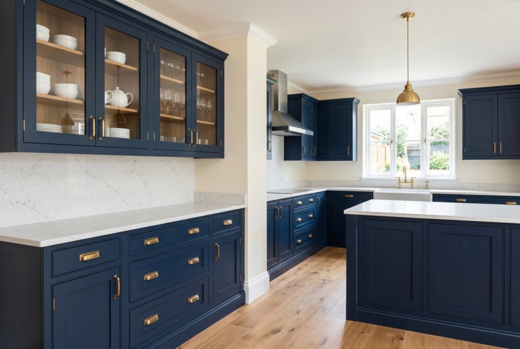
Few colors have transformed modern kitchens the way navy blue kitchen cabinets have. Navy has become the new neutral because it delivers richness without the harshness often associated with black cabinetry.
The reason navy looks expensive is its visual depth. During daylight, it feels sophisticated and tailored. At night, it creates intimacy and warmth. Unlike trendy colors that quickly become dated, navy carries a timeless quality that works across transitional, organic modern, and traditional interiors.
For the best result, pair blue kitchen cabinets with cool veined quartz or marble countertops. Brushed brass hardware creates contrast while reflecting light across the darker surface. Soft cream walls and natural oak flooring prevent the room from feeling overly heavy.
- Paint picks: Benjamin Moore Hale Navy (HC-154), Sherwin-Williams Naval (SW 6244)
- Palette: navy cabinets + white quartz or marble counters + brushed brass hardware + soft cream walls + natural oak floors
2. Midnight Indigo
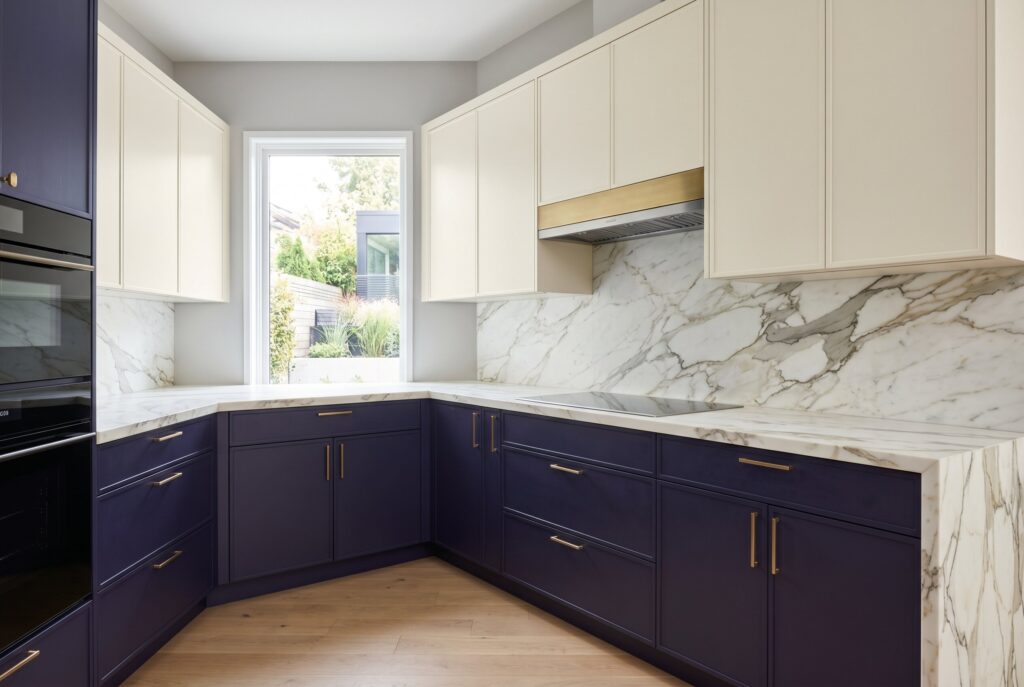
Midnight Indigo takes navy one step further by introducing subtle violet undertones. This creates a more artistic and personalized appearance.
What makes this shade special is its ability to feel luxurious without looking predictable. Homeowners seeking a more expressive kitchen often choose Midnight Indigo because it balances creativity with sophistication.
This color works especially well in two-tone cabinets. Indigo lower cabinets paired with warm cream uppers create visual interest while maintaining balance. Statement stone countertops and matte finishes enhance the richness of the color.
- Paint picks: Sherwin-Williams Indigo Batik (SW 7602), Farrow & Ball Stiffkey Blue (No. 281)
- Palette: indigo lower cabinets + warm cream uppers + statement stone counters + matte finish
3. Slate Blue
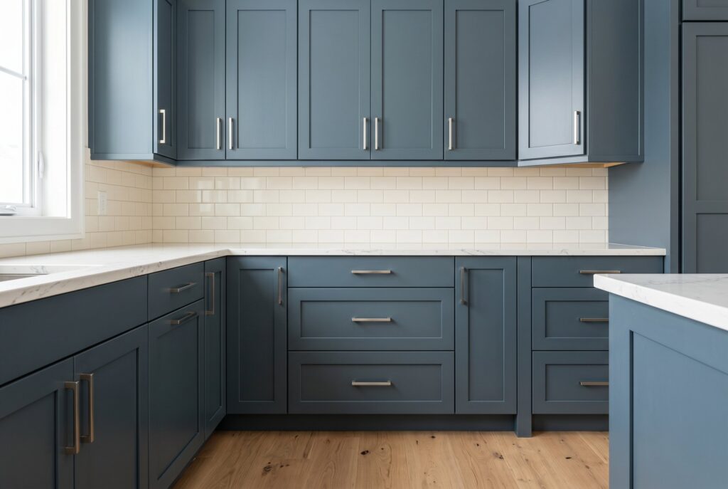
Slate Blue remains one of the most practical cabinet colors because it combines blue, gray, and earthy undertones.
Unlike darker navy shades, Slate Blue feels softer and more approachable. It creates a calming atmosphere while still adding personality. The muted nature of the color also makes it easier to coordinate with changing décor over time.
Natural oak flooring, creamy backsplashes, and brushed nickel hardware help emphasize its understated elegance. This palette feels particularly effective in kitchens where natural light changes throughout the day.
- Paint picks: Benjamin Moore Van Courtland Blue (HC-145), Farrow & Ball De Nimes (No. 299)
- Palette: slate blue cabinets + creamy backsplash + brushed nickel hardware + natural oak floors
4. Soft Black
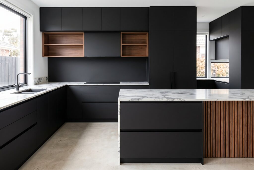
Soft Black represents the evolution of modern luxury. Instead of glossy black surfaces that often feel harsh, matte black cabinetry creates a more refined and architectural appearance.
The secret lies in texture. Matte finishes absorb light rather than reflecting it, making the kitchen feel grounded and sophisticated.
Soft Black pairs beautifully with handleless cabinetry, dramatic stone countertops, and warm wood accents. Together, these elements create a high-end look that feels intentional rather than intimidating.
- Paint picks: Sherwin-Williams Iron Ore (SW 7069), Benjamin Moore Wrought Iron (2124-10)
- Palette: soft black cabinets + dramatic veined stone counters + handleless or slim hardware + warm wood accents
The Earthy & Calm: Greens and Natural Woods
5. Smoky Jade
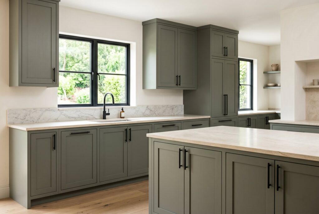
Among all green kitchen cabinets, Smoky Jade may be the most representative of 2026 kitchen cabinet colors. This shade connects the kitchen to nature while maintaining an elevated appearance. It feels calming, restorative, and highly adaptable.
Smoky Jade works beautifully with creamy limestone, marble, and warm white walls. Matte black hardware provides subtle contrast without disrupting the peaceful atmosphere.
Because it sits between green and gray, Smoky Jade adapts well to different light: cooler light brings out its gray side, while warm light pulls it greener. It’s a good first step for homeowners who want color without committing to a saturated shade. If you prefer a lighter green, explore these sage green kitchen cabinet ideas.
- Paint picks: Farrow & Ball Green Smoke (No. 47), Sherwin-Williams Pewter Green (SW 6208)
- Palette: smoky jade cabinets + creamy limestone or marble + matte black hardware + warm white walls
6. Deep Olive

Deep Olive introduces a stronger sense of heritage and character. Unlike brighter greens, Deep Olive creates emotional warmth. It evokes English country homes, mature landscapes, and collected interiors that have evolved over time.
Pair this color with unlacquered brass, textured stone, and rich wood flooring. The result feels layered, sophisticated, and remarkably timeless.
Deep Olive is especially effective on an island or lower cabinets, where it grounds the room without darkening it. In a smaller kitchen, keep the uppers or walls light so the olive reads as rich rather than heavy.
- Paint picks: Farrow & Ball Bancha (No. 298), Benjamin Moore Tate Olive (HC-112)
- Palette: deep olive cabinets + textured stone counters + unlacquered brass hardware + rich wood floors
7. Rift-Sawn White Oak
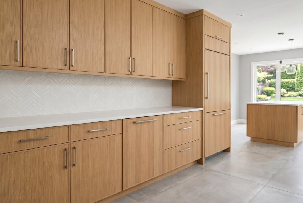
The return of stained wood cabinets is one of the most important kitchen cabinet color trends of 2026. Rift-sawn white oak celebrates natural grain rather than hiding it beneath paint. The subtle texture creates depth that many painted cabinets can’t achieve.
This choice works particularly well for homeowners seeking quiet luxury. Rather than demanding attention, it communicates quality through craftsmanship and material authenticity.
To keep the look high-end, choose a matte or satin clear finish rather than a glossy topcoat, and keep the grain running in a consistent direction across doors and drawer fronts. White oak also pairs easily with almost any painted color on this list, which makes it a smart choice for an island or open shelving in a two-tone kitchen.
- Finish: clear matte or satin topcoat, or a light natural stain for a slightly warmer tone
- Palette: white oak cabinets + white or cream stone counters + minimal hardware + light flooring
8. Rich Walnut
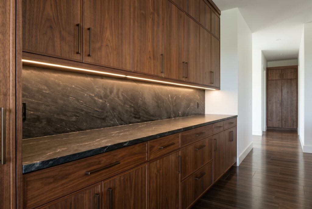
Rich Walnut delivers one of the strongest luxury statements available today. The deep brown tones create visual weight and permanence. Unlike trendy paint colors, walnut often becomes more beautiful as surrounding materials age.
Pair Rich Walnut with dark dramatic stone, integrated lighting, and simple hardware. The result feels powerful, refined, and enduring.
Because walnut is dark and visually heavy, it works best in kitchens with good natural light or as an accent, such as an island, a tall pantry wall, or a coffee bar. Lighter countertops or backsplash tile can keep a full walnut kitchen from feeling closed in.
- Finish: clear oil or satin topcoat to show off the natural grain
- Palette: walnut cabinets + dark dramatic stone + integrated lighting + simple hardware
The Warm Neutrals: The New White
9. Mushroom Greige
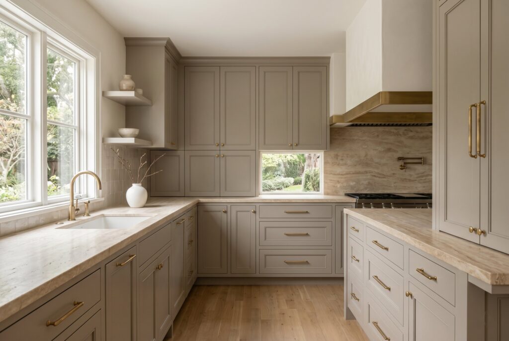
Mushroom Greige has emerged as one of the safest yet most stylish warm neutrals for cabinets. Its beauty comes from complexity. Depending on natural light, it may appear slightly gray, beige, taupe, or even warm brown.
Travertine countertops and unlacquered brass hardware complement this palette exceptionally well. Together, they create a kitchen that feels calm and sophisticated without appearing bland.
That shifting quality is also why sampling matters most with greige. Paint large swatches on a few cabinet doors and check them in the morning, afternoon, and under your evening lighting before you commit, since some greiges can lean green or purple in certain light.
- Paint picks: Farrow & Ball Elephant’s Breath (No. 229), Benjamin Moore Revere Pewter (HC-172)
- Palette: greige cabinets + travertine counters + unlacquered brass hardware + warm white walls
10. Rich Pale Cream
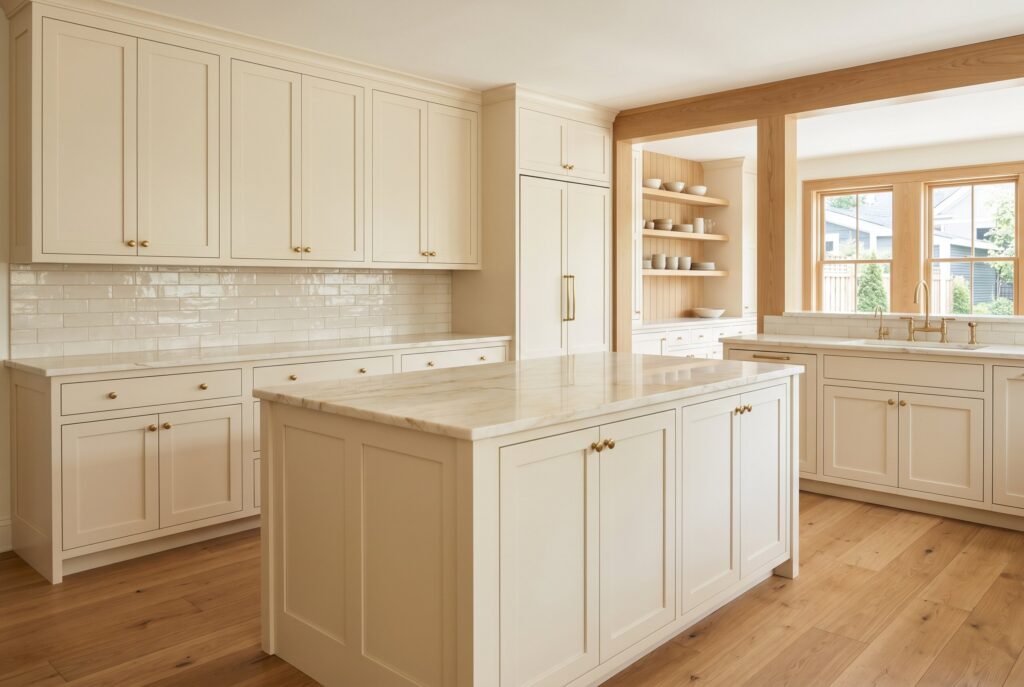
Rich Pale Cream offers everything homeowners once loved about white kitchens while eliminating the coldness. The color reflects light beautifully, making kitchens appear larger and brighter. At the same time, its subtle warmth creates comfort and softness. This shade pairs perfectly with natural oak, creamy stone, and warm metallic finishes.
Cream is also one of the easiest colors to live with long term. It hides minor scuffs better than bright white and works with both warm and cool metals. If you’re working with a compact space, see our guide to small kitchen paint colors that beat white.
- Paint picks: Benjamin Moore White Dove (OC-17), Sherwin-Williams Alabaster (SW 7008)
- Palette: cream cabinets + creamy stone counters + natural oak + warm metallic hardware
11. Butter Yellow

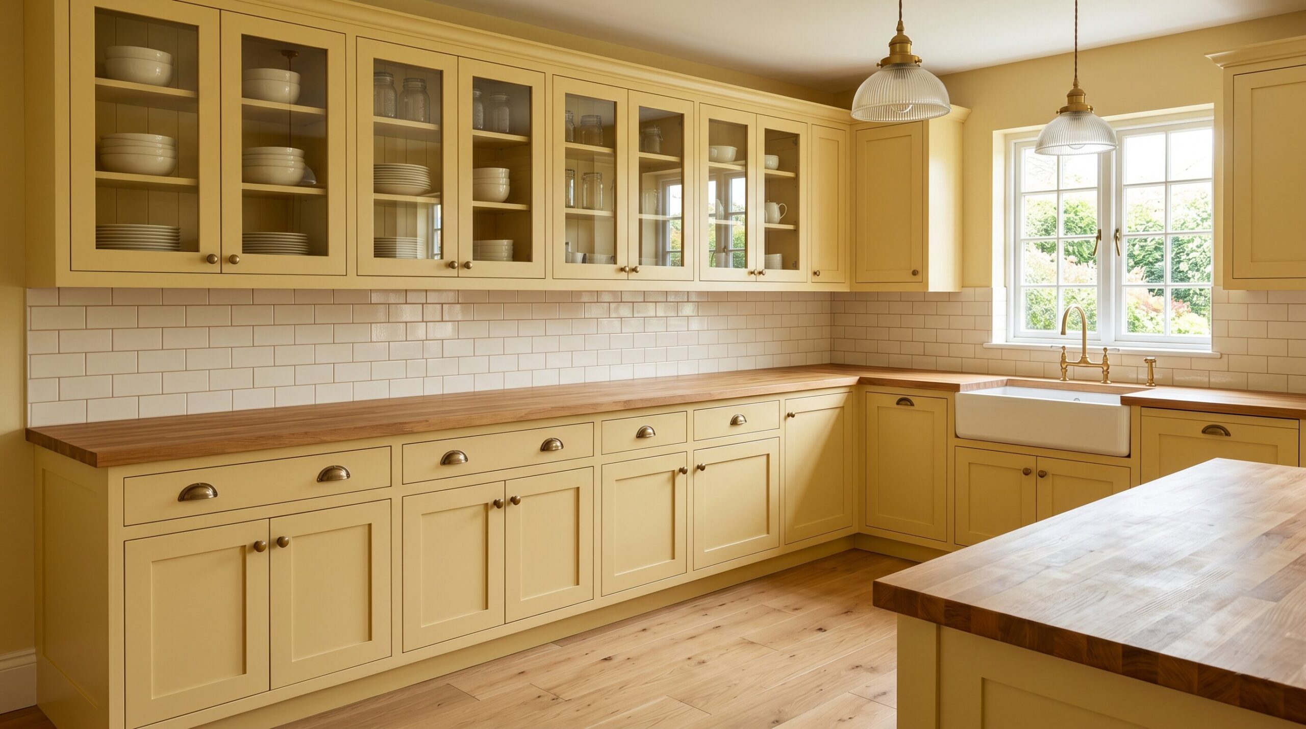
Butter Yellow represents the joyful side of kitchen paint colors. While many people initially view yellow as risky, this muted version feels surprisingly elegant. It introduces warmth, optimism, and personality without overwhelming the room. Butcher block countertops, vintage-inspired lighting, and creamy backsplashes help maintain balance.
Keep the rest of the palette quiet so the yellow feels intentional: warm white walls, natural wood, and simple brass or aged bronze hardware. For a lower-commitment version, try it on an island or a single run of lower cabinets first.
- Paint picks: Benjamin Moore Hawthorne Yellow (HC-4), Farrow & Ball Sudbury Yellow (No. 51)
- Palette: butter yellow cabinets + butcher block counters + creamy backsplash + vintage-inspired lighting
12. Khaki and Muddy Taupe
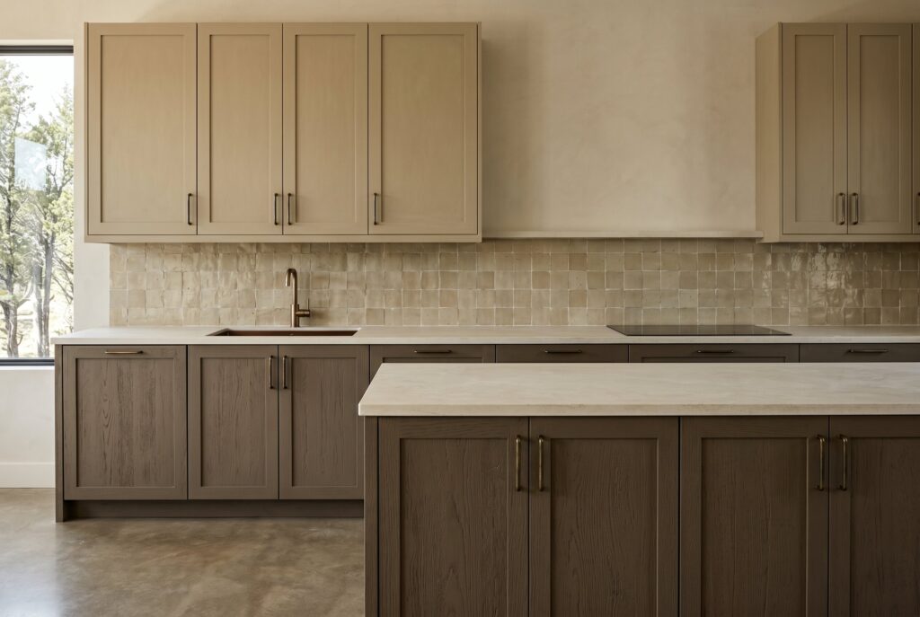
Khaki and Muddy Taupe have become favorites among designers who embrace wabi-sabi and organic modern aesthetics. These colors don’t demand perfection. Instead, they celebrate texture, natural materials, and subtle variation. They’re also highly practical because they conceal fingerprints and daily wear better than lighter alternatives.
For the best result, layer these shades with plenty of texture: limewash or plaster walls, a honed stone backsplash, and natural wood open shelving. Oil-rubbed bronze or aged brass hardware adds warmth without breaking the earthy mood.
- Paint picks: Farrow & Ball Mouse’s Back (No. 40), Farrow & Ball Jitney (No. 293)
- Palette: taupe cabinets + textured stone backsplash + mixed natural wood + aged brass hardware
The Daring & Expressive: Reds and Plums
13. Deep Burgundy
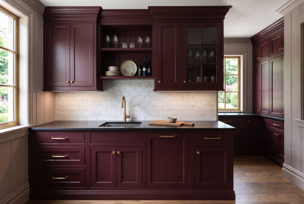
Deep Burgundy is one of the most luxurious colors currently appearing in bespoke kitchen projects. Inspired by historic European interiors, this color creates immediate drama and sophistication. Rather than covering an entire kitchen, it’s often used in butler’s pantries, beverage stations, or statement cabinetry where its richness can truly shine.
If you do use it across a full kitchen, burgundy looks best on paneled or Shaker doors with warm brass and cream or marble countertops that keep the color from feeling too dark. For more ways to use this color family, browse these red kitchen cabinet ideas.
- Paint picks: Farrow & Ball Preference Red (No. 297), Sherwin-Williams Rookwood Dark Red (SW 2801)
- Palette: burgundy cabinets + paneled fronts + brass hardware + cream or marble counters
>>> See more: 15 Natural Rock Retaining Wall Ideas & How to Build One
14. Aubergine and Plum
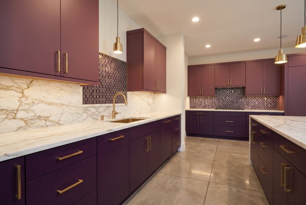
Aubergine and Plum push personalization even further. These colors appeal to homeowners who view the kitchen as an extension of their personality rather than a purely functional space. When paired with warm marble, brass accents, and soft lighting, these shades feel artistic rather than overwhelming.
Because these shades are deep and saturated, they work best in kitchens with good natural light or as an accent on an island, bar, or pantry. Warm white walls and light countertops balance the richness, while brass or gold-toned hardware brings out their jewel-like quality.
- Paint picks: Farrow & Ball Brinjal (No. 222), Farrow & Ball Pelt (No. 254)
- Palette: aubergine cabinets + warm marble counters + brass accents + soft lighting
15. Terracotta

Terracotta brings Mediterranean warmth into contemporary kitchens. Its earthy undertones create instant comfort while maintaining a strong design identity. Terracotta works especially well with zellige tile, natural wood, and textured stone. The result feels welcoming, handcrafted, and deeply connected to natural materials.
Terracotta also covers a wide range: softer clay tones feel relaxed and casual, while deeper rust shades feel richer and more dramatic. Cream walls and warm white countertops keep the space bright.
- Paint picks: Sherwin-Williams Cavern Clay (SW 7701), Farrow & Ball Red Earth (No. 64)
- Palette: terracotta cabinets + zellige tile backsplash + natural wood + textured stone + cream walls
How to Choose the Right Cabinet Color for Your Kitchen
Choosing kitchen paint colors is one of the most important decisions in a remodel. The wrong choice can cost thousands of dollars to correct, while the right choice can elevate the entire home for years.
Test Colors in Your Own Light
The same paint can look completely different from one kitchen to the next. North-facing rooms get cooler light that makes colors read grayer and darker, while south-facing rooms warm them up. Paint large sample boards, move them around the room, and look at them at different times of day before you decide.
Pick the Right Sheen
Satin is the most popular choice for cabinets because it offers a soft glow and is easy to wipe clean. Semi-gloss is even more durable and washable, but it shows brush marks and dents more clearly. Flat and matte finishes look velvety and upscale, but they’re harder to clean, so choose a cabinet-grade formula if you go that route. For application tips, see our guide to getting a pro finish on painted kitchen cabinets.
Balance Dark and Light
The best 2026 kitchen cabinet colors aren’t necessarily the boldest. In fact, many of today’s most popular kitchen cabinet colors focus on versatility, longevity, and the ability to work with a wide range of materials and finishes. The most successful choices are the colors that create harmony between cabinetry, countertops, hardware, flooring, and natural light. If you love a deep shade but have a small or dim kitchen, use it on the lower cabinets or island and keep the uppers and walls light.
Whatever direction you choose, from moody navy to warm cream or natural oak, always test samples under real lighting conditions before making a final commitment. A truly expensive-looking kitchen is created through thoughtful coordination, timeless materials, and a palette that feels authentic every time you walk into the room.
Frequently Asked Questions
What is the most popular kitchen cabinet color for 2026?
There isn’t a single winner. The overall shift is away from stark white and toward warmer, deeper colors: creamy whites and greiges, muted greens, navy, and natural wood finishes. If you want a choice that will still feel current in ten years, warm cream and navy are two of the safest options.
Are white kitchen cabinets out of style?
No, but stark, cool white is less popular than it was. Many homeowners are switching to warmer whites and soft creams, which keep the bright, clean feel of a white kitchen without looking cold or clinical.
What cabinet color looks the most expensive?
Deep, muted colors with complex undertones, such as navy, soft black, and deep olive, along with natural woods like white oak and walnut, tend to look the most high-end. The color is only part of it, though. Quality hardware, natural stone, and a consistent sheen make just as much difference.
What color cabinets are best for a small kitchen?
Light, warm neutrals like pale cream and soft greige reflect the most light and help a small kitchen feel larger. If you want color, use it on the lower cabinets or an island and keep the upper cabinets and walls light.
What paint finish is best for kitchen cabinets?
Satin is the most common choice because it balances durability, easy cleaning, and a soft, refined look. Semi-gloss is a good option for high-traffic kitchens, while matte finishes look luxurious but need a cabinet-grade paint to hold up to daily cleaning.