

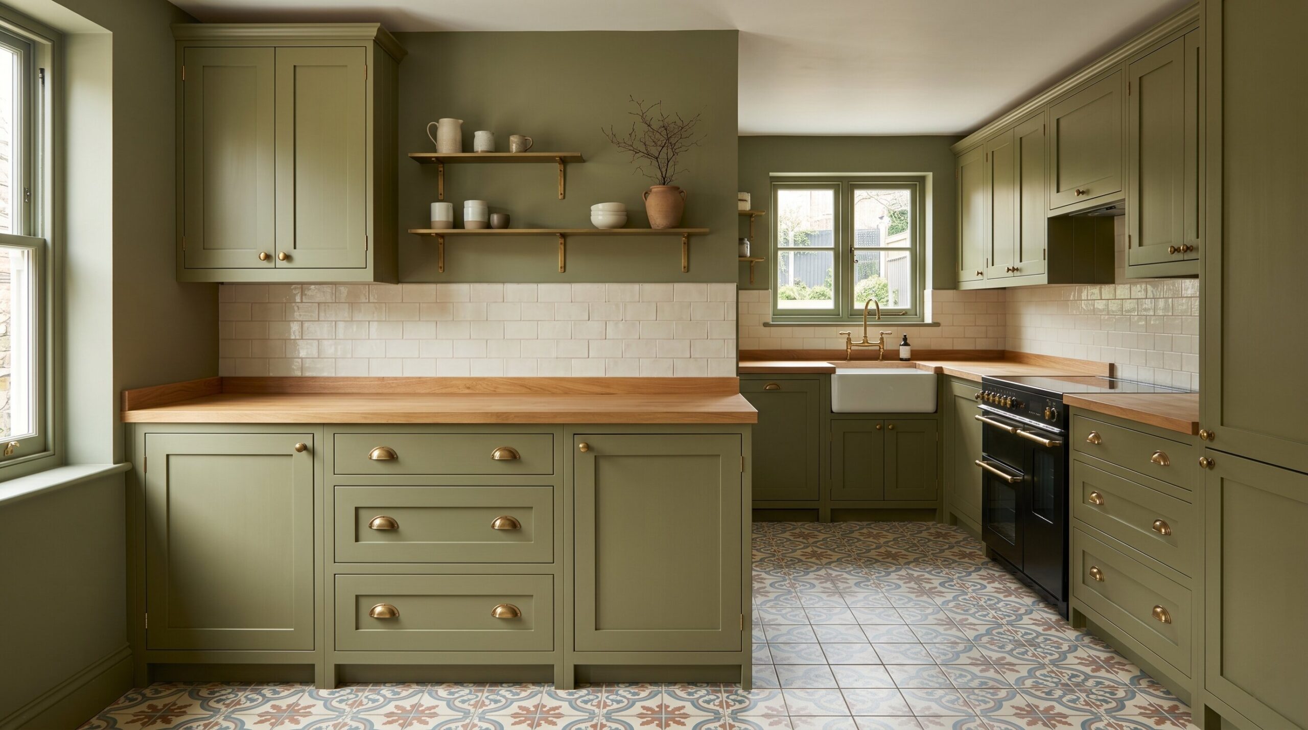
The best paint colors that make small kitchens look bigger are often soft, receding shades such as dusty green gray, mushroom, warm off white, muted blue, and earthy olive. These colors reduce visual noise, soften sharp corners, and create a more continuous kitchen color scheme. The real trick isn’t brightness alone. It’s choosing kitchen paint colors that work with your cabinets, countertops, floors, lighting, and appliances.
The Illusion of Continuity: Why Contrast Is the Enemy
A small kitchen feels smaller when the eye keeps stopping. High contrast between white walls, dark cabinets, busy floors, stainless steel appliances, and black countertops can chop the room into pieces. Every strong edge reminds you where the room begins and ends.
That is why the best colors for small kitchens often create continuity rather than drama. A soft wall color that connects with the cabinets, trim, backsplash, or floor can blur boundaries and make the room feel calmer. This doesn’t mean everything must be pale. It means every surface should feel related.
In a galley kitchen, this matters even more. If the walls, ceiling, and trim are painted in similar tones, the space feels less like a narrow corridor. If the cabinets and walls share related undertones, the room feels deeper and smoother. The goal isn’t to trick the eye with one magic color. It’s to remove visual clutter so the kitchen can breathe.
7 Exact Kitchen Paint Colors That Expand Space
1. Farrow & Ball Pigeon
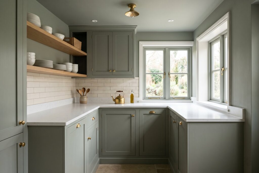
Farrow & Ball Pigeon is a dusty green gray that works beautifully in small kitchens because it visually recedes. Instead of bouncing harsh light around the room, it softens the space and makes edges feel less abrupt.
This color is especially useful in galley kitchens, older homes, and cottage style kitchens where pure white can feel too stark. It has enough gray to stay sophisticated and enough green to feel natural. When used on walls, trim, and even ceilings, Pigeon creates a wrapped, cohesive effect that makes the room feel intentional rather than cramped.

Pair it with white quartz, creamy stone, brass hardware, or natural wood shelves. Avoid pairing it with very cool gray counters because the room may start to feel dull. Pigeon works best when it has warmth nearby.
2. Sherwin Williams Jogging Path
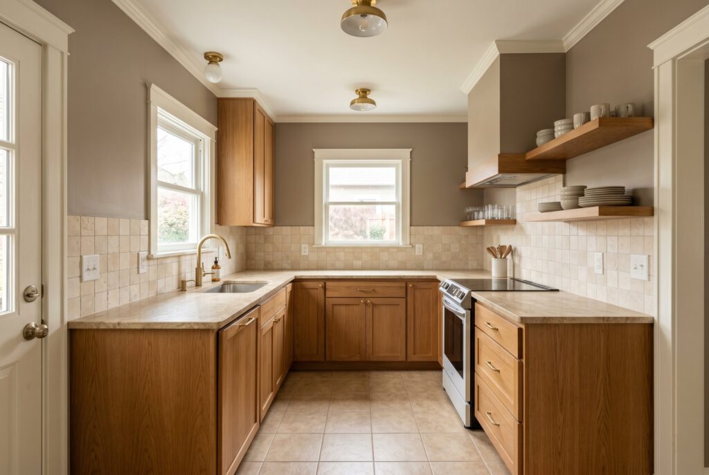
Sherwin Williams Jogging Path is a mushroom toned neutral that sits between beige, gray, and soft putty. It is one of the most practical paint colors for kitchen spaces that already contain wood, stone, or beige flooring.
What makes Jogging Path powerful is its ability to connect fixed finishes. If your small kitchen has oak cabinets, tan tile, warm granite, or brass hardware, a stark white wall can make those elements look dated. Jogging Path softens the contrast and makes older materials feel more current.
It also works well for renters or budget remodels because it improves the room without requiring cabinet replacement. Use it with warm white trim, rift sawn oak, travertine, or creamy backsplash tile. It isn’t flashy, but it’s calm, flexible, and very forgiving.
3. Benjamin Moore Misted Green

Benjamin Moore Misted Green is a soft green that brings freshness without overwhelming a small kitchen. It is gentle enough to act like a neutral, but it has more life than beige or white.
This shade works because green naturally connects with food, plants, wood, and daylight. In a small kitchen, that connection can make the room feel less boxed in. Misted Green is especially good for kitchens that need softness but not sweetness.

Pair it with warm white cabinets, light oak floors, butcher block, or marble look quartz. If your appliances are stainless steel, the green keeps the metal from feeling too cold. Avoid overly bright white trim. A creamier white will help the color feel mature and relaxed.
4. Sherwin Williams White Sesame
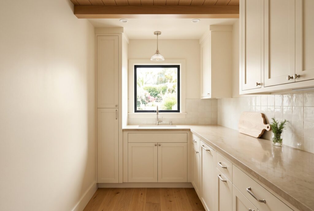
Sherwin Williams White Sesame is the better version of white for people who still want brightness. It has a warm undertone that prevents the kitchen from feeling clinical.
This shade is ideal when you need high light reflection but don’t want the flatness of pure white. It works well in small kitchens with low ceilings, limited windows, or narrow layouts because it brightens without becoming icy.
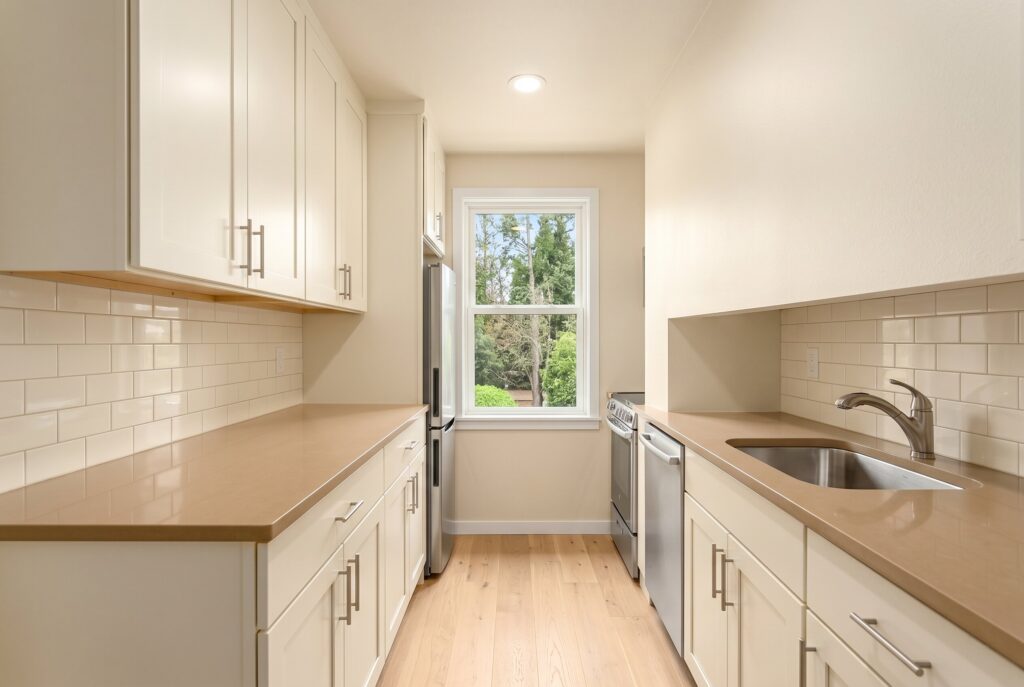
White Sesame is especially strong on walls and ceilings together. That creates a seamless envelope and reduces harsh lines between surfaces. Pair it with cream cabinets, pale wood, warm quartz, or brushed nickel. If your kitchen already has cool gray floors or blue toned counters, test this color carefully because its warmth may clash.
5. Benjamin Moore Van Deusen Blue
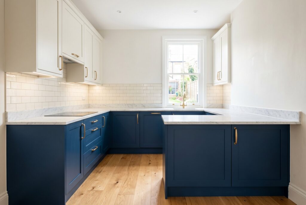
Many homeowners assume dark colors can’t work in a small kitchen. Van Deusen Blue proves that isn’t always true. Used strategically, a deep blue can add depth and make certain surfaces feel farther away.
The safest way to use this color is on lower cabinets, an island, or a single built in wall. Pair it with lighter upper cabinets or warm off white walls to create two tone cabinets that feel grounded but not heavy.
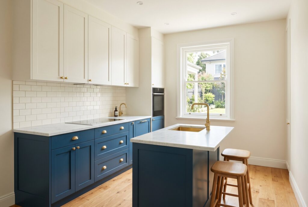
Van Deusen Blue works beautifully with brass, marble, oak, and creamy tile. It gives small kitchens a polished, tailored mood. The key is lighting. Without under cabinet lights or natural light, this shade may feel too dense. With the right balance, it creates moody depth instead of visual shrinkage.
6. Benjamin Moore Blue Note

Benjamin Moore Blue Note is a deep blue with gray undertones, making it softer than many navy shades. It is a strong option for homeowners who want cool colors for small kitchens but don’t want the room to feel beachy or pale.
Blue Note works well with stainless steel appliances because its gray undertone creates harmony with metal finishes. It also pairs nicely with white marble, warm wood, and simple cabinet hardware.
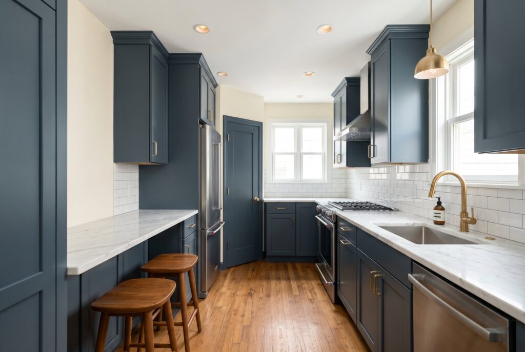
Use it on cabinetry, a pantry wall, or a breakfast nook rather than every surface if the kitchen lacks light. This color brings sophistication, but it needs contrast that feels intentional. Cream walls, warm bulbs, and reflective backsplash tile can keep it from becoming too shadowy.
7. Little Greene Green Stone
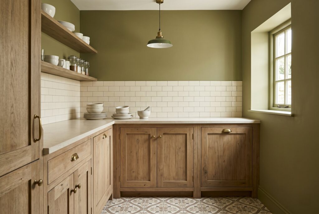
Little Greene Green Stone is an earthy olive toned shade that feels calm, grounded, and quietly elegant. It is ideal for small kitchens with patterned floors, old wood cabinets, or mixed materials because it helps settle the room.
The beauty of Green Stone is that it doesn’t fight existing finishes. It absorbs visual noise and creates a more cohesive backdrop. In a small kitchen, that can matter more than raw brightness.
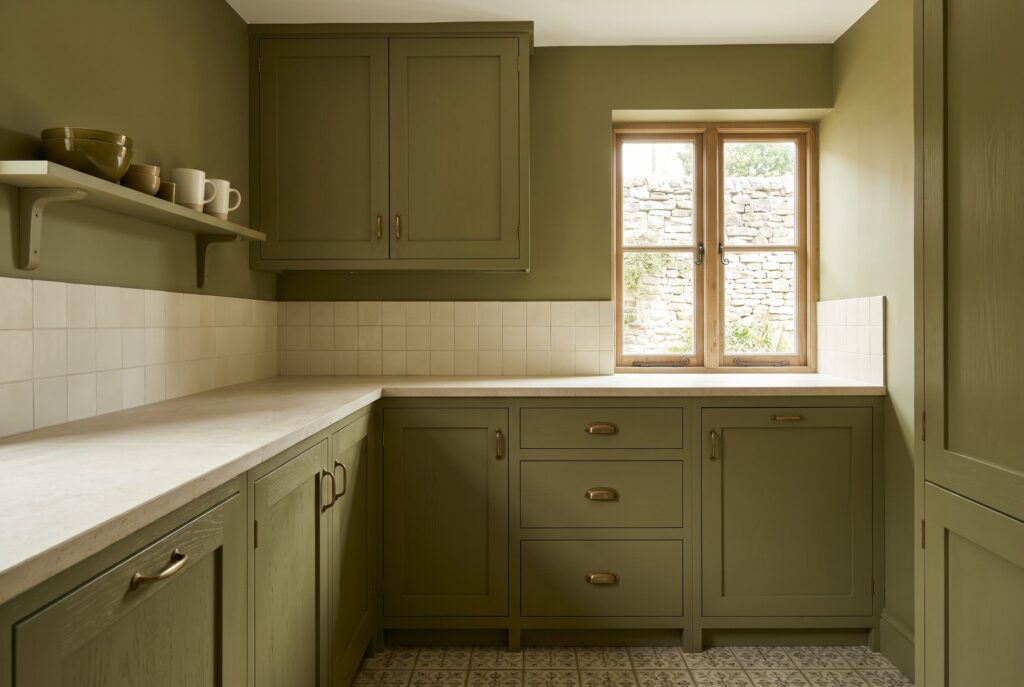
Use it with aged brass, limestone, cream tile, or natural wood. It also works beautifully in cottage and Transitional kitchens where a plain white wall would feel too sharp. Green Stone is best for people who want warmth, texture, and character without making the space feel busy.
Conclusion
You can’t change the square footage of a small kitchen with paint, but you can change how the eye experiences the room. The best paint colors for small kitchens don’t simply make walls lighter. They reduce contrast, soften boundaries, and connect the fixed materials already in place.
Before choosing a color, look at your cabinets, floors, countertops, backsplash, appliances, and natural light. A warm white may be perfect in one kitchen and lifeless in another. A dusty green gray or mushroom tone may make a narrow kitchen feel calmer than white ever could.
Sample every color on multiple walls and check it in morning, afternoon, and evening light. A small kitchen doesn’t need to be plain to feel larger. It needs a color scheme that feels continuous, balanced, and easy to live with.
Related Articles
10 Space-Saving Kitchen Hacks: Smart Tips to Maximize Small Kitchen Storage and Efficiency
Blue Kitchen Cabinets: 18 Classic Tones for Any Style