

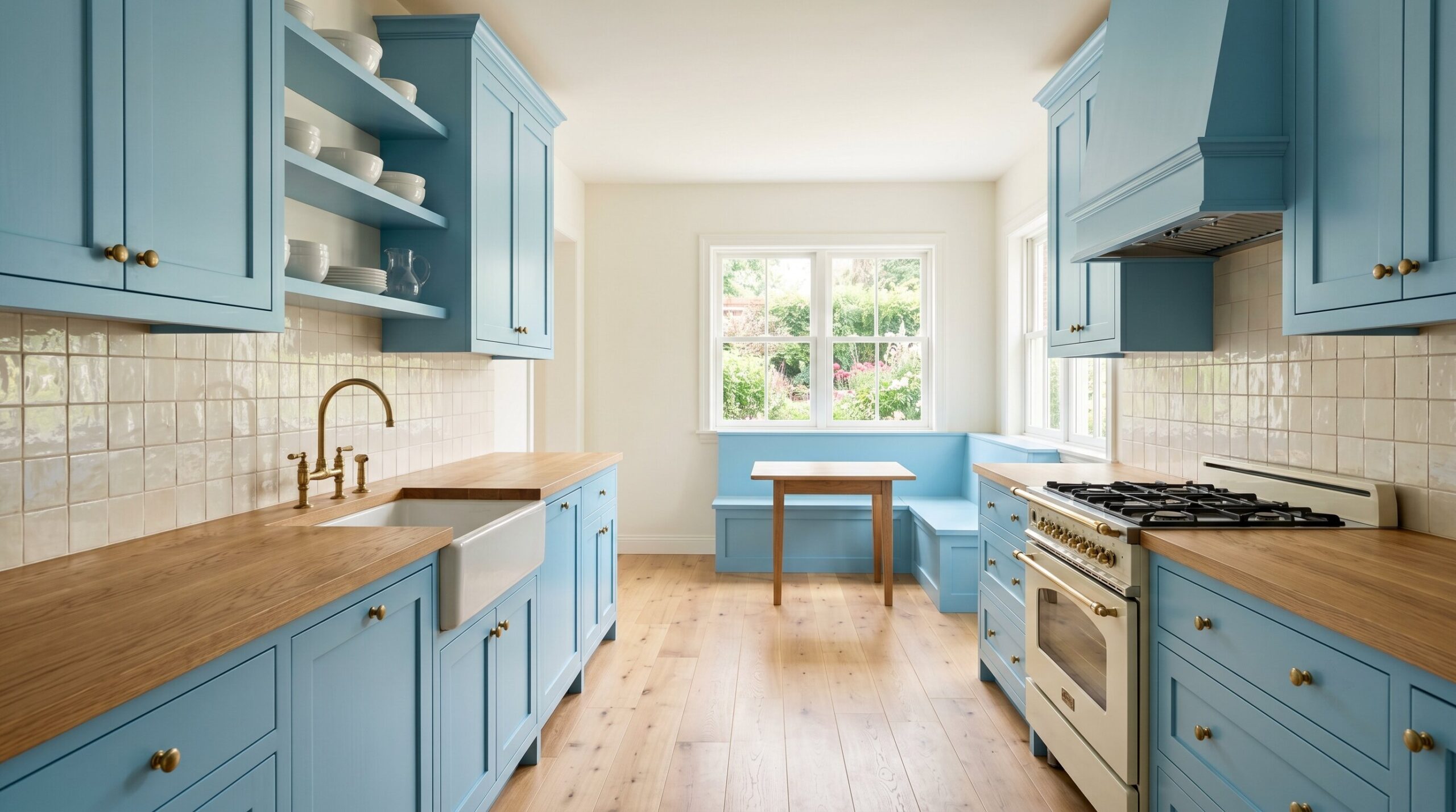
After years of cold white kitchens, 2026 kitchen cabinet colors are shifting toward depth, warmth, and personality. Blue kitchen cabinets have become the new neutral because they feel expressive without being risky, timeless without being plain, and calming without feeling sterile.
From navy blue kitchen cabinets to light blue kitchen cabinets, blue works across Transitional, Organic Modern, coastal, Modern Farmhouse, and traditional kitchens. It pairs beautifully with natural oak, dramatic marble, creamy tile, matte finishes, and tonal wood hardware. If you’re comparing trending kitchen cabinet colors, blue is one of the strongest choices for a remodel that feels personal but won’t age quickly.
The 18 Classic Blue Tones for Your Remodel
1. Hale Navy
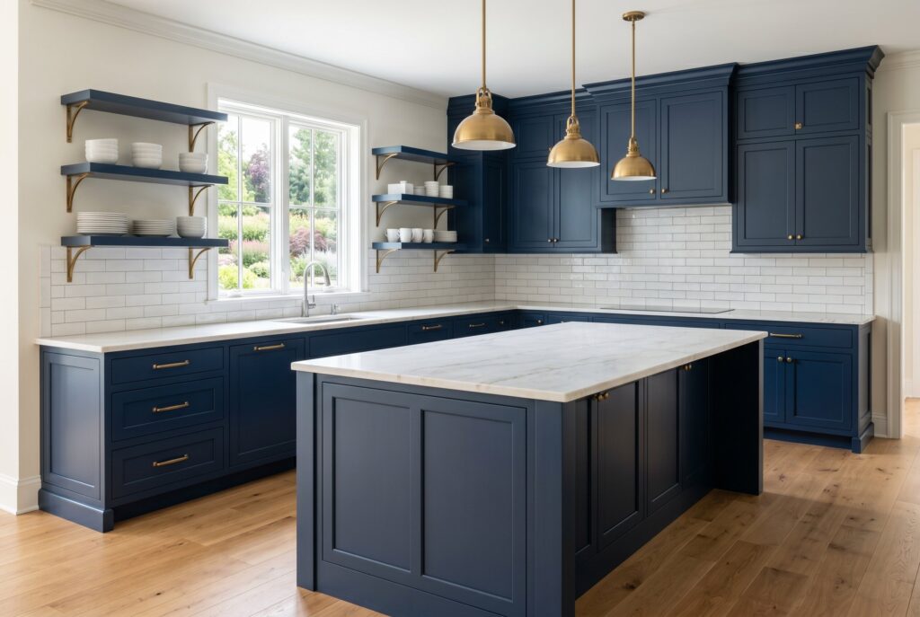
Hale Navy is the classic choice for homeowners who want navy blue kitchen cabinets with structure and confidence. It has enough depth to feel dramatic, but it doesn’t collapse into black under normal lighting. That balance makes it ideal for a large island, lower cabinets, or a full wall of built-ins.
This tone works best when paired with warm whites, brass that isn’t too shiny, natural oak, or marble with soft gold veining. It can feel traditional in a framed cabinet style or crisp and modern on flat panel cabinets. If you want a blue that feels established rather than trendy, Hale Navy is the safest dark option.
2. Midnight Blue
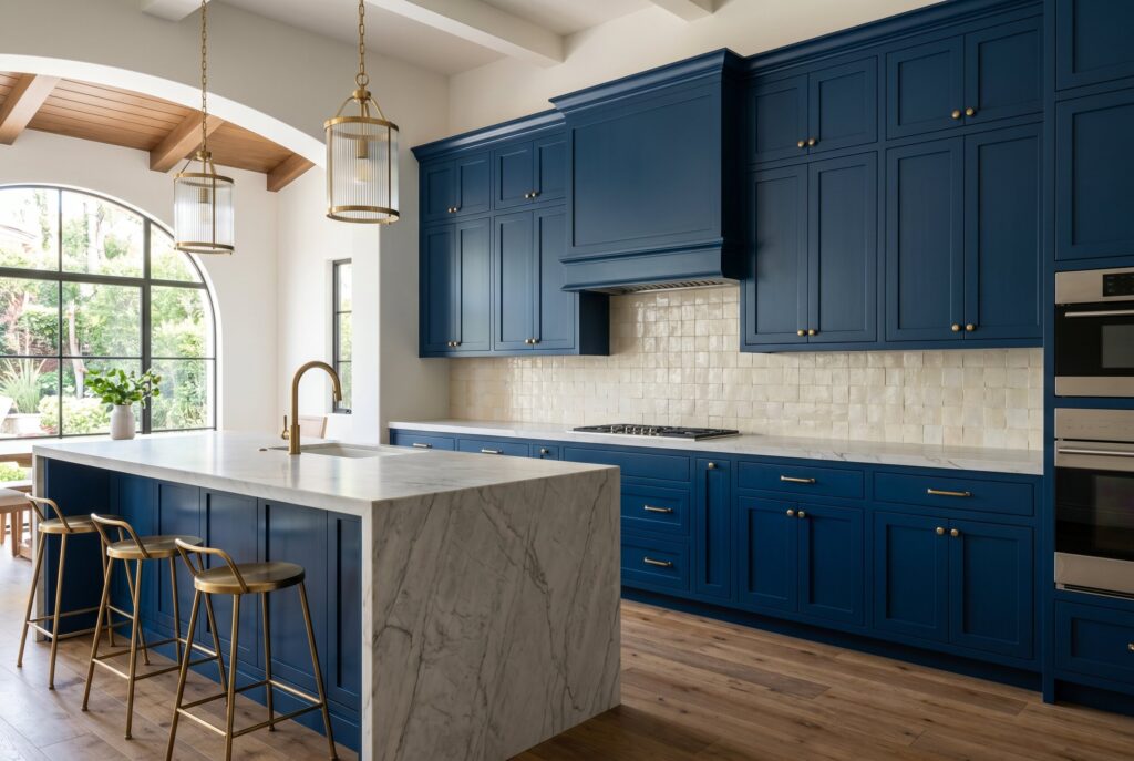
Midnight Blue is darker, moodier, and more cinematic. It belongs in kitchens with strong lighting, tall ceilings, or enough natural warmth from wood floors and stone surfaces. Without those balancing elements, it can feel too heavy.
Used carefully, this shade creates a luxury effect. It works beautifully on a statement island because the depth makes countertops look more sculptural. Pair it with creamy kitchen paint colors, textured tile, and warm metal accents. It’s especially strong for homeowners who want kitchen trends 2026 to feel rich, quiet, and slightly dramatic.
3. Peacoat

Peacoat is a polished dark blue with a tailored feel. It sits between navy and charcoal, which makes it highly usable in homes that need sophistication without too much visual darkness.
This color is excellent for Transitional kitchens because it can bridge classic millwork and modern finishes. It looks sharp with unlacquered brass, but it also works with stainless steel for a cleaner look. Peacoat is a strong choice when you want dark blue kitchen cabinets that feel controlled, refined, and easy to style with stone or wood.
4. Indigo
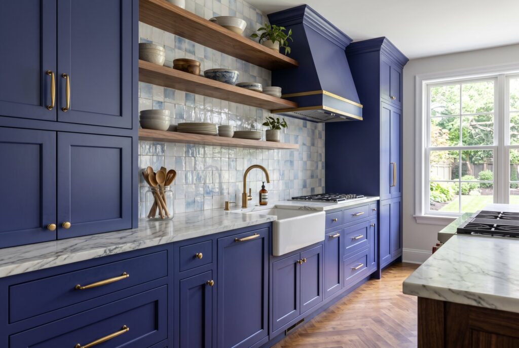
Indigo brings an artistic quality that standard navy doesn’t always have. It carries a subtle violet undertone, which gives the cabinetry more movement and personality.
This is a good color for homeowners who want joydrenching without choosing something loud. Indigo looks beautiful with handmade tile, walnut shelving, and dramatic marble. It isn’t the easiest blue to coordinate, so avoid overly yellow whites or cool gray counters. When the surrounding palette is warm and layered, indigo can make a kitchen feel custom and memorable.
5. Charcoal Blue
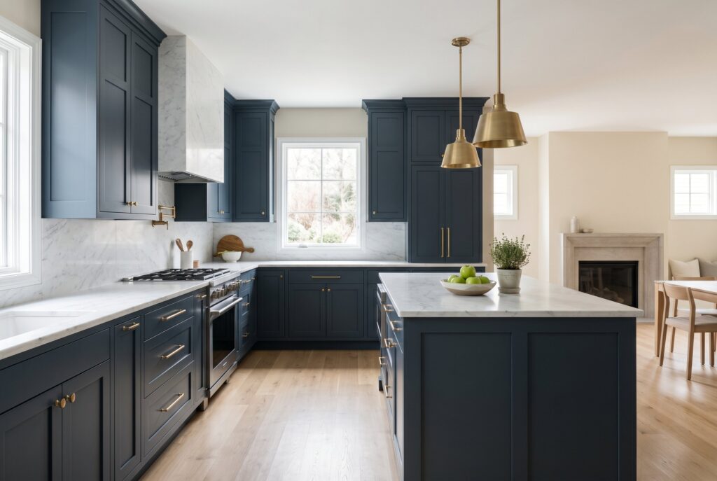
Charcoal Blue is perfect for people who want blue cabinets but still trust neutral design. It leans gray, so it feels calmer and less saturated than true navy.
This shade works especially well in open concept homes because it doesn’t dominate nearby rooms. It also supports many living room paint colors, including warm white, oatmeal, mushroom, greige, and soft taupe. Charcoal Blue is a practical bridge between color and restraint. It’s a smart option for resale focused remodels where personality matters, but overstatement doesn’t.
6. Naval
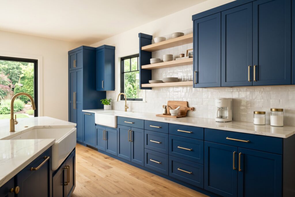
Naval is confident, strong, and slightly masculine. It gives blue kitchen cabinets a bold architectural presence, especially when used on tall pantry cabinets or a full perimeter layout.
Because it has real depth, Naval needs contrast. Use creamy counters, pale oak, textured backsplash tile, or warm lighting to keep the kitchen from feeling too dense. It works beautifully with simple cabinet profiles and matte finishes. For homeowners who want popular kitchen cabinet colors that still feel elevated, Naval offers a polished middle ground between classic and current.
7. Slate Blue
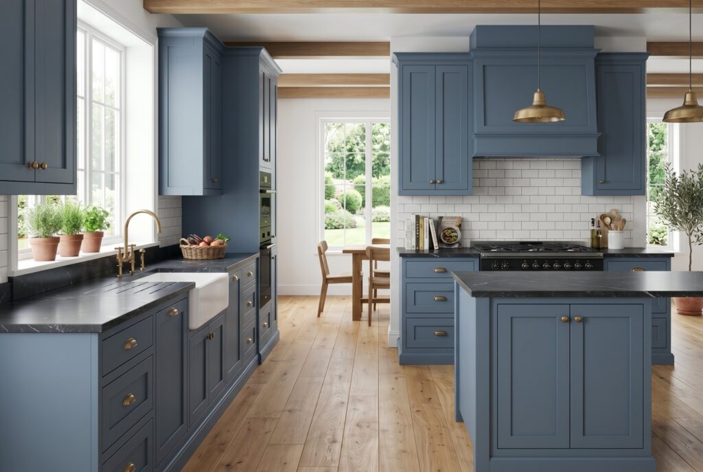
Slate Blue is one of the most flexible trending kitchen cabinet colors because it combines blue with gray and a hint of earthiness. It feels calm, mature, and less coastal than many lighter blues.
This tone is excellent for kitchens with natural stone, soapstone, oak floors, or aged brass. It has enough character to move beyond white, but it doesn’t shout. Slate Blue is especially useful in smaller kitchens because it adds mood without making the room feel closed in. It also pairs well with matte finishes, which help the color feel soft and tactile.
8. Ocean Teal
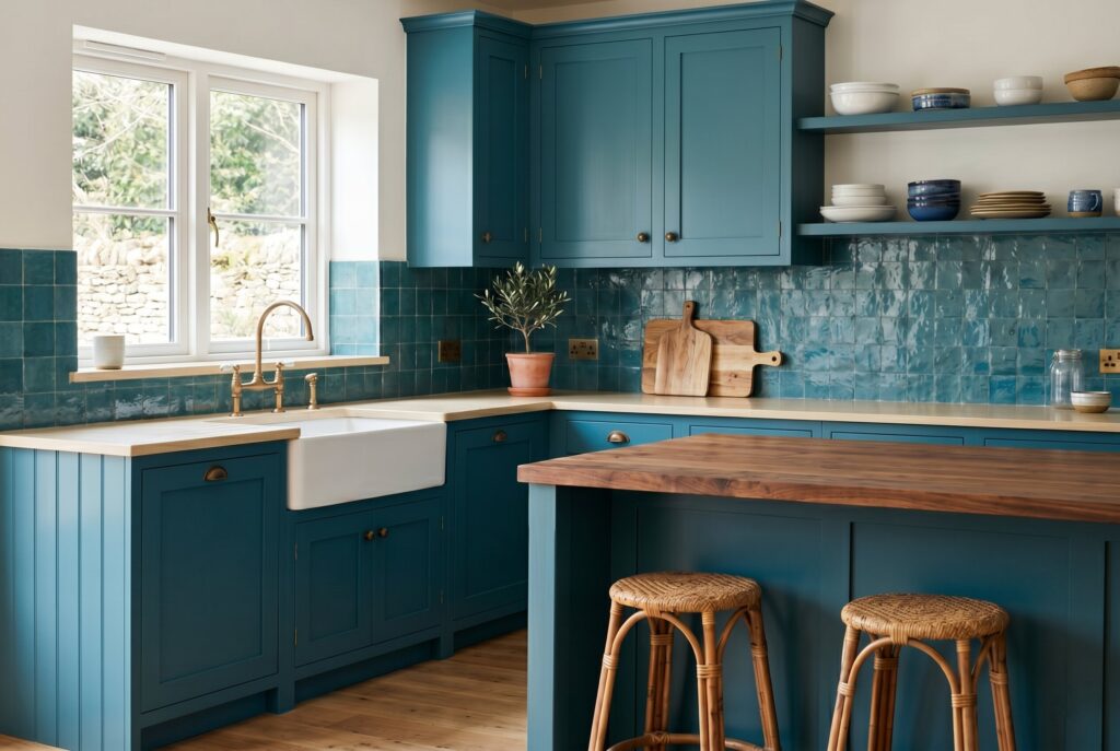
Ocean Teal sits between blue and green, giving the kitchen a deeper connection to nature. It feels more adventurous than navy but still grounded when paired with the right materials.
This shade works beautifully with butcher block, walnut, zellige tile, and warm neutral countertops. It can feel coastal in one setting and moody in another, depending on the lighting. Ocean Teal isn’t for a completely minimal kitchen. It needs texture, warmth, and confidence. Used on an island or scullery, it’s a powerful way to make the room feel designed rather than copied.
9. Smoky Blue
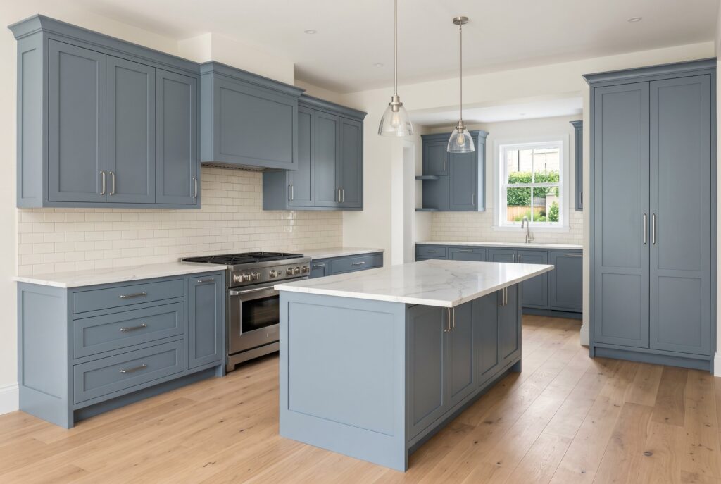
Smoky Blue is quiet, refined, and easy to live with. It has enough gray to feel sophisticated and enough blue to avoid becoming dull.
This shade works well for homeowners who want light blue kitchen cabinets but don’t want a pastel effect. It pairs naturally with creamy tiles, marble look quartz, and brushed nickel. Smoky Blue is also forgiving in changing light. It won’t look too bright at noon or too dark at night. For an understated 2026 remodel, it’s one of the most balanced choices.
10. Sage Infused Blue
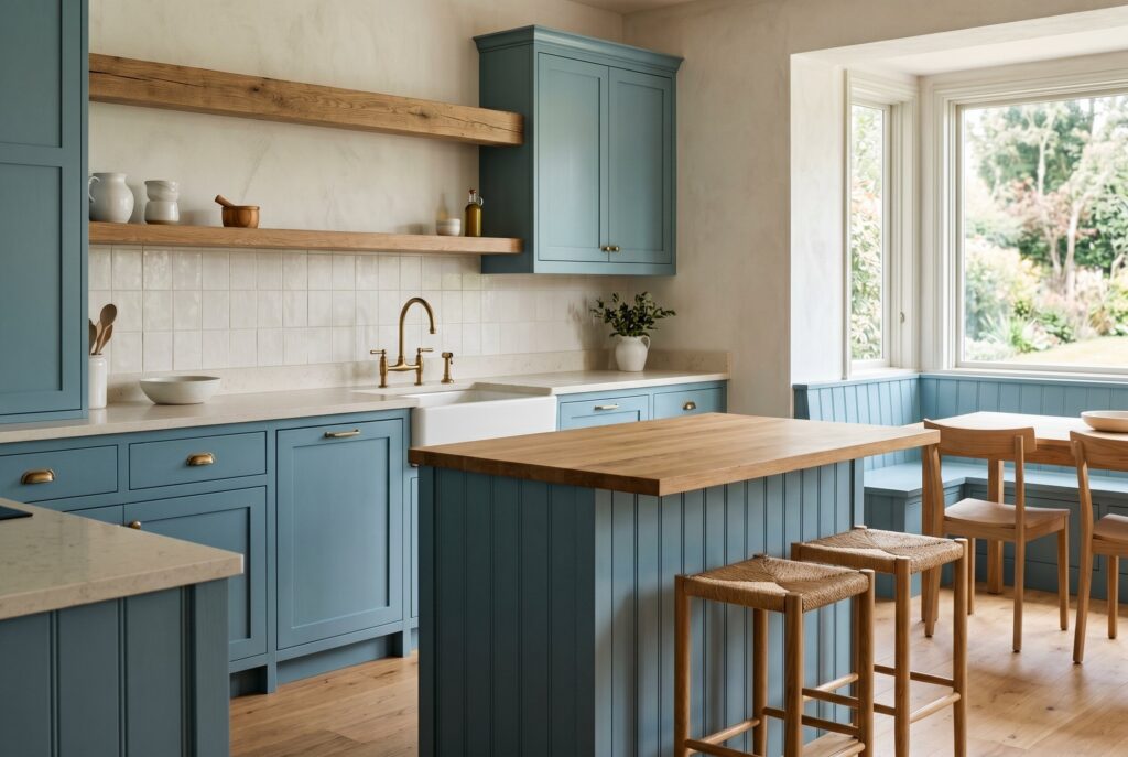
Sage Infused Blue blends blue with a soft green undertone. It connects beautifully with the earthy direction of kitchen trends 2026, especially the move toward natural wood, warm stone, and organic materials.
This color is ideal for homeowners who like sage green but want something cooler and more distinctive. It works well on Slim Shaker cabinets, beadboard details, or a cozy breakfast nook. Pair it with oak, cream, stone, and minimal hardware. It creates a kitchen that feels restful, grounded, and quietly personal.
11. Denim Blue
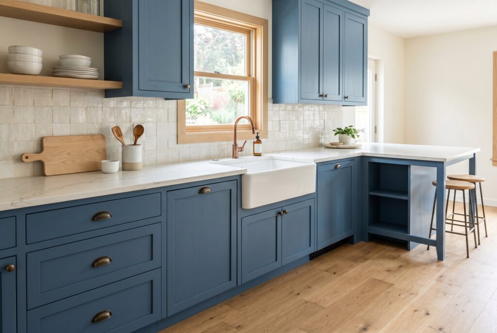
Denim Blue feels familiar, relaxed, and approachable. It doesn’t have the formality of navy or the sweetness of powder blue, which makes it very easy to use in family kitchens.
This shade is especially strong in Modern Farmhouse and casual Transitional spaces. It pairs well with white oak, apron front sinks, warm quartz, and handmade tile. Denim Blue feels lived in from day one, which is part of its charm. It isn’t trying too hard. It simply adds color in a way that feels comfortable, practical, and durable.
12. Stormy Sea
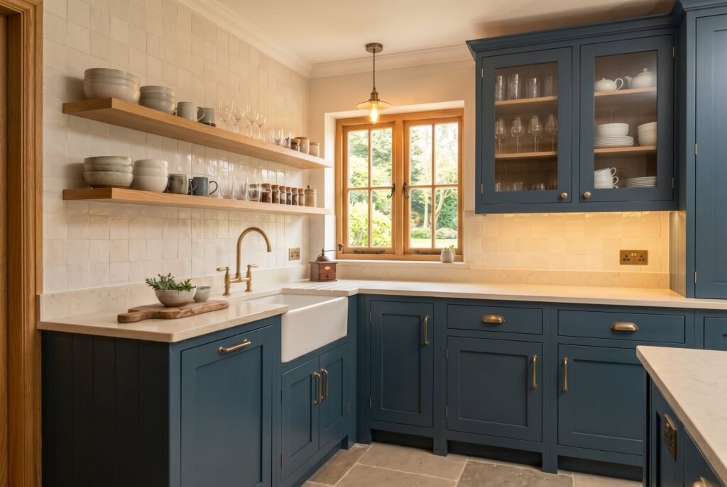
Stormy Sea is a deeper gray blue with drama. It can make a small kitchen feel intimate or a large kitchen feel more architectural.
The key is lighting. Under warm light, Stormy Sea feels cozy and moody. Under cool light, it can turn flat or severe. Use it with warm bulbs, natural wood, and creamy surfaces. It works beautifully on lower cabinets when paired with upper shelves or glass fronts. This is a good shade when you want depth but don’t want the formality of navy blue kitchen cabinets.
13. Pale Aqua
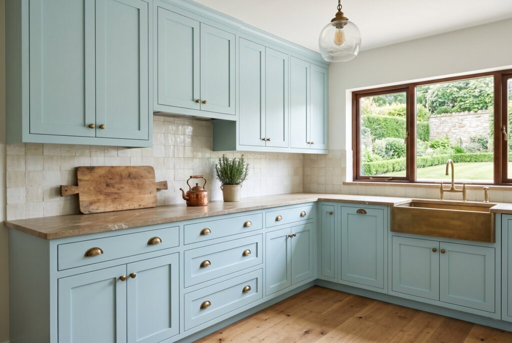
Pale Aqua is a soft, airy choice for compact kitchens, breakfast areas, and homes that need more brightness. It reflects light well while still giving the room personality.
The danger is that it can look too sweet if paired with bright white and shiny finishes. To make it feel grown up, use natural stone, aged brass, warm wood, or creamy zellige tile. Pale Aqua works best when the whole kitchen feels relaxed and textural. It’s a strong answer for homeowners who want light blue kitchen cabinets that feel fresh rather than childish.
14. Powder Blue
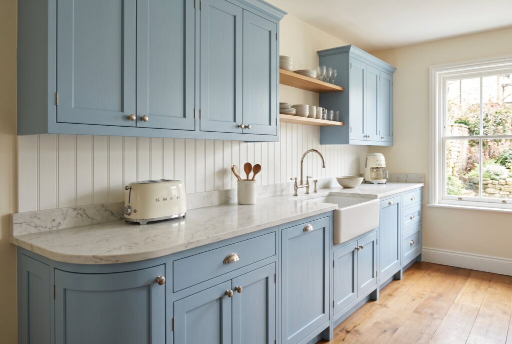
Powder Blue brings a nostalgic mood that fits the retro comeback without looking costume-like. It feels cheerful, gentle, and slightly vintage.
This color works well with off white appliances, marble look quartz, beadboard, and curved countertop edge styles. It isn’t the best choice for a very sleek modern kitchen, but it’s excellent for cottages, older homes, and cozy spaces. To keep it from feeling dated, choose a muted powder blue rather than a candy colored version. The softness should feel intentional, not juvenile.
15. Dusty Blue
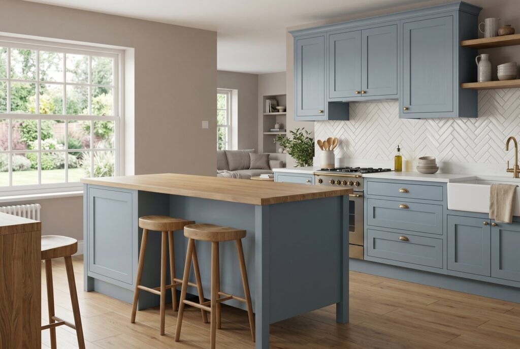
Dusty Blue is one of the easiest blue tones to live with. It has enough gray to soften the color and enough warmth to avoid looking icy. This shade works well across many cabinet styles, from flat panel to Slim Shaker. It pairs beautifully with warm whites, taupe walls, and natural oak. Dusty Blue is useful when the kitchen connects to a living room because it transitions smoothly into neutral paint colors. It’s a safe choice for homeowners who want color but don’t want their cabinets to become the only thing people notice.
16. Sky Blue
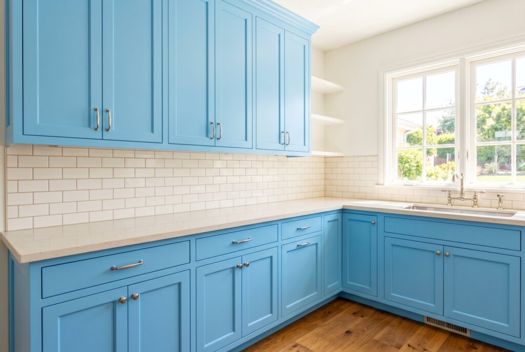
Sky Blue is brighter and more optimistic. It works best in sunny kitchens where natural light supports its fresh, open quality. This shade can be beautiful on upper cabinets, a pantry wall, or a small kitchen that needs visual lift. However, it needs grounding. Pair it with wood floors, woven textures, warm stone, or darker accents so it doesn’t feel too thin. Sky Blue is camera ready and cheerful, but it should be balanced with materials that bring maturity.
17. Ice Blue
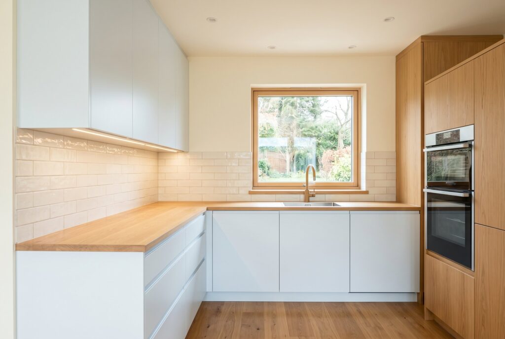
Ice Blue is nearly neutral. It sits close to white but carries a cool blue cast that gives the cabinetry a sharper, cleaner personality. This color works well in minimalist kitchens, especially with flat panel cabinets and integrated appliances. It can make a small space feel larger, but it may feel cold if surrounded by gray counters and bright white walls. To make Ice Blue work in 2026, warm it up with oak, cream tile, and soft lighting. It’s subtle, but in the right room, it feels crisp and elegant.
18. Robin’s Egg Blue
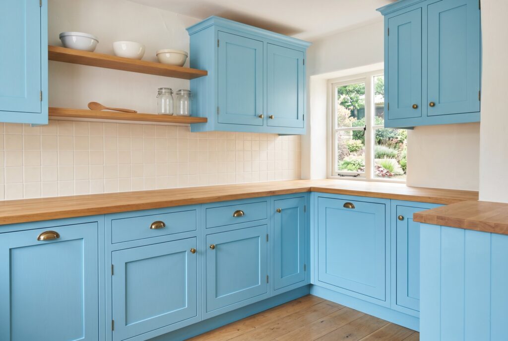
Robin’s Egg Blue is playful, nostalgic, and full of charm. It brings energy without the heaviness of dark blue kitchen cabinets.
This tone works best when the rest of the kitchen is calm. Use creamy tile, natural wood, simple hardware, and warm white walls. It can feel beautiful in a cottage kitchen, breakfast room, or vintage inspired remodel. The key is restraint. Let Robin’s Egg Blue be the emotional note, then keep everything else edited. That way, the kitchen feels joyful, not busy.
Styling Your Blue Kitchen: Textures and Room Transitions
Blue cabinets look best when the surrounding materials add warmth and texture. Matte finishes are stronger than glossy finishes because they hide fingerprints and make the color feel more expensive. Tonal wood hardware creates a quiet custom look, while brass and stainless steel offer sharper contrast.
For countertops, avoid cold gray whenever possible. Warm quartz, marble with gold veining, creamy stone, butcher block, and soapstone all make blue feel richer. If your kitchen connects to a living room, choose living room paint colors that support the cabinetry. Warm white, oatmeal, pale taupe, mushroom, and soft greige create a smoother transition than stark white.
Conclusion
Choosing kitchen paint colors can feel risky when trends move so quickly. But blue has range, history, and emotional staying power. It’s bold enough to personalize a kitchen, calm enough for daily life, and classic enough to avoid feeling disposable.
Whether you choose navy blue kitchen cabinets, smoky gray blue, soft denim, or light blue kitchen cabinets, the goal is balance. Pair blue with natural oak, warm stone, matte finishes, and thoughtful lighting. Done well, blue kitchen cabinets won’t just follow 2026 kitchen trends. They’ll create a kitchen that still feels beautiful years from now.
Related Articles
Sage Green Kitchen Cabinets: 27 Modern Farmhouse Ideas 2026
23 Two Tone Kitchen Cabinets: The Only Color Trends You Need in 2026
17 Red Kitchen Cabinets: Modern Painted Ideas to Wow Guests in 2026
13 Painted Kitchen Cabinet Ideas and How to Get a Pro Finish in 2026