

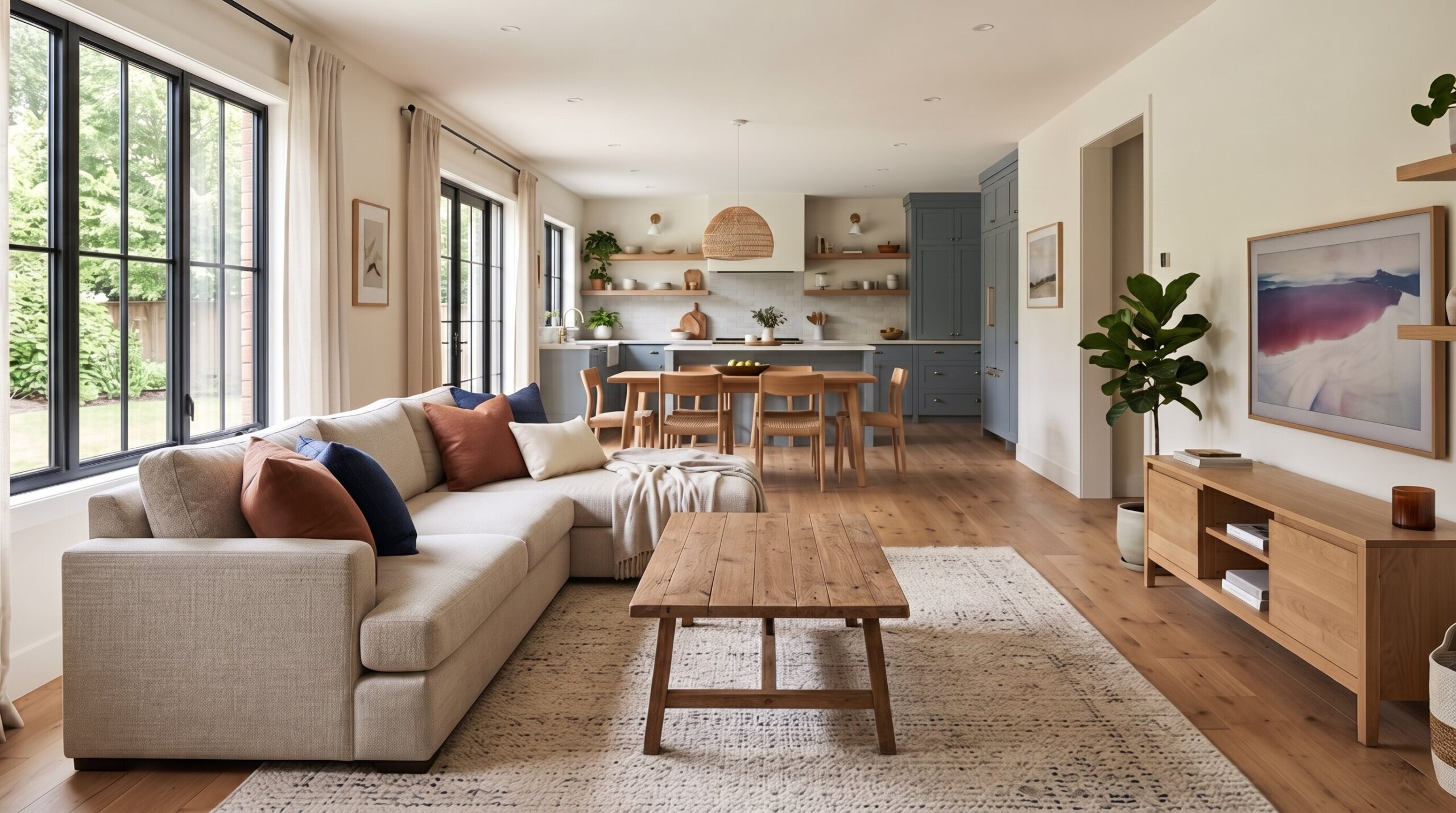
In an open plan home, your living room color schemes must connect with the kitchen, dining area, flooring, sofa, rug, curtains, and cabinetry. A color that looks beautiful on one wall can feel wrong if it clashes with nearby wood tones, kitchen cabinets, or natural light. Instead of choosing isolated living room paint colors, build a complete palette. The best paint colors for living rooms create flow, define zones, and make the whole home feel intentional.
Why Following One-Color Advice Can Be Limiting
Normally, many homeowners are told to choose a single safe option for living room color. While neutral shades can be versatile, the best color for a living room depends on the room’s natural light, size, furnishings, and the overall mood you want to create.
Soft greige, warm beige, muted sage green, dusty blue, and light taupe are all popular living room color ideas because they add personality while remaining easy to decorate around. These shades can make a space feel warm, welcoming, and visually interesting without overwhelming the room.
In open-concept homes, it’s also important to consider how the living room color connects with adjacent spaces. Paint should complement flooring, cabinetry, furniture, and architectural details to create a sense of flow throughout the home. Ultimately, the best living room paint color is one that enhances your space and reflects your style. Rather than relying on a single color recommendation, explore tones that work with your home’s lighting, finishes, and design goals.
The Modern Organic Collection
1. Travertine and Oak
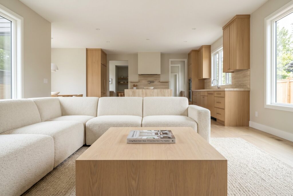
Travertine and oak create one of the most reliable modern organic palettes because both materials feel warm, natural, and quietly expensive. Benjamin Moore Balboa Mist works beautifully as the wall color because it sits between gray and beige, allowing it to connect with stone, wood, linen, and cream upholstery.
This palette is best for open plan homes where the kitchen has white oak cabinets or warm stone countertops. A large cream boucle sectional, handwoven wool rug, and pale oak coffee table will keep the living room soft without making it plain. Avoid cool gray furniture here because it can break the warmth that makes the scheme feel seamless.
2. Warm Cream and Walnut
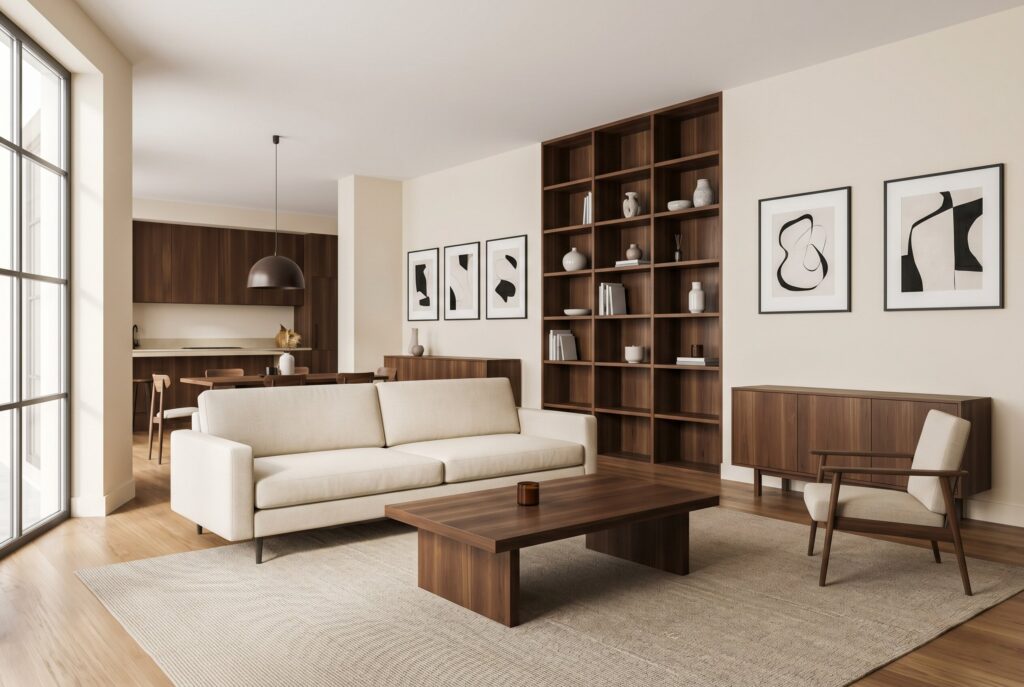
A warm cream living room is the designer’s answer to a cold white living room. Sherwin Williams Shoji White gives the walls enough softness to feel bright but not sterile. When paired with walnut furniture, the room gains depth, contrast, and a more established feeling.
This palette works especially well if your kitchen has dark wood accents, bronze lighting, or warm neutral cabinets. Use a linen sofa, walnut shelving, and black framed art to create structure. The mistake to avoid is using too many pale pieces. Walnut needs room to anchor the design, or the palette can feel washed out.
3. Plaster Pink and Chocolate
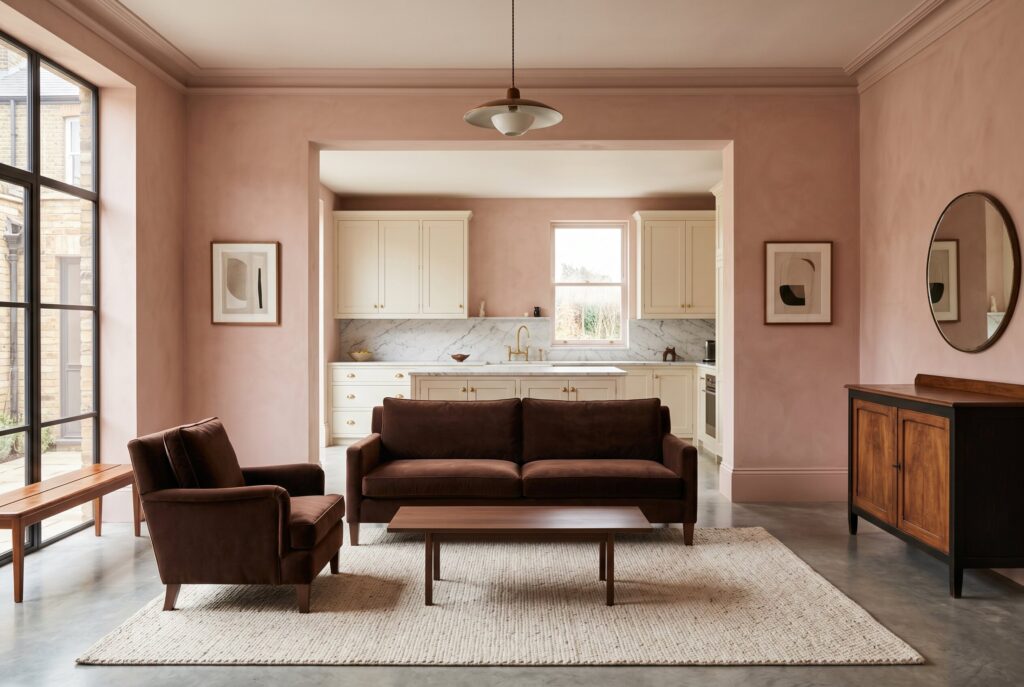
Plaster pink isn’t childish when it’s muted, chalky, and paired with deeper brown. It creates a living room that feels artistic, warm, and slightly European. A chocolate sofa or brown velvet chair gives the palette weight, while pale walls keep it soft.
This is one of the most emotional living room color ideas because it creates comfort without relying on beige. It works well beside a kitchen with cream cabinets, brass hardware, or marble counters. Avoid bright pink undertones. The color should feel dusty and plaster like, not sweet.
4. Mushroom and Ivory
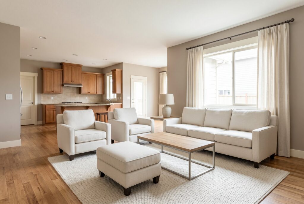
Mushroom and ivory are perfect for homeowners who want a neutral room with more depth than white. Mushroom walls create shadow and softness, while ivory upholstery keeps the room open and bright.
This palette is especially useful in open plan homes because mushroom tones can bridge many fixed finishes: oak floors, beige tile, stone countertops, and warm kitchen cabinetry. Add textured curtains, a wool rug, and ceramic lamps to prevent the room from feeling too smooth. Don’t pair mushroom walls with icy white trim. It makes the undertones look muddy.
5. Clay Taupe and Natural Linen
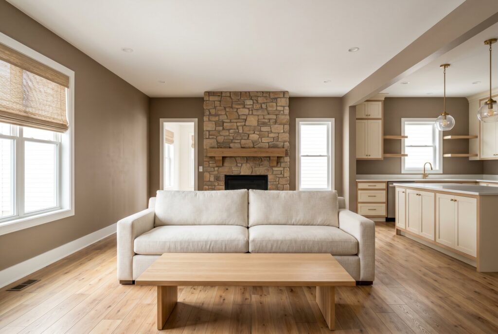
Clay taupe brings a grounded, earth based feeling to the living room. It has more personality than beige but isn’t as bold as terracotta. When paired with natural linen, it creates a relaxed and mature palette. This scheme works well in homes with warm wood floors, woven shades, and stone fireplaces. It also transitions beautifully into kitchens with cream cabinets or natural oak. Use matte black or aged brass accents sparingly for definition. Too much dark contrast can make the room feel heavier than intended.
6. Stone Beige and Black Accents
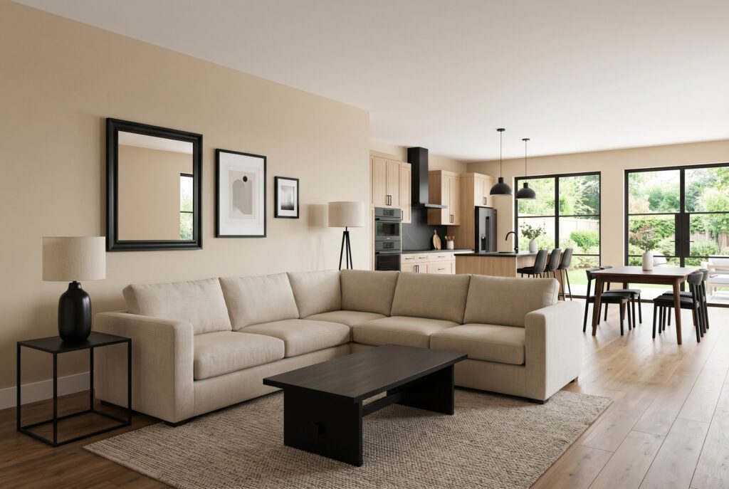
Stone beige is an understated wall color that becomes powerful when paired with black details. The beige keeps the room warm, while black lamps, picture frames, and side tables create crisp lines.
This palette suits transitional interiors because it feels classic but not outdated. It works especially well when nearby kitchen hardware or appliances already include black. Choose a large oatmeal or cream sectional to keep the room relaxed. Avoid using black as the dominant color unless the space has excellent natural light.
7. Cream, Sage, and Oak
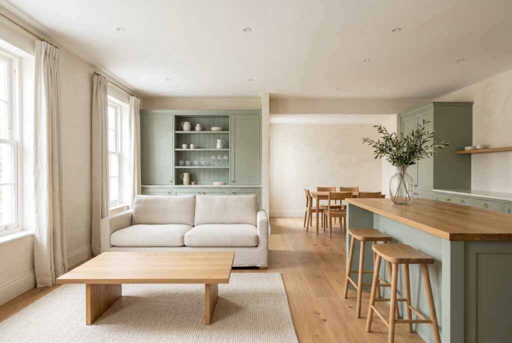
Cream, sage, and oak form a soft nature inspired palette that feels calm from every angle. Cream walls brighten the room, sage accents bring gentle color, and oak keeps everything grounded.
This is one of the safest living room color schemes for open plan homes because it connects easily with green kitchen cabinets, oak islands, or warm white cabinetry. Use sage on pillows, art, a built in cabinet, or curtains rather than every wall. The goal is freshness, not a theme. Too much sage can make the room feel flat if there isn’t enough texture.
The Moody and Grounded Collection
8. Deep Teal and Leather
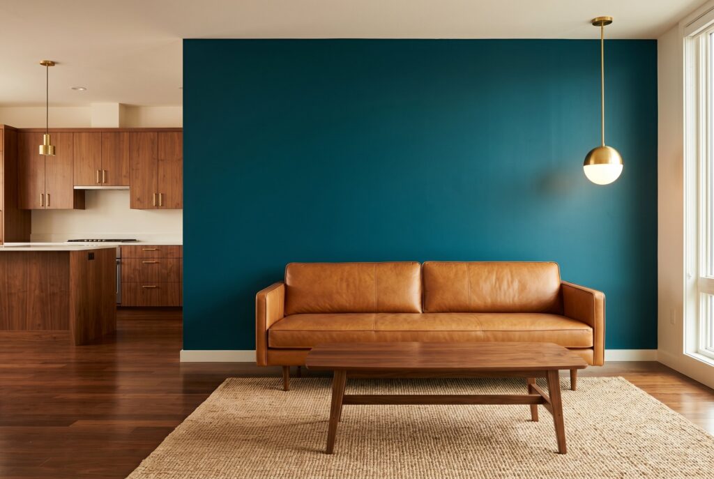
Deep teal works beautifully behind a TV wall, fireplace, or built in shelving because it visually recedes. That means the wall feels deeper, which can make the living room more intimate and layered.
Pair deep teal with a tan leather sofa, walnut coffee table, and warm brass lighting. The leather keeps the room from feeling too cool, while the teal adds sophistication. This palette works best when the kitchen nearby is warm and restrained. Avoid pairing teal with bright white walls everywhere else because the contrast can feel too abrupt.
9. Navy and Warm Gold
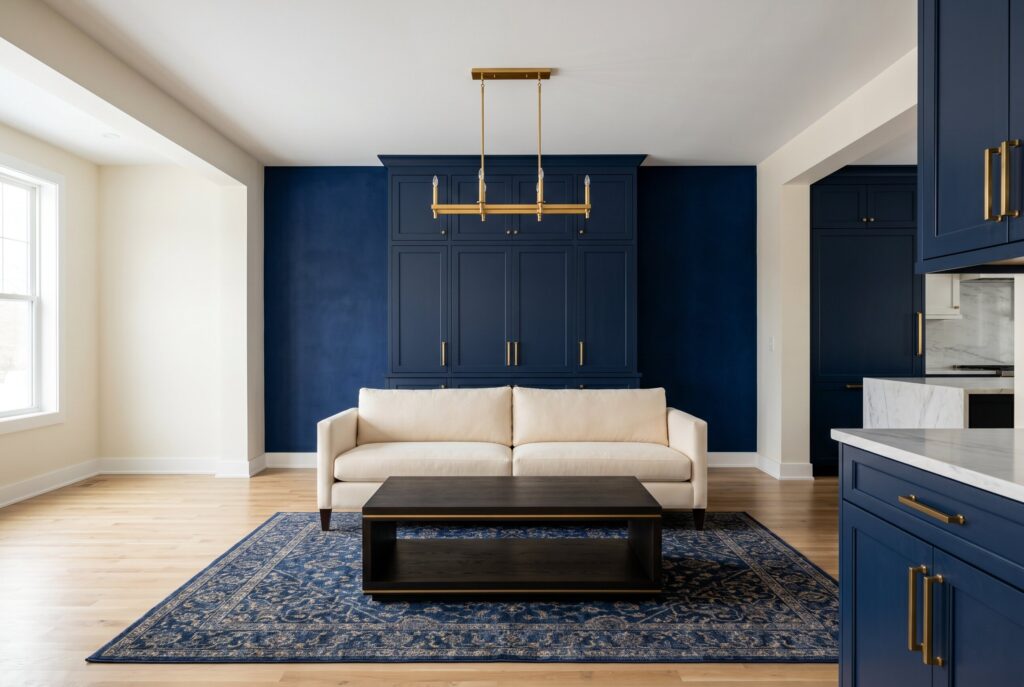
Navy and warm gold create a classic living room palette with real staying power. Navy adds structure and drama, while gold lighting and cream upholstery keep the scheme from feeling too dark.
This palette is best for homeowners who want a polished, tailored room. It connects especially well with navy kitchen cabinets, brass hardware, or marble countertops. Use navy on built ins, an accent wall, or a rug if painting every wall feels risky. Don’t use overly shiny gold. Brushed or aged finishes feel more expensive.
10. Chocolate Brown and Cream
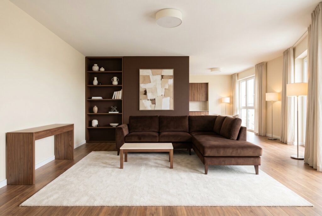
Chocolate brown is returning because it makes a living room feel cocooning, rich, and grown up. When paired with cream, it becomes warm rather than heavy.
Use chocolate brown on a sofa, built-ins, or one deep accent wall. Cream walls, a pale rug, and soft lamps keep the room balanced. This palette works well in open plan homes with walnut cabinets, brown veined stone, or warm flooring. Avoid mixing chocolate brown with too many cool grays because the room can lose its depth and warmth.
11. Olive Green and Warm White
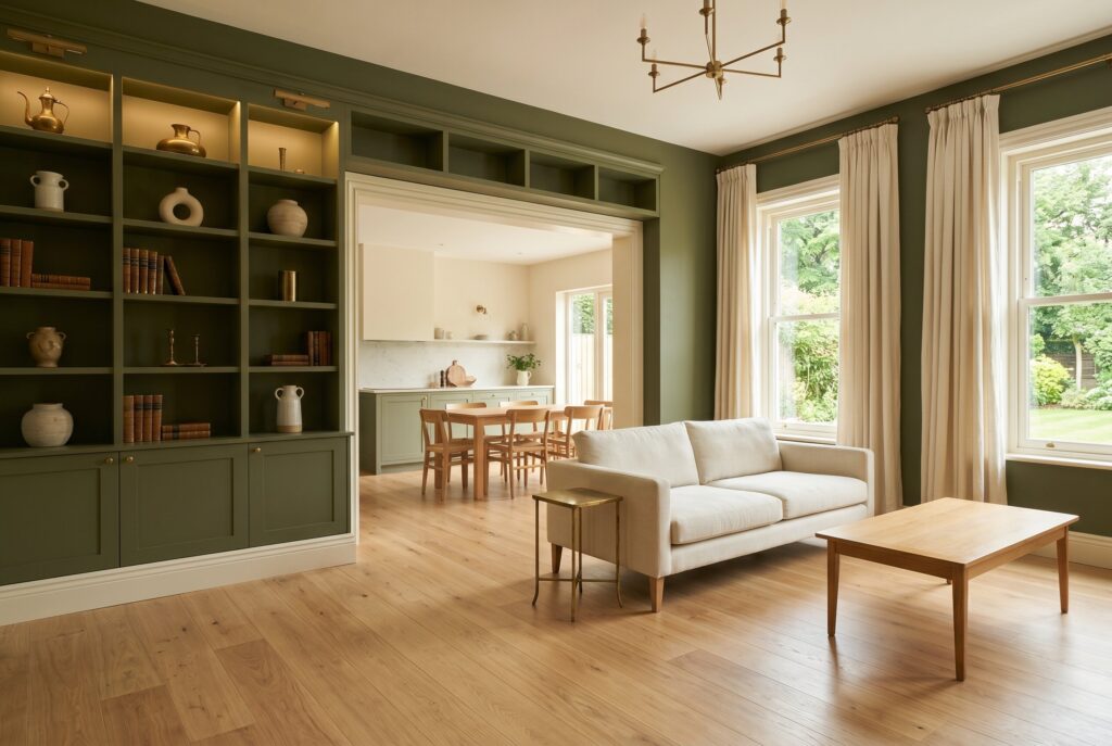
Olive green feels calm, grounded, and deeply livable. It works well in living rooms because it brings nature indoors without feeling bright or trendy.
Pair olive walls or built-ins with warm white trim, oak furniture, linen curtains, and aged brass. This palette connects beautifully with kitchens that use cream stone, sage cabinets, or natural wood. Olive is strongest when it has warm lighting. Under cool LED bulbs, it can look dull. Always test it in evening light before committing.
12. Charcoal and Oatmeal
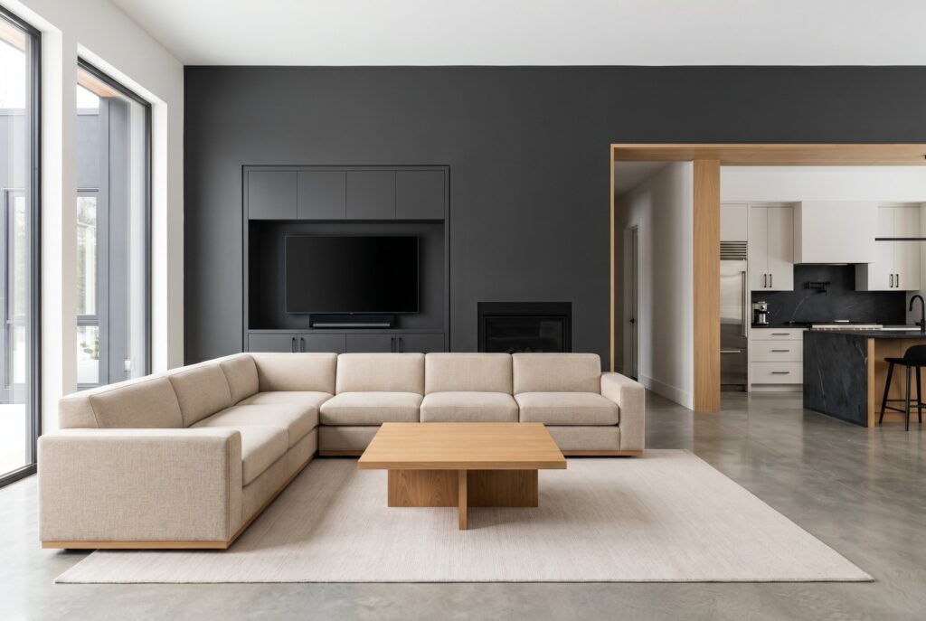
Charcoal can make a living room feel sophisticated, but it needs softness. Oatmeal upholstery is the perfect counterbalance because it warms the darkness and keeps the space approachable.
Use charcoal on a fireplace wall, media wall, or cabinetry rather than every surface. Then layer an oatmeal sectional, pale rug, and wood accents. This palette works well when the kitchen includes black hardware, dark stone, or stainless steel. Avoid glossy charcoal paint. A matte or eggshell finish feels calmer and more architectural.
13. Plum and Taupe
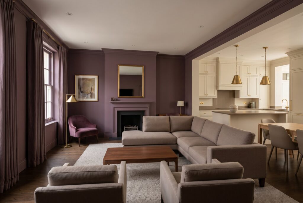
Muted plum creates a refined living room that feels more interesting than gray but still elegant. Taupe keeps the palette grounded and prevents plum from becoming too theatrical.
This scheme works best in rooms used for evening relaxation, reading, or entertaining. Use plum on walls, drapery, or accent chairs, then balance it with taupe seating and warm light. It pairs well with cream kitchens and brass accents. Avoid purple tones that are too bright. The color should feel smoky and mature.
14. Deep Brown and Burnished Brass
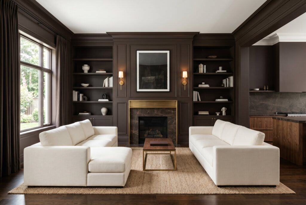
Deep brown and burnished brass create a luxurious room that feels layered rather than flashy. Brown brings depth and comfort, while brass introduces warm reflection.
This palette works well in formal living rooms, open plan lounges, and spaces with fireplaces. Use deep brown on built-ins or one main wall, then add brass sconces, a cream sectional, and a natural fiber rug. It connects beautifully with walnut kitchens or brown veined stone. Don’t overdo metallic finishes. A little brass is elegant. Too much becomes distracting.
The Coastal and Airy Collection
15. Muted Sage and Linen
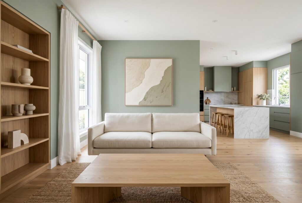
Muted sage is one of the best living room wall colors for homeowners who want color that still behaves like a neutral. It feels fresh, quiet, and easy to coordinate.
Pair it with white linen curtains, a cream sofa, oak accents, and stone accessories. This palette is ideal for open plan homes where the kitchen has marble, white oak, or sage cabinetry. Muted sage works best with natural textures. Without linen, wood, or woven materials, it can look flat. Avoid overly gray sage if the room is already shaded.
16. Dusty Blue and Terracotta
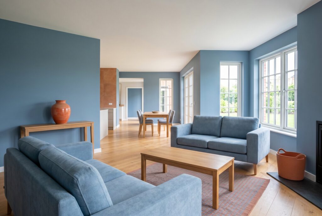
Dusty blue and terracotta balance coolness and warmth beautifully. Dusty blue makes the room feel airy, while terracotta brings sun baked warmth through ceramics, pillows, or rugs.
This palette is ideal for homes that want subtle color without a coastal cliché. It works well beside kitchens with cream cabinets, warm tile, or oak flooring. Use dusty blue on the walls and terracotta as an accent, not the reverse. Too much terracotta can overwhelm an open plan space.
17. Pale Blue and Warm White
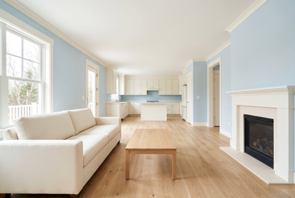
Pale blue creates airiness, but warm white keeps it from feeling cold. Together, they create a soft and timeless living room color scheme.
This palette works especially well in rooms with good natural light, white oak floors, and nearby white or cream kitchens. Use pale blue walls, warm white trim, and a beige or cream sofa for continuity. The key is undertone control. Avoid pale blues with icy gray undertones if your lighting is weak. They can make the room feel chilly.
18. Sea Glass Green and Oak
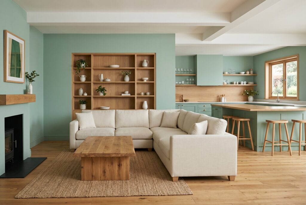
Sea glass green has a gentle coastal quality, but oak makes it feel grounded and mature. This combination is ideal for relaxed open plan homes that need a calm transition between living and kitchen zones.
Use sea glass green on walls or built-ins, then repeat oak in the coffee table, shelves, or flooring. A cream sectional and woven rug will keep the palette soft. This works well with kitchens that include green accents or natural wood. Avoid overly polished furniture. The palette needs texture to feel authentic.
19. Soft White and Pale Blue
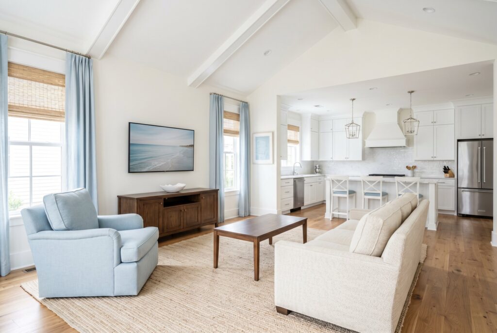
Soft white and pale blue are perfect for homeowners who want a white living room with a little more personality. The pale blue can appear in pillows, art, curtains, or an accent chair rather than wall paint.
This palette is best for open plan homes where the kitchen is already white or cream. The blue adds freshness without breaking the flow. Use woven shades, warm wood, and a textured rug to avoid a flat look. Don’t pair this scheme with stark black accents unless you want a sharper, more graphic room.
20. Cloud Blue and Sand
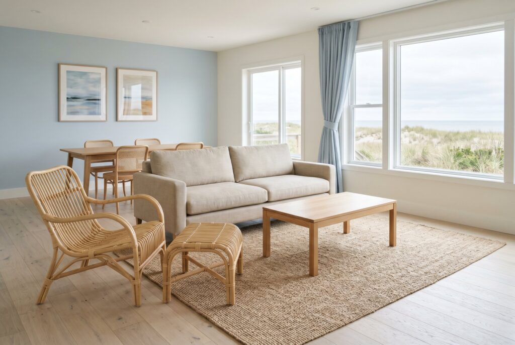
Cloud blue and sand create a softer version of coastal design. Cloud blue brings lightness, while sand tones add warmth and prevent the room from feeling thin.
This palette works well with beige sofas, pale wood, rattan, linen, and warm white walls. It is ideal for rooms that face strong daylight because the colors stay soft without disappearing. In darker rooms, choose a warmer blue gray rather than a true pastel. The biggest mistake is making the room too themed. Keep the styling natural and restrained.
21. Gray Green and Cream
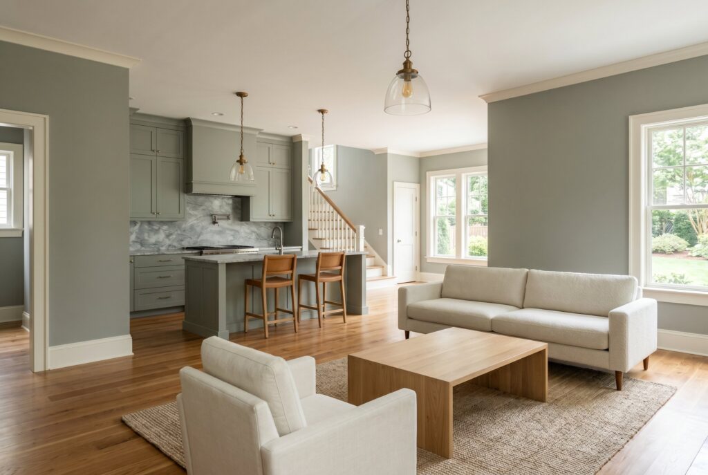
Gray green is a sophisticated alternative to both beige and sage. It has enough color to feel designed but enough gray to stay quiet. Pair gray green walls with cream seating, oak tables, and brass or bronze lighting. This palette works well with open kitchens that include stone counters or muted green cabinetry. It is especially good for transitional spaces because it feels both classic and current. Avoid pairing it with cool white trim. Warm cream makes the color feel more expensive.
The Polished Classic Collection
22. Swiss Coffee and Navy
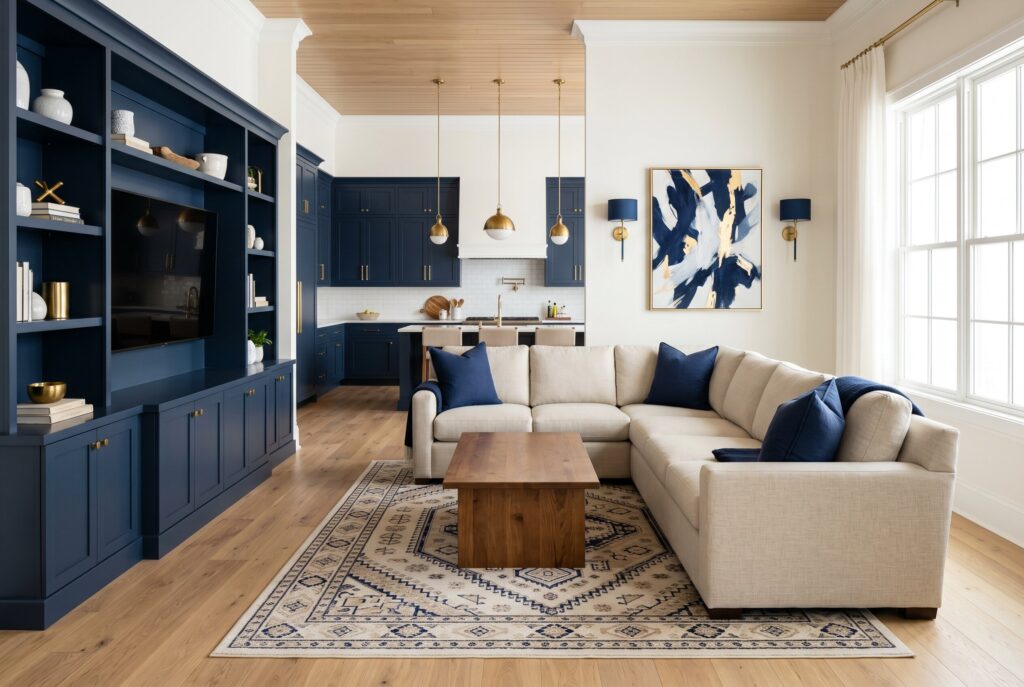
Benjamin Moore Swiss Coffee creates a warm white background that feels softer than pure white. Navy adds the structure the room needs, especially through pillows, art, built-ins, or a painted cabinet. This palette works well in open plan homes because it gives the living room definition without making the whole space dark. It also connects naturally with navy kitchen cabinets or brass hardware. Use a large linen sectional and a patterned rug for depth. Avoid using too many small navy accents. One strong navy moment looks more intentional.
23. Chantilly Lace and Natural Wood
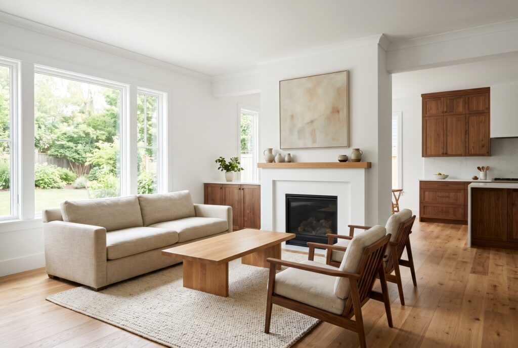
Benjamin Moore Chantilly Lace is clean and bright, but it needs natural wood to feel livable. Without texture, it can become too sharp for a cozy living room. Use Chantilly Lace on walls and trim, then add oak, walnut, wool, linen, and handmade ceramics. This palette is best for homes with generous daylight and warm floors. It also works well when the kitchen has natural wood cabinets. Avoid pairing it with cool gray sofas and chrome finishes. That combination can make the space feel sterile.
24. Dimity and Soft Black
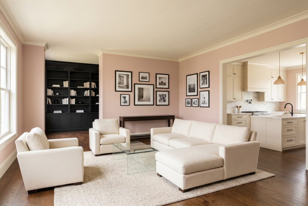
Farrow and Ball Dimity has a pinky taupe undertone that gives walls a gentle warmth. Soft black accents add definition without making the room feel harsh.
This palette works especially well in traditional and transitional homes. Use Dimity on walls, soft black on picture frames or built ins, and cream upholstery for balance. It connects nicely with kitchens that use warm neutrals, marble, or black hardware. Avoid bright white ceilings. A warmer ceiling tone will make the whole room feel more cohesive.
25. Balboa Mist and Brass
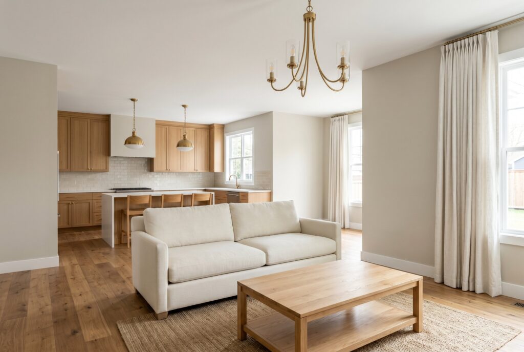
Benjamin Moore Balboa Mist is one of the most flexible living room paint ideas because it shifts between gray, beige, and taupe. That makes it excellent for open plan rooms with multiple materials.
Pair it with brass lighting, a cream sofa, warm wood floors, and textured curtains. It works with both modern organic and classic interiors. Balboa Mist is especially helpful when you’re trying to connect a living room to a kitchen with oak cabinets, white stone, or beige tile. Avoid cool blue gray accents, which can make the paint look muddy.
Conclusion
The best living room color ideas don’t come from choosing a single beautiful paint chip. They come from building a complete color system. Your wall color should connect with your sofa, rug, kitchen cabinets, flooring, lighting, and the view into the dining area.
In an open-plan home, living room colors should create flow without making every zone feel identical. The goal is to choose a palette that gives the living room its own identity while still relating naturally to the kitchen and dining space. When color works as a cohesive system, the entire home feels calmer, warmer, and more refined.
Related Articles
21 Sage Green Rug And Couch Ideas For A Minimalist Living Room 2026
White Living Room Ideas: 27 Ultra Cozy Layered Spaces