

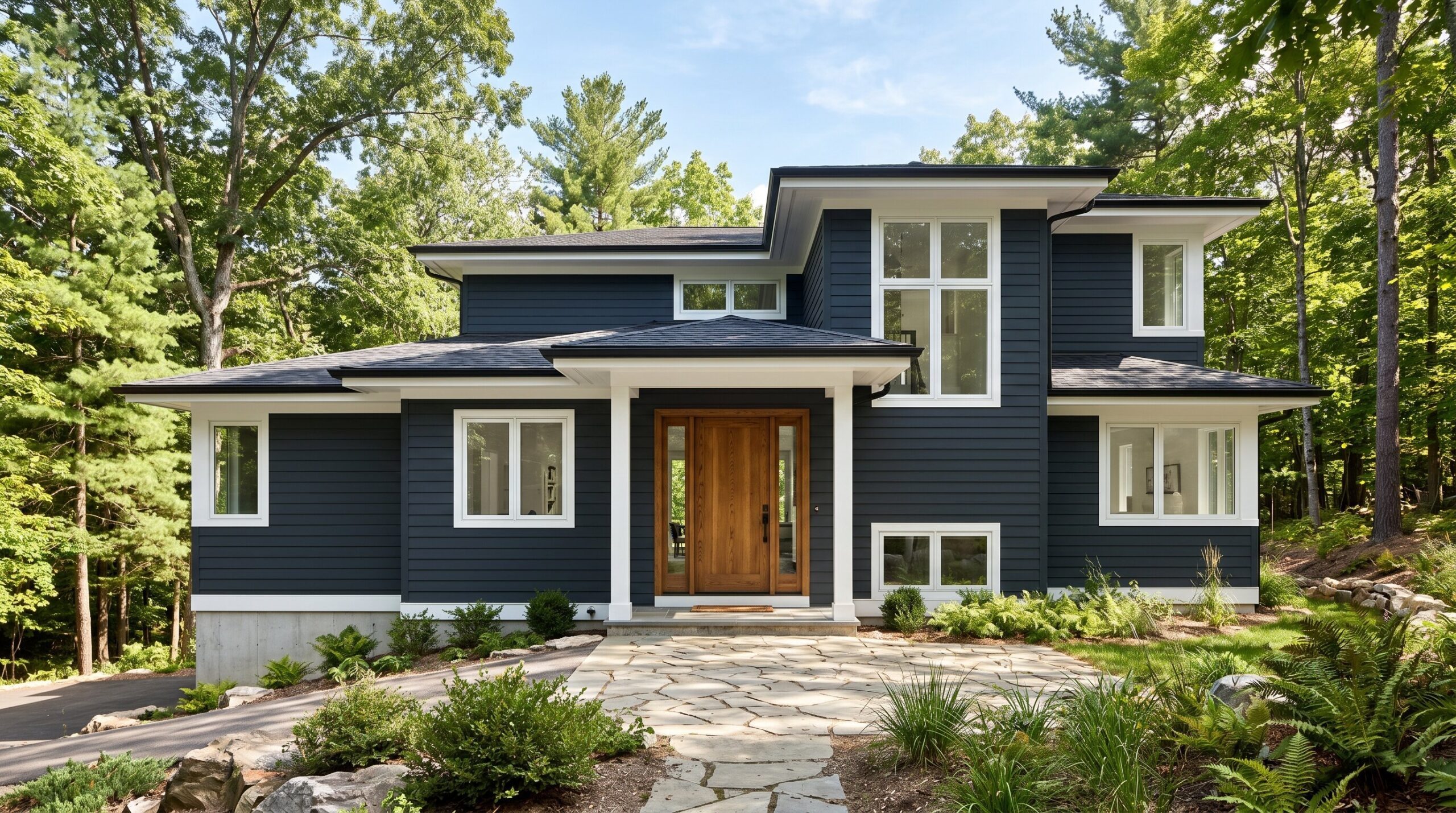
Choosing exterior house colors is one of the most important curb appeal decisions a homeowner can make. A beautiful palette can make a home look more valuable, more welcoming, and more architecturally complete. A poor palette can clash with the roof, flatten the siding, and weaken resale value.
In 2026, exterior house paint colors are moving away from cold gray and toward warm neutrals, earthy greens, coastal blues, and moody darks. The best home exterior color palettes combine body color, trim, front door paint colors, roof undertones, siding material, brick, stone, climate, and neighborhood context.
The Fixed Elements Rule: Don’t Fight Your Roof
Before choosing exterior paint colors, look at the parts of your home that aren’t changing. The roof, brick chimney, stone foundation, garage door, windows, driveway, and landscaping already set the color direction. If your new siding color ignores those elements, even premium paint can look wrong.
A black or charcoal roof is flexible. It works with white exterior house palettes, green exterior house palettes, blue exterior house tones, greige, taupe, navy, and dark charcoal. A brown roof needs warmer undertones such as cream, beige, mushroom, olive, clay, or warm taupe. Red brick usually looks best with warm whites, muted greens, taupes, deep browns, and soft black accents. Gray stone pairs better with blue gray, charcoal, soft white, and cool green.
21 Paint Combos by Home Style and Climate
1. Warm Cream Body, Snow White Trim, and Oak Door
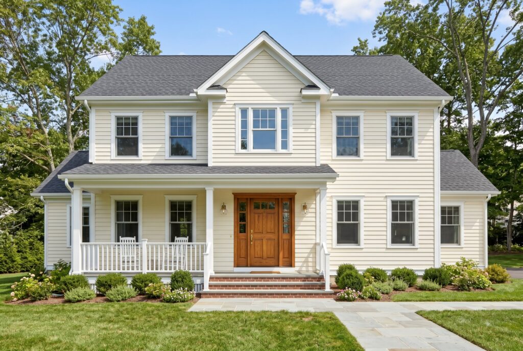
This is one of the safest exterior color schemes for resale because it feels fresh without becoming sterile. A warm cream body softens the home, while snow white trim keeps the windows, porch railings, and roofline crisp. The oak front door adds a natural note that makes the palette feel expensive rather than plain.
This combo works beautifully on Modern Farmhouse, Cape Cod, Colonial, and ranch homes. It is especially strong with black, charcoal, or weathered wood roofs. If your home has red brick steps or a stone walkway, the cream body helps connect those warm materials.
The main mistake is choosing a cream that is too yellow. In full sun, yellow undertones intensify quickly. Test a large sample before painting.
2. Benjamin Moore Grant Beige, Swiss Coffee Trim, and Walnut Door
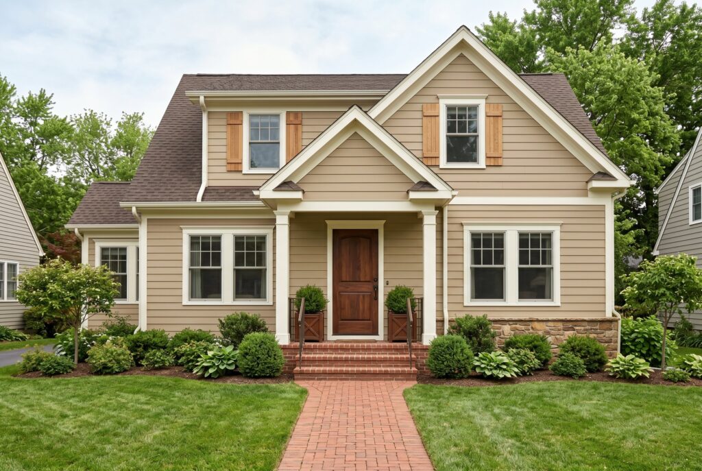
Grant Beige is a refined beige that works well when pure white feels too sharp. It has enough warmth to flatter brown roofs, brick paths, cedar shutters, and mature landscaping. Swiss Coffee trim keeps the palette soft and polished, while a walnut door gives the home a grounded, established feeling.
This is a strong choice for traditional homes, Tudor inspired exteriors, Craftsman bungalows, and suburban homes with mixed materials. It also works well in neighborhoods where bold exterior house colors may feel too risky.
The curb appeal comes from restraint. Nothing screams for attention, but every part looks intentional. Avoid pairing this palette with icy gray stone or bright blue shutters. Those cooler elements can make the beige look muddy.
3. Mushroom Taupe Body, White Trim, and Black Door
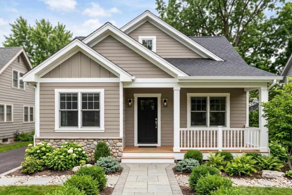
Mushroom taupe is one of the best exterior siding colors for homeowners who want a warm neutral that still feels modern. It sits between beige, gray, and brown, which makes it extremely adaptable. White trim gives the home structure, while a black door adds the sharp focal point needed for curb appeal. This palette works with black roofs, brown roofs, brick foundations, and stone accents. It is ideal for ranch homes, transitional homes, and cottages that need a more current look without losing warmth.
The resale value is strong because mushroom taupe feels updated but not trendy. The mistake is using too many accent colors. Keep shutters, railings, and lighting simple so the subtle body color can do its work.
4. Greige Body, Cream Trim, and Bronze Door
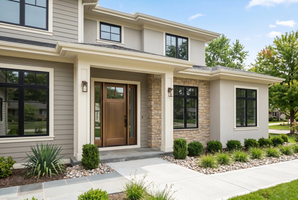
Greige remains popular because it solves the problem of gray exterior house colors feeling too cold. A warmer greige body pairs well with stone, concrete paths, black windows, and warm wood details. Cream trim softens the contrast, while a bronze door feels richer than basic black. This combination is excellent for contemporary, transitional, and suburban homes. It is also forgiving in changing light because greige can shift between gray and beige throughout the day.
For climate, greige performs well in both sunny and shaded areas, but you should avoid shades with strong purple undertones. Those undertones can become obvious on large siding surfaces. Use bronze lighting, simple landscaping, and warm stone to make the palette look complete.
5. Sherwin Williams Dover White, Black Windows, and Cedar Door
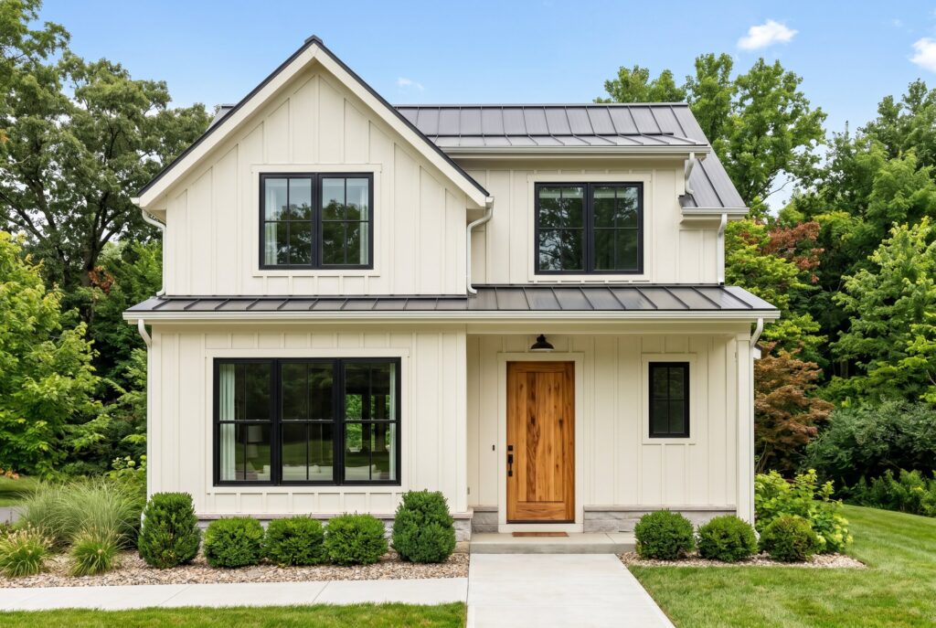
Dover White is a warm white exterior choice that avoids the flatness of brilliant white. When paired with black windows and a cedar front door, it creates the modern farmhouse look without feeling overly copied. The warmth in the body color keeps the house approachable.
This palette works best on homes with simple lines, board and batten siding, metal roofs, or black shingle roofs. The cedar door is important because it prevents the black and white contrast from becoming too graphic.
This is a resale safe palette, but it needs clean maintenance. White exteriors show dirt faster, especially near landscaping and splash zones. Use durable exterior paint and avoid overly glossy trim, which can make the home look harsh in direct sun.
6. Soft Beige Body, Ivory Trim, and Dark Wood Door
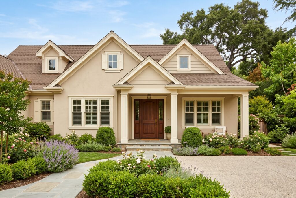
Soft beige is a quiet exterior paint color that works well for homes with brown roofs, tan stone, or warm brick. Ivory trim creates a gentle contrast, while a dark wood front door gives the entrance depth. This palette suits Mediterranean, ranch, traditional, and Craftsman homes. It is especially useful in warm climates because lighter body colors reflect more light and do not absorb heat like dark exteriors.
The curb appeal is calm and welcoming. It won’t look dramatic from the street, but it will look settled and expensive when paired with good landscaping. Avoid bright white trim, because it can make soft beige look dull. Ivory is better because it keeps the undertones connected.
7. Stone Taupe Body, White Trim, and Sage Door
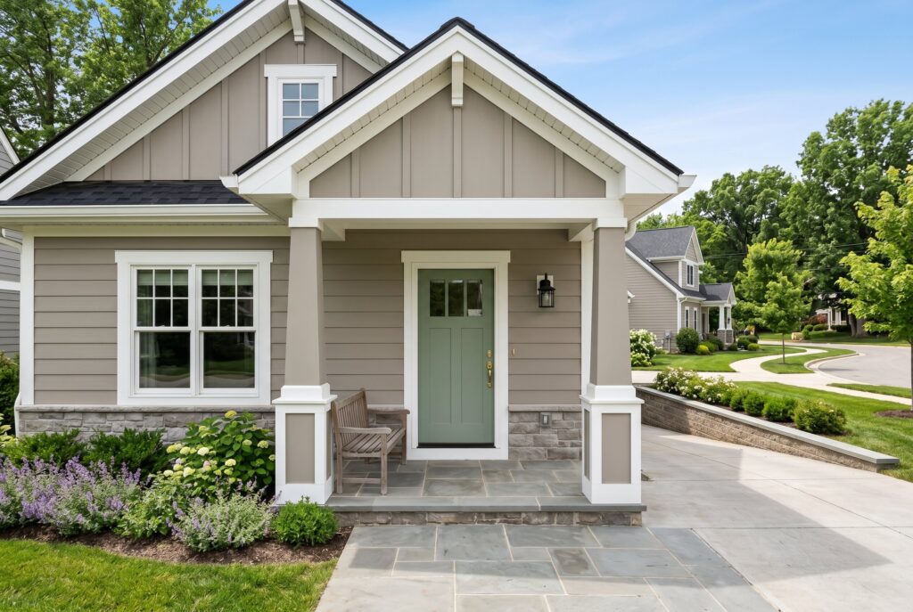
Stone taupe is a sophisticated body color for homes that need warmth and structure. It works beautifully with white trim because the contrast defines the architecture without looking too stark. A sage front door introduces a natural accent that feels current for 2026. This combination is especially good for homes with gray stone foundations, black roofs, or weathered wood details. It also works on cottage, Craftsman, and transitional exteriors.
The sage door improves curb appeal without taking over the whole palette. If you are nervous about green exterior house colors, using sage on the door is a low risk way to test the trend. Avoid pairing this palette with red shutters, which can make the exterior feel dated.
8. Benjamin Moore Nightfall, White Trim, and Oak Door
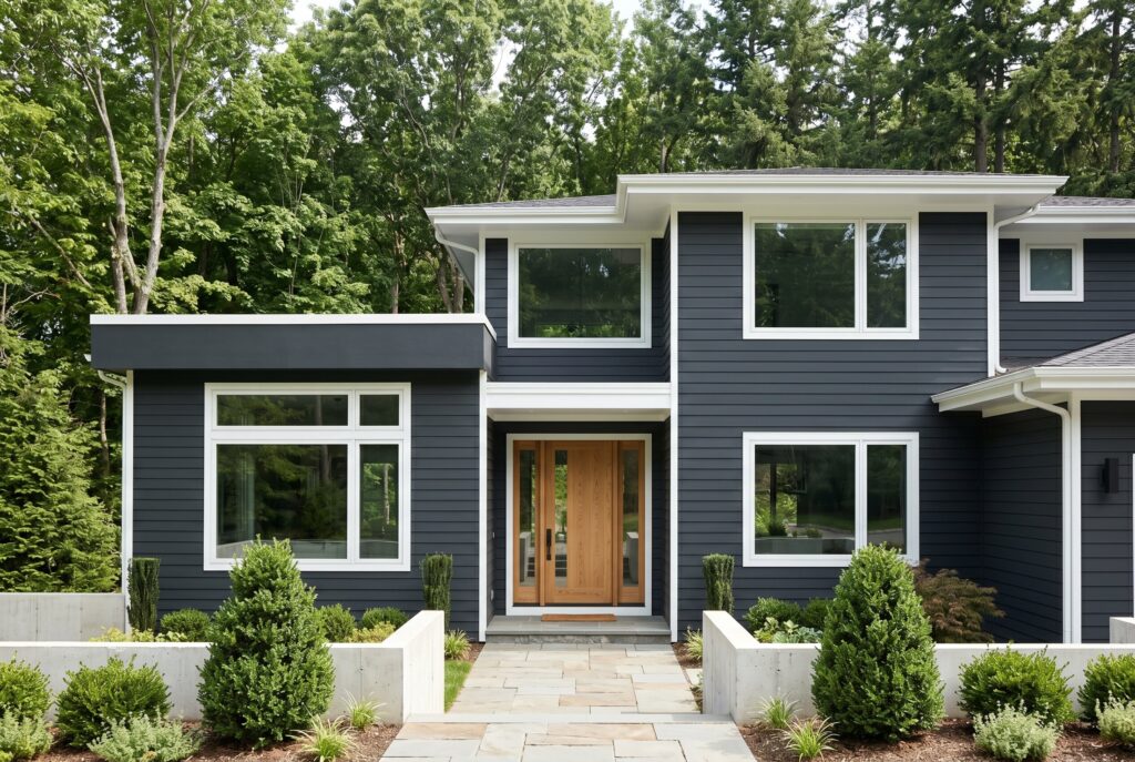
Nightfall is a deep, dramatic exterior color that creates instant architectural presence. It is ideal for homeowners who want a dark exterior house without going completely black. White trim keeps the home readable from the street, while an oak door softens the darkness.
This combo works best on homes with strong shapes, modern lines, or wooded lots. It can make modest siding look more intentional and expensive. It is also excellent for cabins, contemporary homes, and modern farmhouses.
The climate warning matters. Dark exterior colors absorb heat and may fade faster in harsh sun. If your home faces intense afternoon light, test carefully and choose high quality exterior paint. In shaded or cooler climates, this palette can look stunning for years.
9. Sherwin Williams Inkwell, Cream Trim, and Wood Door

Inkwell is nearly black but has enough depth to feel softer than flat black. Cream trim gives the exterior warmth, while a wood door prevents the home from feeling severe. This is one of the boldest curb appeal paint colors for 2026. It works especially well on contemporary homes, modern cottages, and homes with simple siding. It also looks strong with black roofs, metal roofs, and natural stone paths.
Because Inkwell is very dark, landscaping becomes essential. Green plants, gravel paths, wood planters, and warm porch lighting help the house feel welcoming instead of closed off. Avoid using Inkwell with bright white trim if you want a softer luxury effect. Cream is more refined.
10. Charcoal Gray Body, White Trim, and Walnut Door
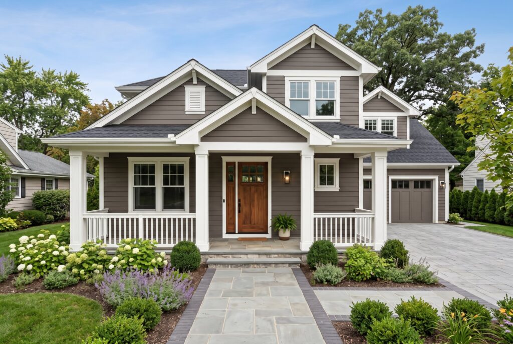
Charcoal gray is a more flexible alternative to black. It creates depth while still feeling familiar enough for resale. White trim sharpens the lines, and a walnut door adds warmth. This palette is strong for Craftsman homes, split level homes, contemporary builds, and houses with black roofs. It also works well with gray stone or concrete driveways.
The key is choosing a charcoal with the right undertone. Blue charcoal can feel cold in shaded climates, while brown charcoal feels warmer and more grounded. If your home has red brick, use a warmer charcoal. If it has gray stone, a cooler charcoal may work better. The wrong undertone can make the entire exterior feel disconnected.
11. Soft Black Body, Warm White Trim, and Bronze Door
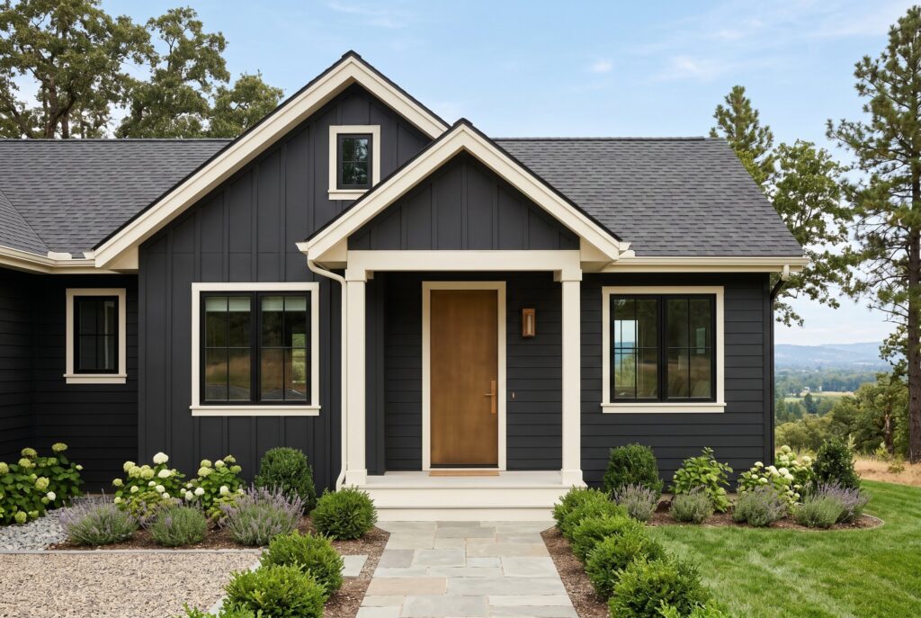
Soft black is different from pure black. It has a muted, chalkier quality that looks more architectural and less harsh. Warm white trim keeps the contrast classic, while a bronze door adds an understated metallic warmth. This palette works beautifully on modern homes, small cottages, and homes with clean rooflines. It can make a simple exterior look designer planned. It is also effective on homes with black window frames.
For resale, this is bolder than greige or cream, but it can attract buyers who love modern curb appeal. Avoid using too many black accents beyond the body color. If the roof, windows, gutters, railings, and door are all black, the home can lose dimension.
12. Deep Forest Charcoal, Cream Trim, and Oak Accents
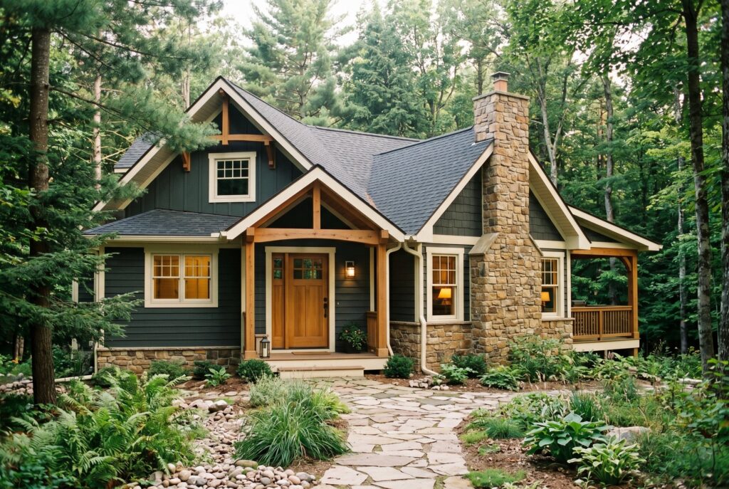
Deep forest charcoal blends green, gray, and black into one moody color. It is softer than black and more nature connected than plain charcoal. Cream trim keeps it from feeling too heavy, while oak accents make the exterior feel organic.
This palette is ideal for wooded lots, mountain homes, cabins, and modern Craftsman exteriors. It also works well with stone chimneys and natural landscaping.
The advantage is harmony with nature. The house feels grounded rather than flashy. The mistake is pairing it with cool white trim or blue toned gray stone. Cream trim and warm stone keep the green undertone looking intentional. This is a strong choice if you want drama without losing warmth.
13. Benjamin Moore Regent Green, Cream Trim, and Matte Black Door
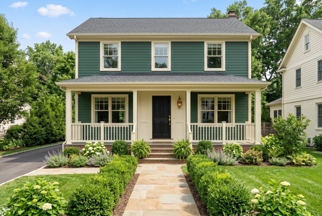
Regent Green creates a rich green exterior house that feels dramatic but classic. Cream trim softens the look, and a matte black front door gives the entrance a tailored finish.
This palette works well on traditional homes, cottages, historic inspired exteriors, and houses surrounded by greenery. It can also make red brick look more sophisticated because the muted green supports the warmth of the brick.
The curb appeal is elegant and slightly moody. It is a stronger choice than sage, so it needs confident execution. Avoid bright white trim because it can make Regent Green look too intense. Cream trim creates a more expensive effect. In very sunny climates, choose premium paint to reduce fading.
14. Benjamin Moore Mohegan Sage, White Trim, and Natural Oak Door
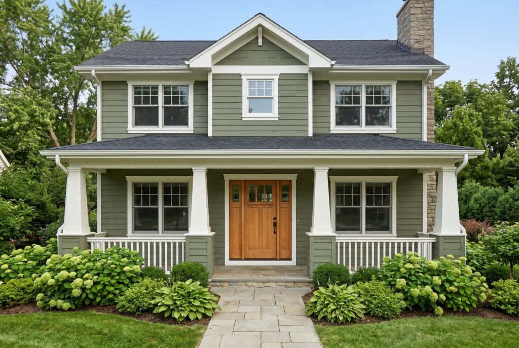
Mohegan Sage is one of the most livable green exterior house colors because it feels earthy without being too dark. White trim keeps the palette fresh, while a natural oak door adds warmth.
This combo is perfect for Craftsman homes, cottages, ranch houses, and homes with garden heavy landscaping. It works with black roofs, brown roofs, and even warm stone details.
The reason this palette succeeds is balance. The green gives personality, the trim gives clarity, and the wood door keeps everything grounded. It is also resale friendly because muted sage feels natural rather than trendy. Avoid overly colorful front door accents. Red or yellow doors can push the palette toward novelty instead of refinement.
15. Olive Green Body, Cream Trim, and Black Door
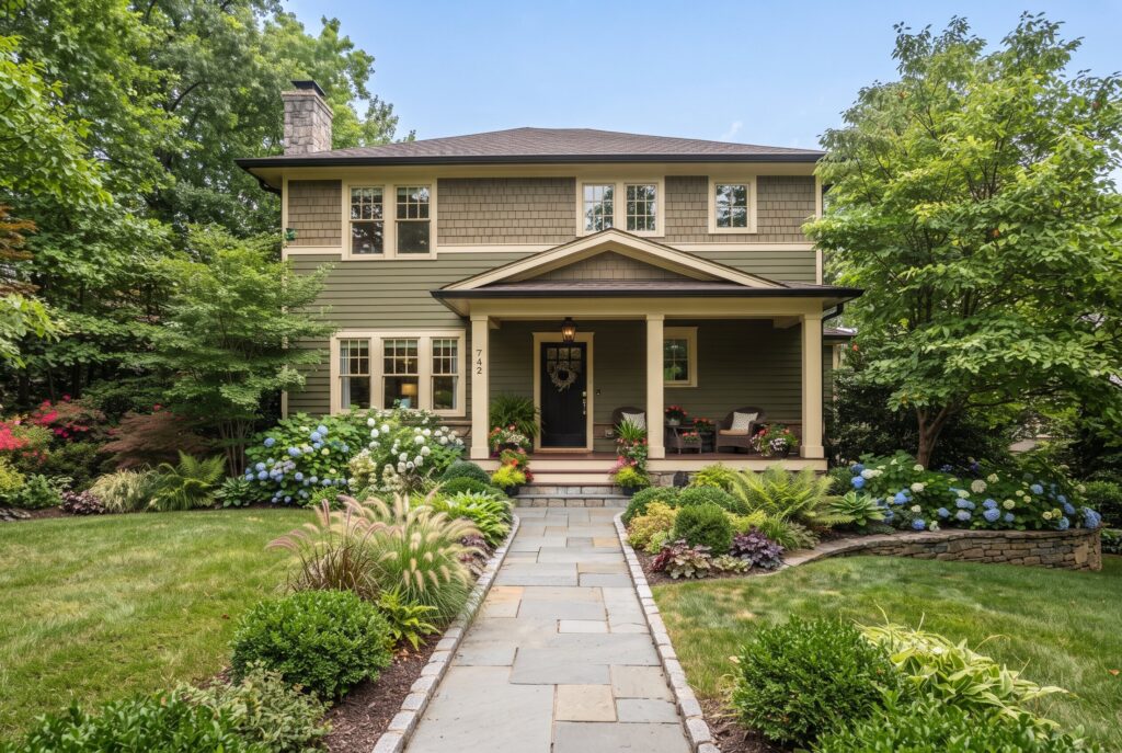
Olive green is one of the most sophisticated exterior paint colors for 2026. It has enough brown in it to feel grounded, which makes it easier to pair with brick, brown roofs, tan stone, and mature landscaping.
Cream trim keeps the body color from feeling too heavy. A black front door creates a strong focal point and gives the palette a polished finish.
This combination suits English cottage, Craftsman, Mediterranean, and traditional homes. It is also practical because olive hides dirt better than pale siding. Avoid bright green landscaping directly against the house if the tones clash. Choose plants with deeper or silvery foliage for a more layered curb appeal effect.
16. Moss Green Body, White Trim, and Walnut Door
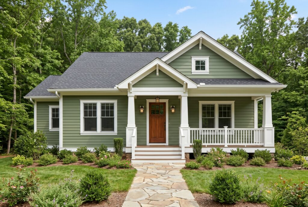
Moss green feels calmer and more natural than brighter green siding. It works especially well for homes in wooded neighborhoods or rural settings because it blends with trees, shrubs, and shaded landscapes.
White trim gives moss green enough contrast to keep the architecture visible. A walnut door adds richness and helps the palette feel more refined.
This is a great exterior color scheme for cottages, cabins, and Craftsman homes. It also works with dark roofs and natural stone paths. The main risk is making the house disappear too much into the landscape. Use trim, lighting, and porch details to keep the entrance visible. Good curb appeal still needs a clear focal point.
17. Gray Green Body, Ivory Trim, and Bronze Door
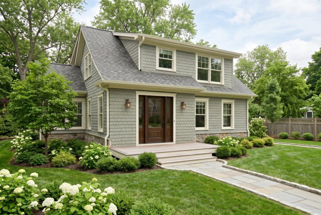
Gray green is ideal for homeowners who want color but still prefer restraint. It reads as a neutral from the street, yet it has more personality than standard beige or gray. Ivory trim adds softness, and a bronze door creates a warm, understated accent.
This palette works with gray roofs, black roofs, stone foundations, and weathered wood. It is especially useful for transitional homes and neighborhoods where bold colors may feel out of place.
Gray green also performs well in different climates because it does not look too harsh in full sun or too muddy in shade. Avoid pairing it with pure white trim, which can make the green look dull. Ivory trim creates a smoother transition.
18. Boothbay Blue Body, White Trim, and Red Door
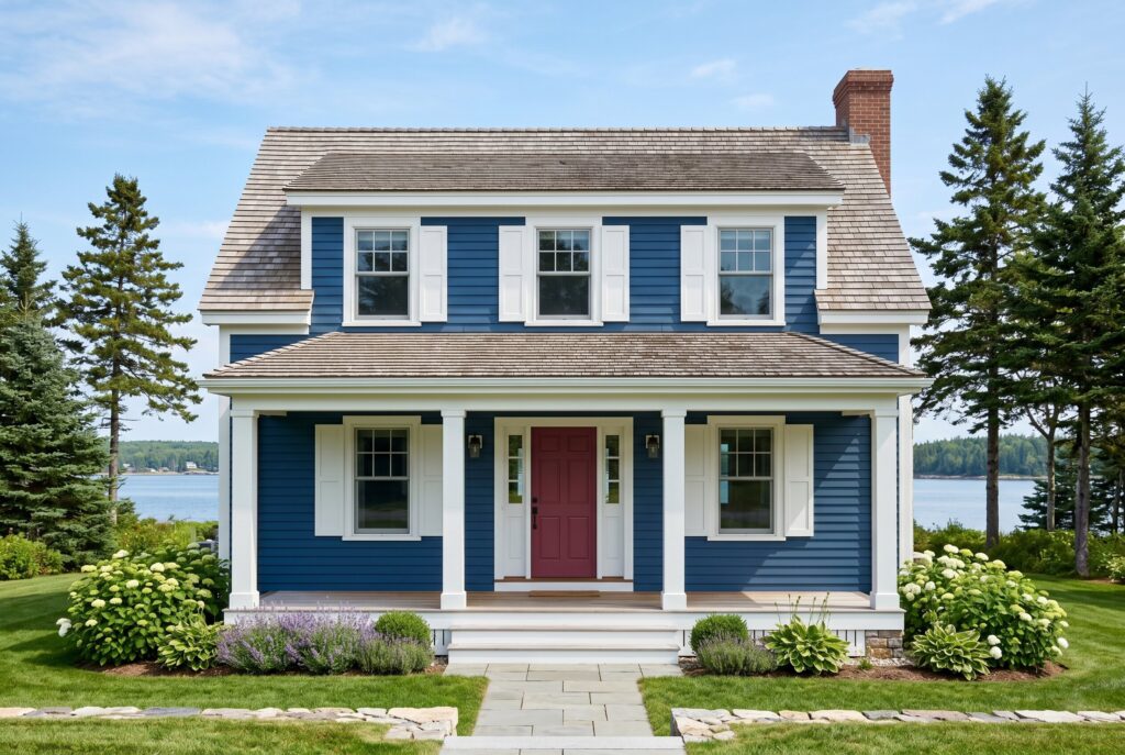
Boothbay Blue is a classic blue exterior house direction, especially for coastal, Cape Cod, and lake inspired homes. White trim keeps it crisp, while a red door adds an iconic Americana accent.
This palette works best with gray roofs, black roofs, or weathered wood shingles. It looks especially charming on homes with shutters, porches, or symmetrical windows.
The red door must be chosen carefully. A muted red or deep cranberry feels more sophisticated than a bright primary red. This palette has strong curb appeal because it feels familiar and cheerful. Avoid using too many nautical details. The color combination already suggests coastal character, so the styling should stay simple.
19. Blue Gray Body, White Trim, and Oak Door
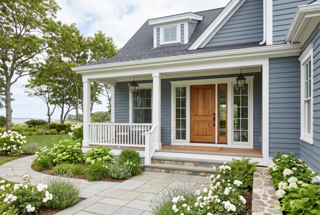
Blue gray is one of the most versatile exterior house colors because it feels calm, classic, and slightly modern. White trim brightens the home, while an oak door adds warmth that prevents the palette from feeling cold.
This combo works well on coastal homes, ranch homes, Colonial exteriors, and transitional siding. It pairs best with black, charcoal, or gray roofs.
Blue gray can be tricky with brown roofs because the undertones may fight. If your roof is warm, choose a blue gray with green or muted slate undertones. The curb appeal is strongest when landscaping includes soft greens, white flowers, and natural stone. Avoid bright blue shutters, which can make the house look less refined.
20. Deep Navy Body, Cream Trim, and Natural Wood Door
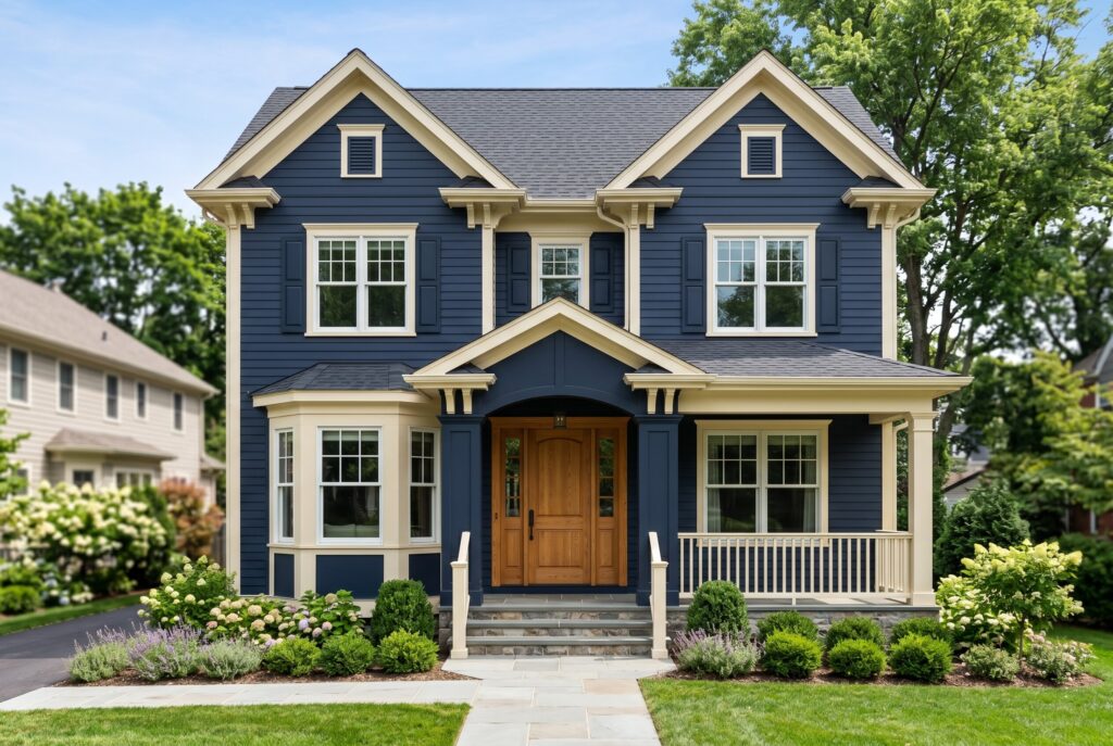
Deep navy gives a home a polished, substantial feeling. Cream trim softens the contrast, and a natural wood door keeps the exterior from feeling too formal.
This palette is excellent for traditional homes, modern farmhouses, and homes with strong symmetry. It works well with black roofs, gray roofs, and white window frames.
Deep navy is less harsh than black but still bold enough to feel memorable. It is also more resale friendly than many dramatic colors because navy has long term appeal. The mistake is using bright white trim if you want warmth. Cream trim makes navy feel richer and better connected to stone, brick, and wood accents.
21. Coastal Mist Blue, White Trim, and Charcoal Door
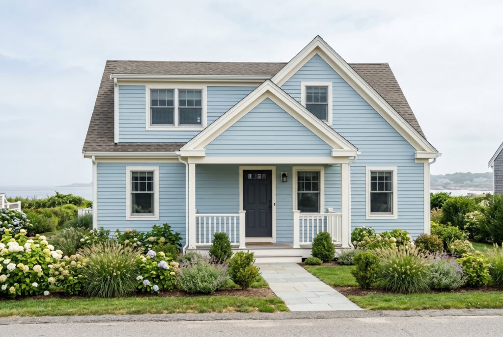
Coastal Mist Blue is a softer, lighter blue that works well for homes that need brightness and calm. White trim keeps the palette airy, while a charcoal door gives the exterior a more grounded finish.
This combination is ideal for beach houses, lake cottages, Cape Cod homes, and small homes that need to look larger from the street. The light body color reflects sun well, making it a practical choice for warmer climates.
Because the palette is soft, texture matters. Shutters, porch railings, window boxes, and layered landscaping help create depth. Avoid pairing this body color with overly bright white in harsh sun, as the whole exterior can look washed out. A slightly warm white trim is usually safer.
Navigating HOAs and Resale Value
Before spending thousands of dollars on exterior painting, check HOA rules, historic district restrictions, and neighborhood standards. Some communities regulate body colors, trim colors, garage doors, shutters, and even front door paint colors. Approval may feel inconvenient, but repainting after a violation is far worse.
If you plan to sell within five years, choose resale safe exterior color schemes such as warm white, greige, mushroom taupe, sage, blue gray, or soft beige. If you want more personality, use bold colors on the front door, shutters, porch ceiling, or planters. Those accents are easier and cheaper to change.
Exterior paint always looks lighter outside than it does on a small indoor swatch. Test large samples on different sides of the house and check them in morning, afternoon, and evening light.
Conclusion
The best exterior house colors don’t work alone. They create a relationship between siding, trim, roof, brick, stone, front door, porch, climate, and landscape. Warm neutrals protect resale value. Earthy greens connect the home to nature. Coastal blues create calm. Moody darks add drama and architectural confidence. The right palette doesn’t only make the house look freshly painted. It makes every fixed element feel intentional and gives you pride every time you pull into the driveway.
Related Articles
24 Grey Exterior House Colors: Modern Schemes for a Sophisticated Look in 2026